Choosing a new color palette for your home can be a tricky process. How do you know which colors will suit your personality and unique style? To gain inspiration for your next remodel, look no further than your zodiac sign. Your zodiac sign, or sun sign as some astrologers refer to it, can help you better understand your personality, making it easier to create a color palette that suits your style.
To help you find some inspiring new paint colors to spruce up your space, we spoke to expert astrologer and psychic Stina Garbis, who gave us insight on which hues best suit each zodiac sign. Garbis is the owner of Psychic Stina, where she provides personal and professional consulting services to individuals and businesses worldwide. Below are her suggestions for the best paint colors for each zodiac sign.
Aries
The best colors for an Aries would be “reds, oranges, and brownish-reds,” Garbis said. Due to its planetary ruler Mars, the planet of war, and the signs’ fiery nature, Garbis believes an equally bold and firey look would be best for this sign. She says this palette reminds her “of the colors of the southwest,” which can be a fantastic place to draw inspiration when designing a home that suits an Aries.
Taurus
Garbis explained, “Royal Taurus ruled by Venus likes luxury,” so colors like emerald greens, velvety purples, and warm taupes are best for this sign. Jewel tones are especially welcomed since they radiate luxury and provide a warm and vibrant atmosphere. Gold details and earthy browns are also fantastic additions to a Taurean-inspired space.
Gemini
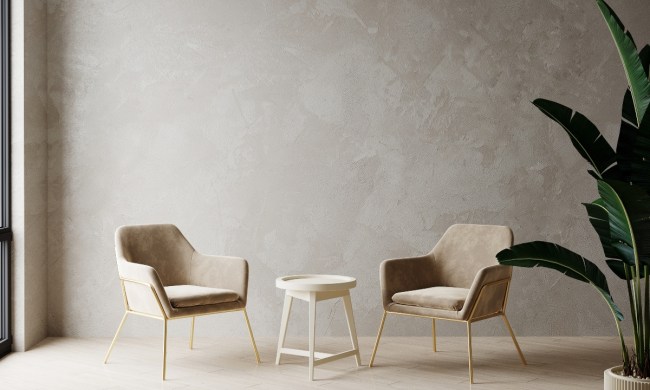
Gemini is an air sign ruled by Mercury, the planet of communication. Thanks to their light and airy nature, Garbis said Geminis “may enjoy yellows and whites and bright, uplifting colors that create a background for their bright imagination.” This social sign can benefit from bright hues, pastels, and other light or muted hues that provide a simple backdrop. Green and silver details may also be wonderful complementary colors for a home design with this bright aesthetic.
Cancer
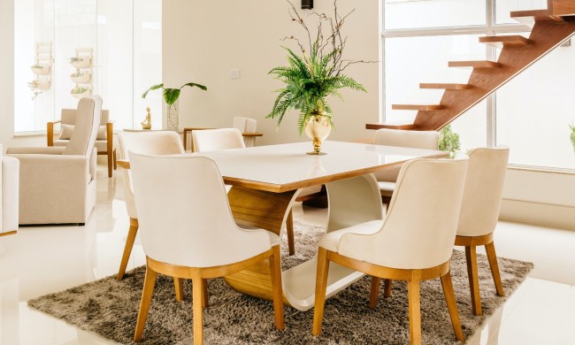
With Cancer being a water sign ruled by the moon, Garbis said they may prefer “colors like the ocean,” which can evoke a sense of peace and tranquility. Reflecting the push and pull of the tides, colors like turquoise, blues, and blue-grays are just what Cancers need. Cancerians should pair warm neutrals like taupe, beige, and tan, to pair with the blues for a beach-inspired aesthetic. Black and white accents can also tie the look together.
Leo
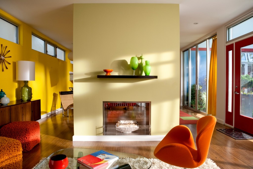
Like Aries, “Leo’s another fire sign and ruled by the sun,” Garbis said. This means bold colors and “bright hues like oranges and yellows” would be a fantastic choice for a Leo. Garbis also remarked that this fire sign reminds her of “Chinese firecrackers or fire dragons or the bright marquee of an exciting movie.” Bold patterns, chinoiserie, marquee-inspired decor, and other flashy details also complement the exciting colors.
Virgo
Virgo is an Earth sign, so Garbis said these sun signs “would enjoy varying shades of green and browns.” An earthy palette with luxe leather furniture, darker accent pieces, and plenty of vintage books could highlight this sign’s inclination toward intellect. To pull off the perfect Virgo color palette, homeowners should use both light and dark greens alongside rich and leathery browns for a deep, forest-inspired look.
Libra
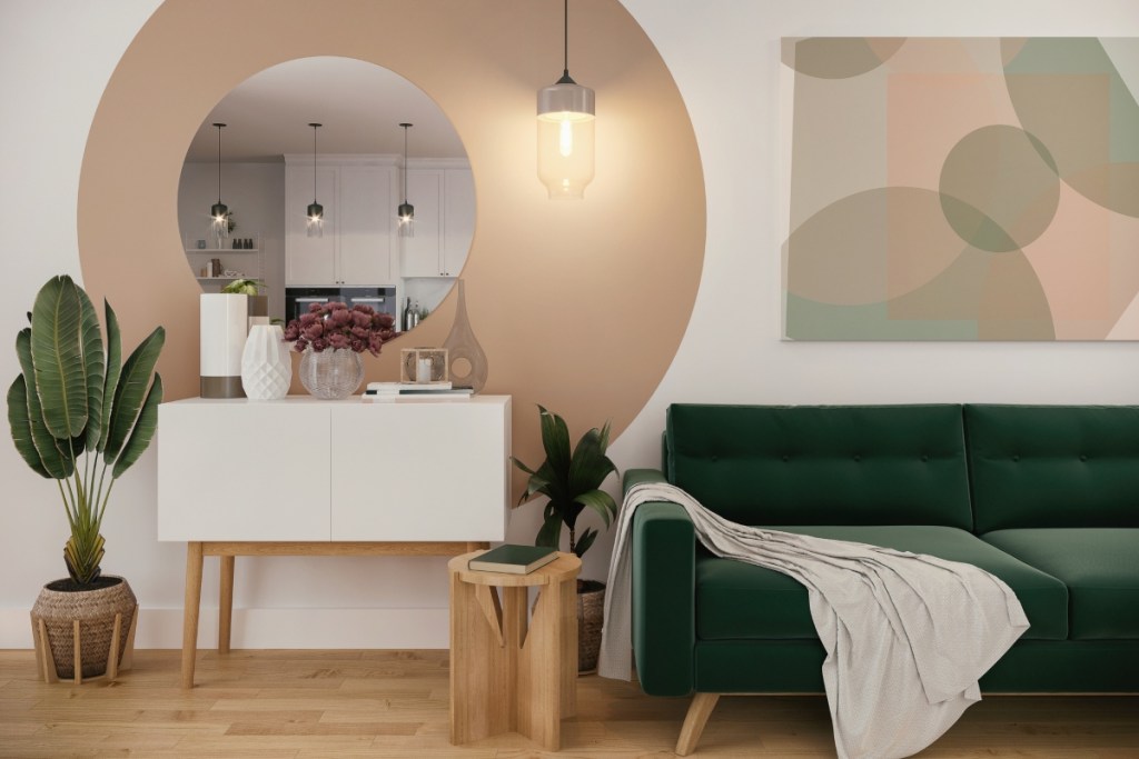
Libras are an air sign “ruled by Venus and represented by the scales,” Garbis said. This sign would enjoy “deep luxury and passionate colors [like] purples and pink, fuchsias, deep peach tones, and mauve.” Consider canyon tones, pastels, and colors that reflect a soft sunrise or sunset. Pair these hues with rose gold or copper accents for a sweet and elegant look.
Scorpio
Garbis said that “complicated and mysterious Scorpios [should] use deep and dark colors” like blacks, dark blues, velvety purples, forest greens, and blue-blacks. These darker tones can create a moody and complex atmosphere perfect for this mysterious zodiac sign. Pairing these dark colors with light tans and creams, soft reds, and off-whites can also balance the space. Additionally, leather materials and metal finishes create a sophisticated and elegant look that ties the whole room together.
Sagittarius
Sagittarius is ruled by the lucky planet Jupiter. They are the last fire sign in the zodiac, so it’s no surprise that fiery colors like cherry red or bright orange will suit their aesthetic. Though Garbis also noted that lime green or hot pink would be suitable choices as well. She said Sagittarians “may use extra bright colors or even neons to express their spunkiness.” Carefully blending eclectic patterns and bold colors shows off a Sag’s big personality.
Capricorn
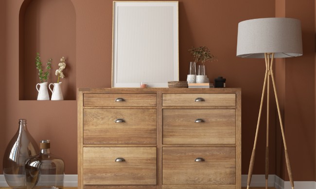
For the complex Capricorn, Garbis advised using “varying shades of browns and greens, and rustic-type colors” for this hardworking sign. Pairing these colors with metals, leather, and richly-toned masonry can enhance the rustic shades in the Capricorn color palette for a tranquil, Southwestern vibe.
Aquarius
For Aquarius, the water-bearing air sign, Garbis recommends using colors like “aquamarine, grays, blue-grays, and light purples.” Additionally, sea-glass details, airy fabrics, and driftwood pieces can anchor this airy, blue-gray design.
Pisces
As the last sign of the zodiac, Garbis said, “Watery and sensitive Pisces [should use] light blues and light greens with sparks of brighter colors like pinks.” She noted this color palette is “reminiscent of an opalescent, rainbow-colored fish or a beautiful mermaid tail,” and these stunning hues create the perfect backdrop for an afternoon of daydreams and pure imagination.
Decorating your home based on your zodiac can spruce up your space and reflect your personality. So, try out these fun color combinations, and experiment with other hues of your own, to create an exciting and personalized space that’s uniquely you!