Beige colors often get neglected in many homes. After spending years in the spotlight in traditional and modern spaces, the color beige took a backseat while homeowners began looking for more exciting shades to introduce into their spaces. But that doesn’t mean that beige is boring!
On the contrary, beige is a fantastic color to bring into your space, especially if you’re aiming to amp up a neutral color palette. Or perhaps you want to opt for a traditional and timeless look? With many unique and exquisite undertones, beige paint colors can transform your room into an enriching and inviting space. If you’re curious about how you can bring beige into your home in an exciting new way, check out our favorite picks for this paint color.
Why beige is a wonderful color for your home
While beige has a reputation for staleness for many homeowners, it’s a favored color by many designers. In interior design, beige allows decorators to take advantage of a neutral palette to amplify the accents and textures of the surrounding space. The best part about beige is the range of unique undertones that designers can choose from. For example, a pink-based beige that boasts a vibrant red undertone is vastly different from a beige with a creamy yellow undertone.
Depending on your needs and the look you’re aiming for in your design, beige can help enhance the look of your space by creating a warmer or cooler appeal. Additionally, beige is a fantastic way to use neutrals in your design without going overboard or making the space appear too bland.
Once you’ve decided that beige might be right for your space, it’s time to choose a paint color that meets your needs. Below are some of our favorite beige paint colors, which are sure to invite comfort and vitality to your home.
Behr’s Cascade Beige N240-1
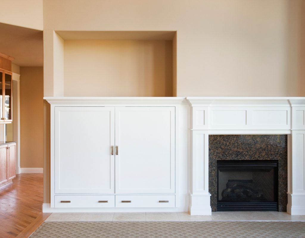
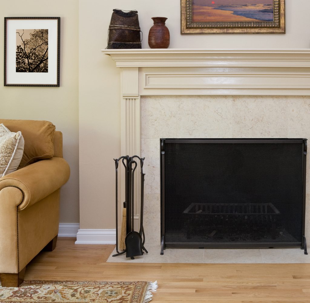
When you think of the classic, true beige color, Behr’s Cascade Beige N240-1 might come to mind. This subtle tone is the perfect base for nearly any color palette. It’s gentle, wistful, and perfect for inviting more vibrance and light to your space.
Cascade Beige has a pale, peach undertone, allowing this paint color to add more warmth to your walls. Best paired with steel gray, rich browns, and olive green accents, this shade looks absolutely stunning in dining rooms and living rooms, where neutrals are preferred. However, pairing this beautiful beige with a soft lilac or periwinkle blue could also be fantastic for kids’ rooms!
Behr’s Spiced Beige PPL-61
If you prefer a warmer tone, then Behr’s Spiced Beige PPL-61 could be what you need. This rich shade features a beige with an orange undertone, making it an excellent neutral addition to a canyon color palette or a sunset-inspired space. Pair this soothing beige with burnt orange, russet tones, or deep reds to bring out its natural glow.
In addition, this warm orange-tinted beige is the perfect backdrop for a cool color palette in need of extra “spice.” To best take advantage of this color in your palette, use it with other warm tones on your kitchen cabinets, in the dining room, or in your home office for a warm appeal.
Sherwin-Williams Warm Oats SW 9511
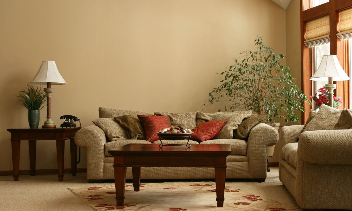
The Sherwin-Williams paint color Warm Oats SW 9511 is a great choice for homeowners looking for a cooler, creamier shade. This color exhibits a velvety beige with yellow undertones that lean toward the cooler end of the color spectrum. Fit for living rooms, bedrooms, and bathrooms in need of more light, Warm Oats is fantastic for brightening a dark and dingy space.
What we love about this buttery color is that the subtle yellow undertones give the shade a sweet, summery, hometown vibe. For cottages, country houses, or homes with traditional and farmhouse aesthetics, this can be a lovely beige choice. Pair it with bold white, black, or velvety greens and pale reds to highlight its stunning nature.
Benjamin Moore’s Greenbrier Beige HC-79
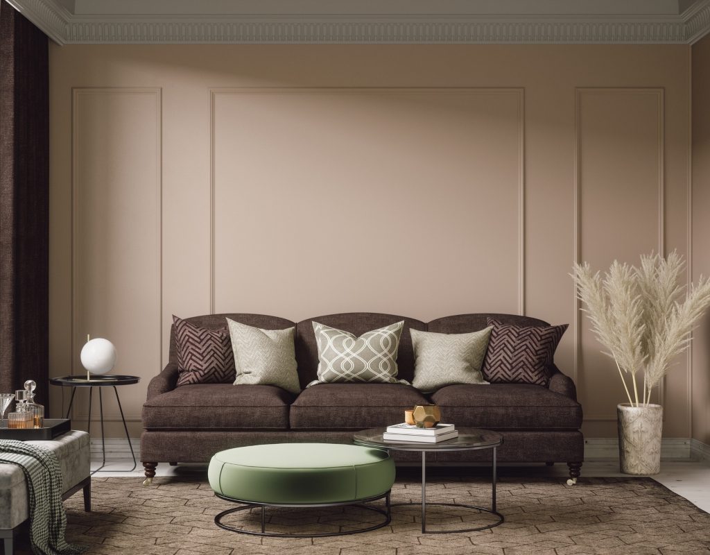
Benjamin Moore’s Greenbrier Beige HC-79 is a perfect choice for adding warmth and depth to your space. As a deeper shade of beige, this paint color features dark green undertones that make it feel rich and earthy. Paired with lighter beige or dark brown, this neutral tone can add an outdoorsy aesthetic to your space. Bring out the green undertones with houseplants and natural wood decor.
This paint color would be a great addition to rustic, vintage, or boho-inspired home designs in need of some earthy neutrals. Additionally, this color looks best in entryways, open floor plans, and bedrooms, where the tone adds a hint of luxury to the space.
Glidden’s Eternal Beige 10YY 75/084
If you’re looking for a light and uplifting hue, Glidden’s Eternal Beige brings an uplifting tone to any space. This color is soft, gentle, and reassuring. A hint of pink spices up the undertone of this creamy color, giving it a soft blush feel that is well-suited for kitchens, bathrooms, bedrooms, or nurseries. Style it with crisp white tones to amplify this airy hue or ground it with rich mocha browns and dark oak furniture.
Pale blue and seafoam green bring out the warm undertones of this color, which allows this hue to feel beachy and coastal. If you’re decorating a seaside estate, Eternal Beige could provide a lovely sand-colored tone to your palette.
Beige is not a boring color. While it may have a bland reputation for many homeowners, designers consistently use this beautiful neutral tone to bring out the subtlety and simplicity within their designs. Try using beige in your space to brighten your home, enhance your color palette, or strengthen the style appeal of your space. With so many amazing beige tones to choose from, you’re sure to find something to inspire your next interior design project.