If you’re looking to add sophistication and drama into your space, you can’t go wrong with vibrant jewel tones. These rich and vivid colors create a dark, moody space that encourages creative thought and brings a bit of flair to your home. Jewel tones are the perfect way to spice up the look of your space while also diving headfirst into a colorful and eclectic palette. So, whether you’re experimenting with a new design style or are looking for some exciting inspiration for your next DIY project, here are a few stunning jewel tone paint colors that you’re sure to love.
Why jewel tones are a great addition to your home
Jewel tones are rich and vibrant, often leaning heavily on the saturated end of their color family. These stunning colors tend toward darker shades, creating a moody and dramatic effect. From elegant purples to vivid greens, deep blues to rich yellows, jewel tones are a surefire way to add character and excitement to any space.
These more mature tones are perfect for bedrooms and dining spaces where sophistication and complexity are welcome. Additionally, these rich colors are the perfect complement for softer neutrals or other muted hues that require a darker tone to add a little contrast and visual interest to the space. Further, jewel tones can also create the perfect maximalist space.
Excellent choices for a bold and exciting palette, these shades also blend beautifully with blacks and browns to create a lounge space that’s as inspiring as it is focused. This makes them a great addition to home libraries, offices, or studies where more drama is welcome.
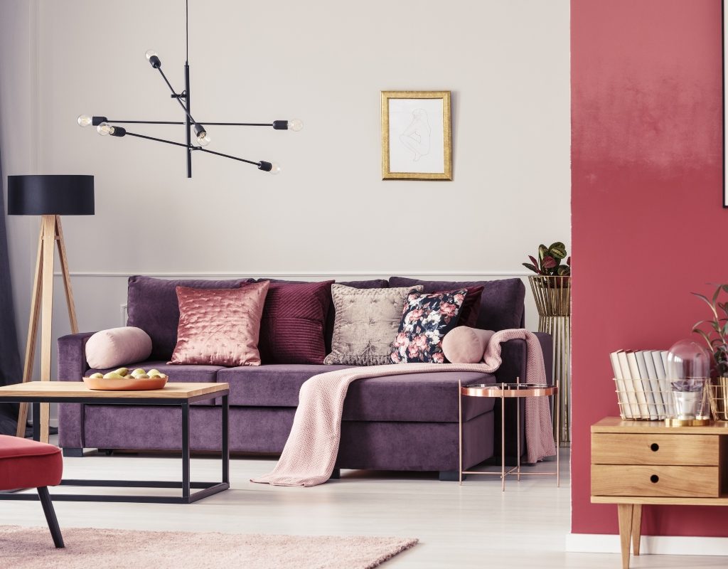
PPG’s Purple Cabbage PPG18-24
To add these lovely jewel tones to your home design, check out PPG’s Purple Cabbage. Purple Cabbage is a luxurious dark fuschia shade with rich and vibrant red undertones. As a commanding purple tone, this color radiates luxury and sophistication. Well-suited for areas in the home that need an elegant touch, this jewel tone excels at bringing an opulent aesthetic to any room. Try it in the dining room for a sophisticated look, or bring it into the kitchen for a vibrant touch that will inspire your next experimental dish.
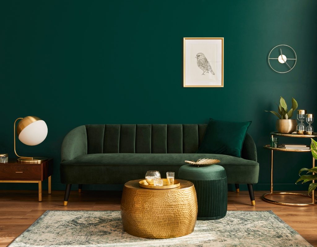
Sherwin-Williams’ Shamrock SW 6454
Sherwin-Williams’ Shamrock is a rich and earthy jewel tone that invites a lush and lively look to your space. As a deep emerald color, Shamrock is reminiscent of evergreen trees and other natural elements. This velvety deep green looks best in sitting areas like entryways, living rooms, and dining rooms, where you can relax and enjoy the organic feel of the space. Green jewel tones are especially great for adding a luxe look to your space since they pair beautifully with gold and brass metallic details and crystalline decor.
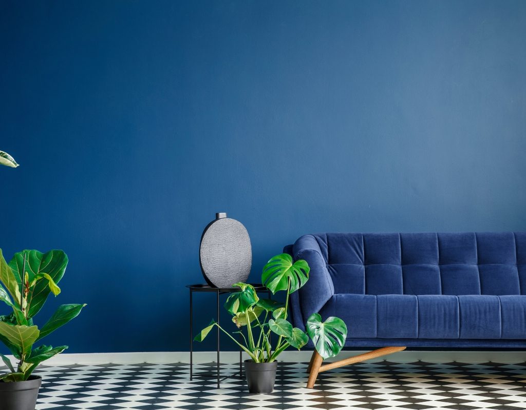
Benjamin Moore’s Slate Teal 2058-20
Blue jewel tones are especially popular in home decor, thanks to their vibrant yet relaxing aesthetic. If you’re interested in inviting a deep, rich hue to your space, we recommend Benjamin Moore’s Slate Teal. Slate Teal is an exotic blue-green saturated shade that’s complete with a hint of black undertones, creating a color that can be either deep and thought-provoking or calm and tranquil. We recommend using this color in bathrooms, bedrooms, or any other space where comfort and coziness are welcome. For finishing touches, pair it with gold details, natural wood tones, and lively green hues to create a small oasis in your home.
Behr’s Plantain Chips M290-6
Plantain chips by Behr is a delectable and vibrant yellow-gold hue. As a darkened yellow with brown undertones, this brassy color is perfect for adding a subtle yet energetic feel to your space. This jewel tone can brighten a dark room or uplift a darker design aesthetic by contributing a sunny sensibility. Try adding Plantain Chips to your living room, office, or kitchen for an exciting and joyful look. Or, pair this tone with rich blue or green jewel tones for a striking contrast that’s perfect for eclectic or maximalist spaces.
Sherwin-Williams’ Red Bay SW 6321
You can’t go wrong with Red Bay by Sherwin-Williams, a slightly muted ruby that exudes drama and sophistication. Best used in moderation or as an accent tone, this fiery red shade is perfect for creating a striking, dramatic effect in any room. For example, use Red Bay as an accent color in your kitchen to bring spice and sophistication to the space. Or, add it to the bedroom or living room for a heightened romantic feel. This color looks stunning beside darker hues and can be a great addition to a modern home that needs a dose of personality.
These jewel tones are a fantastic way to bring vibrancy and elegance to a space. They allow you to incorporate fun and exciting colors without leaving you with a room that looks fit for a kid. Pair these tones together for a daring look or add them as accents to create a dramatic and sophisticated effect. Either way, these colors are sure to elevate your home’s design, making you the best interior designer on the block.