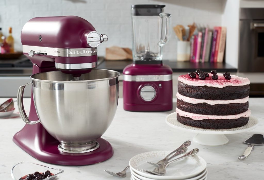
KitchenAid just announced their bold and vibrant color of the year. A shade that diverges from the norm and breaks the status quo in home design, Beetroot is meant to add a splash of color to your space. This rich magenta tone is vastly different from the traditional white kitchen aesthetic of years past. With a focus on creating an exciting and celebratory space, Beetroot is a bold shade that will allow homeowners to express themselves while creating a luxe, energizing space for everyone to enjoy.
If you’re interested in learning more about this opulent shade and how it could impact this year’s kitchen decor, then we have everything you need to know.
Why did KitchenAid choose Beetroot as the color of the year?
The journey to KitchenAid ultimately choosing Beetroot as the color of the year is deeply rooted in the symbolism and emotional impact that lays behind both the term and the shade. Jessica McConnell, Director of Advanced Design at Whirlpool Corporation, stated that Beetroot is a “boundaryless color” and that it was chosen to reflect the times we live in and how it has impacted the collective. McConnell places importance on choosing Beetroot to reflect the current idea of “making space for everyone.” The goal was to select a color that was bold, inclusive, and ultimately celebratory.
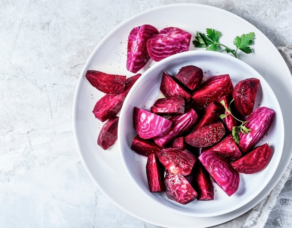
Beetroot, a rich magenta and purple tone, features both feminine and masculine qualities. As a blend of hot pink and deep blue, Beetroot showcases a duality that the team at KitchenAid wanted to capture. Additionally, the symbolism of the root and the plant having to be uprooted to be enjoyed perfectly articulates the mood of the times we live in as openness becomes a political forefront. For these reasons, Beetroot became the bold and exciting color of the year for KitchenAid.
What does this mean for kitchen design?
Since Beetroot is a rich, vibrant shade to include in the kitchen, many homeowners are likely wondering what this could mean for the future of kitchen design. Here are our thoughts on this bold color.
Bringing the fun back into the kitchen
One reason Beetroot was chosen as the KitchenAid color of the year was that it had the opportunity to set a distinct mood. This vibrant purple tone is warm, reassuring, and uplifting. Gone are the days of stark white kitchen landscapes. Instead, bold and exciting tones are stepping in to offer homeowners a chance to really curate an intentional mood for their spaces.
Veering toward the eclectic
Another trend we’re seeing with the emergence of vibrant colors like Beetroot is that kitchen home designs are veering toward the eclectic. Fun, funky, and artistic designs are taking center stage as trends like minimalism fall to the wayside. Maximalism is one trend that we’re seeing in abundance lately as homeowners eagerly invite color, personality, and excitement to their homes. This need to revamp our spaces to reflect something exciting, adventurous, and a bit eccentric is what makes colors like Beetroot so popular!
Opening up to the possibilities of pattern and curated design
Along with maximalism comes pattern and curated design. In the near future, we could expect kitchen design to boast more pattern, colors, and a play on geometric shapes. Fun mosaics and tile are likely to become trendy in our kitchens. Additionally, an interest in handmade pieces, curated art, and sculptures could be an investment homeowners are drawn toward to adorn their homes.
With a new wave of curiosity opening doors to the possibility of more color, vibrance, and pattern in home design has many designers and homeowners alike are excited to see what new trends await. As we shift into more colorful and eclectic home design trends, we’re noticing a unique interest in inclusivity and expression. KitchenAid’s Beetroot is certainly a color to take advantage of this year if you’re looking to bring a bold statement to your space!