Monochromatic color schemes create a sense of elegance and sophistication in many homes. For homeowners looking to take a minimal approach to home design and to express their unique style in a luxurious yet straightforward way, monochrome is the way to go.
If you’re interested in this color palette or want to achieve a monochromatic aesthetic, then there are a few do’s and don’ts that you need to be aware of. So, today we’re covering all the tips and tricks for pulling off a successful monochromatic color scheme to help you make your design a success.
Do pick a base color
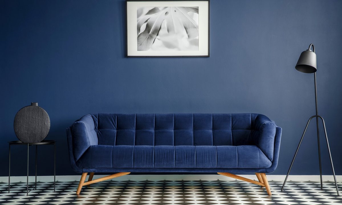
One of the first rules of a monochromatic design is to pick a base color. Monochromatic color palettes are created by using one color as your base and then using varying tones of that color to help pull off a cohesive look. For example, a classic monochrome palette might have the base color black. Different hues and tones of black would then be used throughout the design.
Since the color you pick will be the base of your entire design, it’s essential to choose a shade that suits your personal aesthetic. For people looking to experiment with monochromatic design, we recommend starting with a neutral tone like black, white, gray, or brown to help ease into this aesthetic.
Don’t go too bold, too fast
Going along with what we mentioned above, it’s important to ease your way into a monochromatic color palette. One issue we see many homeowners facing is struggling to work with bold, bright colors in their design. Shades like yellow, blue, red, and green can be tricky for homeowners to use. We recommend not going too bold too quickly. Instead, start with a neutral tone that allows you to ease into the aesthetic.
Similarly, you don’t have to go all out with monochrome immediately. Instead, start by painting your walls in your chosen color and purchasing large furniture in different hues. It’s okay if your design isn’t perfectly monochromatic at first. Ease your way into it to make sure you achieve your desired look.
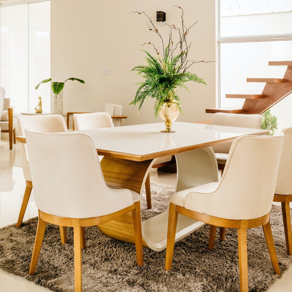
Do use a variety of tones in your design
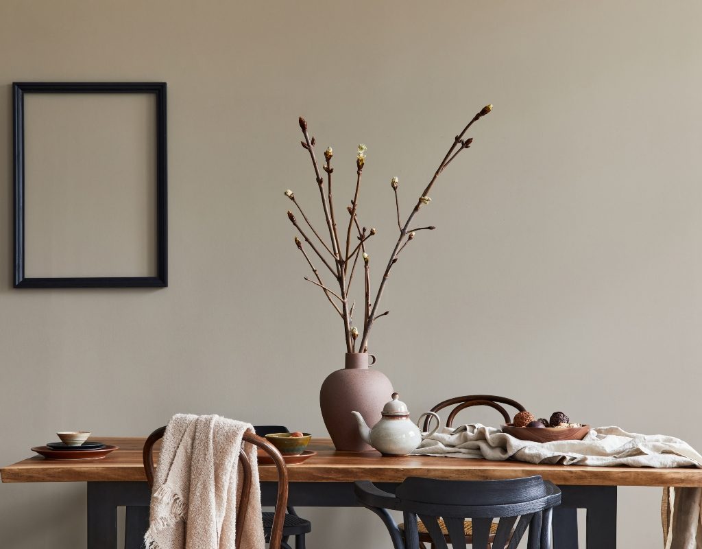
For those inexperienced with monochromatic color palettes, it can be tempting to choose one tone of a color and stick with it throughout the entire design. Unfortunately, the lack of variety in tone will make the design appear flat and dull. So, to combat this struggle in a monochromatic design, we suggest using a variety of tones and hues to help create more visual interest.
For example, if you’re using brown as your base color, try using a lighter-toned brown on your walls and opting for a dark chocolate brown flooring. Adorn the space with velvety-red-hued brown furniture, cream textiles, and yellow-brown woods. You’ll still have a monochromatic color palette, but the space will appear much more lively than if you elected for only one shade of brown throughout the design.
Don’t clutter the space
Another thing you should avoid when creating a monochromatic space is too much clutter. Monochromatic color palettes can make a space look busy, even if only a handful of decor or furniture pieces are in the room. Instead of overwhelming the space with more minor details, opt for a more minimalist approach to your design.
Keep things simple with only a few wall decorations or table pieces, so the space doesn’t become too cluttered or messy. A simplistic approach to a monochromatic design can keep the space feeling quaint and balanced.
Do play around with texture
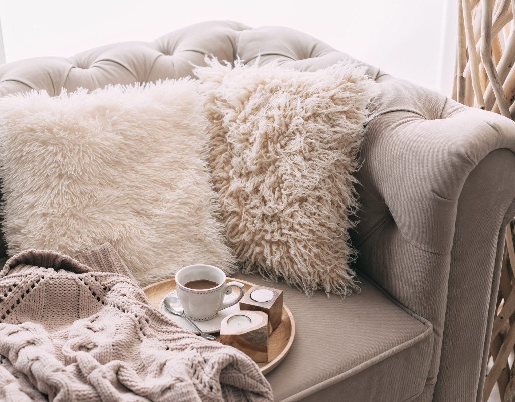
In addition, texture is a vital component of pulling off a successful monochromatic interior design. Since the main struggle of monochromatic home design is preventing the space from appearing flat or dull, it’s important to play around with textures that help the room come alive. Try blending different woods, metal, ceramic, and textiles to create a more vibrant space.
For example, use blankets and throw pillows on sofas and chairs for a cozy look, and don’t forget to add a rug or two to help ground the design. Additionally, glass and ceramic pieces add a dainty quality to the design to offset more dramatic materials like wood, stone, or metal.
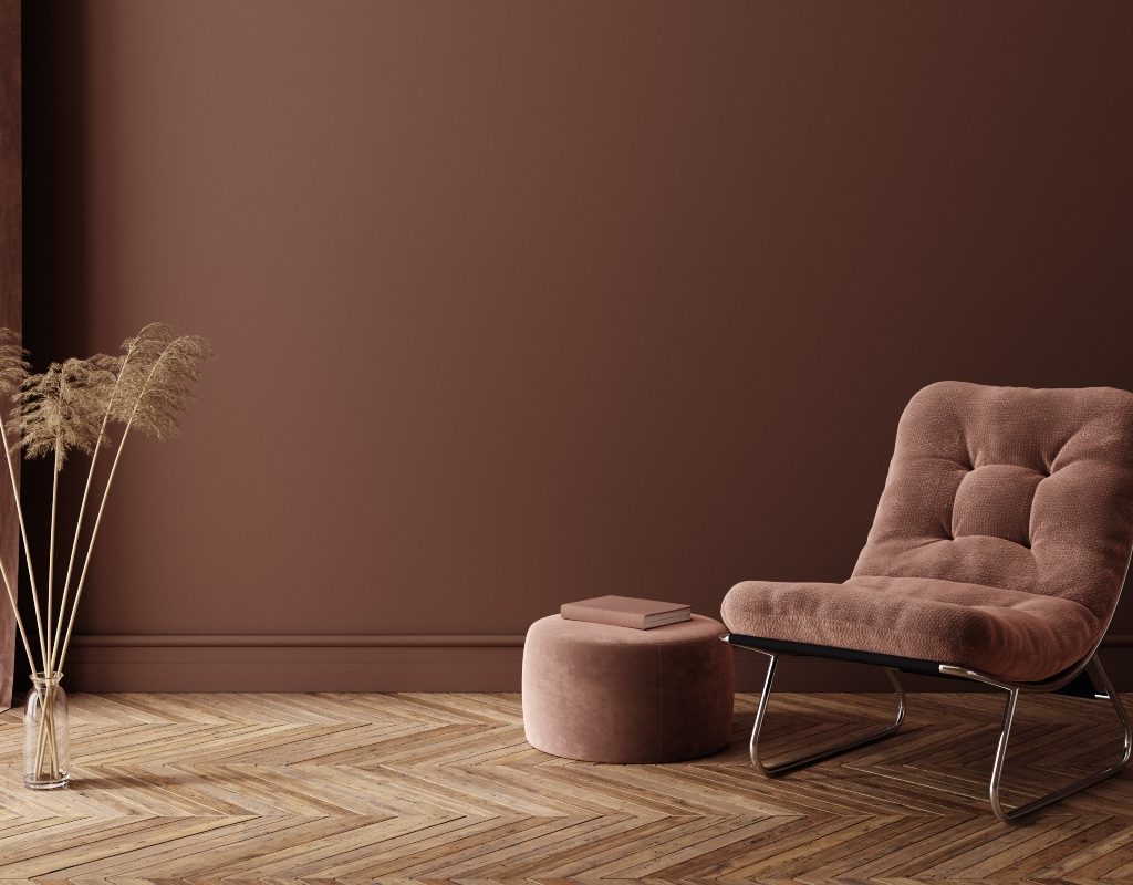
Don’t forget an accent color
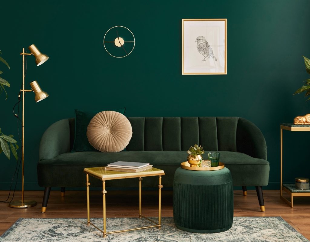
An interesting aspect of monochromatic design is that many designers sometimes break the status quo by implementing an accent color into their spaces. While it’s not necessary, an accent color can add a pop of visual interest throughout the room and make the whole design feel more luxe and inviting. For example, purple monochrome can come alive with a rich, jewel-green accent tone.
Alternatively, a black monochromatic color palette might appear more elegant with a white or red accent color. Using an accent color in your monochromatic design is also an excellent way to ease into the color palette. Don’t be afraid to go bold, even if only in the details at first.
Do paint the ceiling and trim
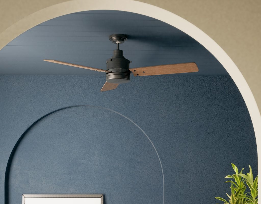
Today’s monochromatic color palettes truly embrace color. This means color-drenching your space in one hue to really make an impact in your design. The last thing you need is a plain white ceiling or white trim that breaks up the look of your monochrome space. Leaving the ceiling and trim unpainted can make your space feel unfinished and ruin the sleek aesthetic of monochrome palettes.
Instead, paint your ceiling the same color as your walls. Or, paint your ceiling in the accent color you’re using. Painted ceilings are ultra-trendy right now, so your space will look refined and modern. If you have trim pieces around the windows, doorway, floor, and ceiling, paint them in the same base color or accent color to make the design appear more seamless.
Monochromatic color palettes are a great way to create an inviting and visually appealing space. These designs create a distinct atmospheric mood depending on the base color of the designer’s choice, which intrigues many homeowners. So whether you opt for monochrome in your bedroom, bathroom, or living space, remember these tips. Monochromatic design is all about simplicity and sophistication to create a dynamic space.