
The countertop color you shouldn’t choose if you plan on ever selling your home

You need to avoid this color to market your house successfully

Kitchen with a green tile backsplash
Hendrickson Photography/Shutterstock / Shutterstock

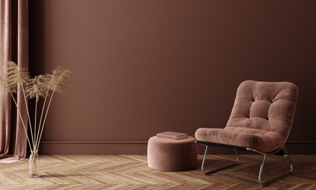
When selling your home, you want buyers to walk in and imagine themselves living in the space. To best accomplish this sensation, many homeowners choose neutral colors to provide a blank slate. And when it comes to the kitchen countertops, this is no exception.

However, some buyers may be leaning toward a countertop color or undertone that turns many buyers away, preventing a successful sale. Today, we’re giving you everything you need to know about yellow kitchen countertops and why you shouldn’t keep them if you intend to sell your home.

Recommended Videos

Why you should avoid yellow countertops

small outdated kitchen with window curtains
Christopher Meder / Shutterstock

When we say “yellow countertops,” you might imagine bright yellow vinyl or laminate counters from the 1960s and 1970s. While these midcentury countertops still exist in some homes, yellow countertops also had a comeback in ’90s and early 2000s revival designs but on a subtler scale.

Yellow undertones in stone and marble countertops were popular for a while. Even today, some homeowners choose to install kitchen counters with a yellow undertone or yellow/golden hue. However, this can look a bit tacky. Here’s why.

Yellow can resemble aging

Yellow can be a great color to invite sunshine and brightness into a room. However, on the kitchen countertops, yellow resembles aging. Particularly against bright white tones, yellow looks discolored, stained, and aged. When a homebuyer steps into your kitchen and notices those yellow-toned or golden marble or granite counters, they might immediately associate them with a poorly maintained or unhygienic space.

It’s a dated countertop hue

Additionally, yellow countertops in the kitchen appear dated. Bright yellow counters are too bold and often reflect the ’60s and ’70s contemporary decor that favored primary colors. While some homebuyers may be interested in this, the lack of neutrals will deter others who don’t favor a dated style. Also, golden or yellow undertone stone countertops feel just as dated as ’60s vinyl. These counters were popular in McMansions in the ’90s and therefore feel outdated and tacky to many modern buyers.

Can you use yellow in the kitchen?

cluttered cottage kitchen design with rustic beams
Andreas von Einsiedel / Getty Images

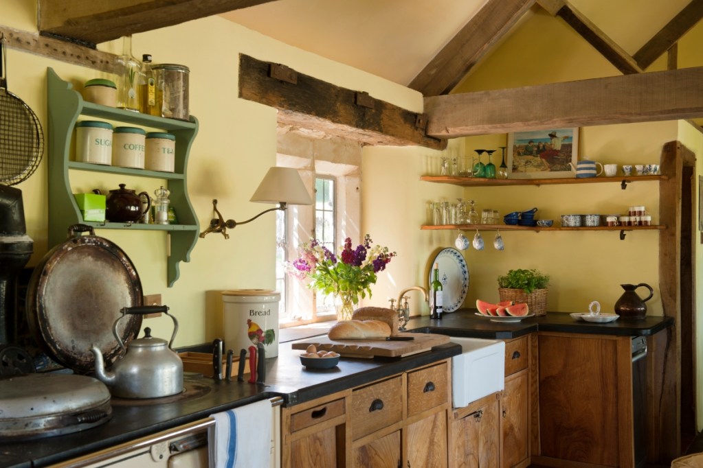
If done well, yellow can be used in the kitchen. Many cottages or cottagecore-themed homes look great with a pastel yellow kitchen wall. Farm homes also enjoy yellow on vintage refrigerators, floor mats, seat cushions, or throughout decor. However, you’re unlikely to see yellow countertops making a feature as they often look unappealing.

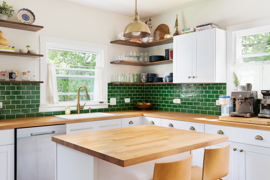
What countertop colors are best?

quartz countertops in a modern kitchen
John Keeble / Getty Images

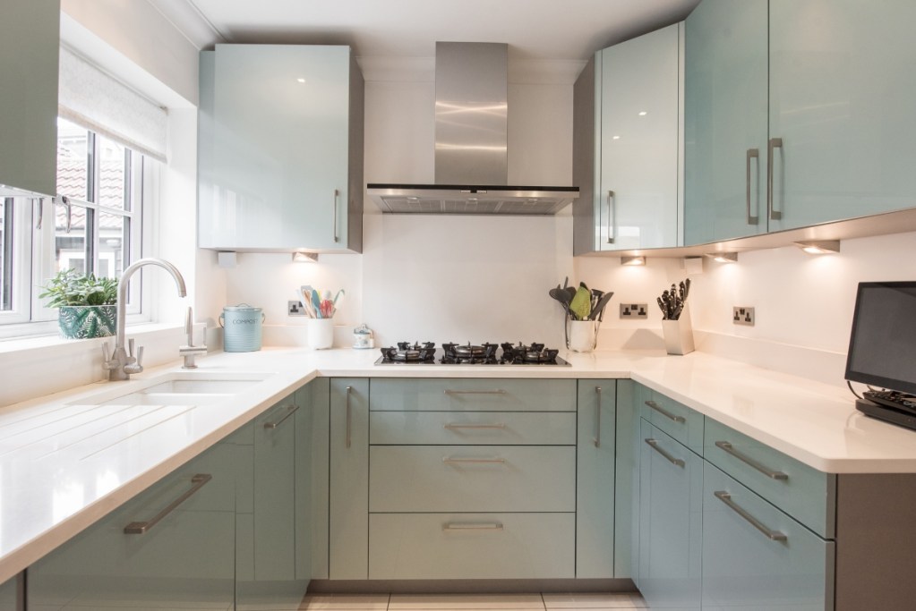
The best countertop color to use in a modern-day kitchen is a neutral tone. White quartz, veined marble, and light granite are popular choices. Avoid bold colors, vinyl, or tile if you want to appeal to the majority of buyers. Whites, beiges, creams, and tans are OK. Some homeowners even opt for black countertops, which can look sleek and sophisticated. Avoid yellow undertones whenever possible to prevent an aged and dated look.

The kitchen is one of the strongest selling points of any home, so investing in your kitchen is important to ensure it appeals to buyers. Avoid dated countertops and yellow countertop colors, which don’t sell well. Instead, keep your palette neutral so homebuyers can see themselves in the space.

Editors' Recommendations

Amelia Wilson
Amelia Wilson (author pen name Amelia J. Wilson) is a content writer in Greenwood, IN. She often enjoys topics on…
5 breathtaking dining room paint colors that add a luxe touch to your home
Wondering what color to paint your dining room? Try one of these amazing paint tones
Moody rich gray dining room wall color for an elegant look

If you’re looking for a way to refresh your dining room, adding a new paint color can spruce up your walls and create a luxe feel in your space. While it’s easy to slack on your dining room design, leaving it feeling dull or uninspired, being intentional with your paint colors could transform your room. From rich browns to deep jewel tones, creating a luxe dining space is all about using color to create an elegant and sophisticated touch. If you've overlooked this crucial detail for creating a seamless dining room design, maybe now is the time to consider refreshing the look of your space with a fresh coat of paint.

Here, we give you five breathtaking dining room paint colors and tips on how to style them to help inspire you to create a luxurious look in your home.

Read more
An interior designer reveals the home decor you should (and absolutely should not) buy at HomeGoods
What you should and should not pass up in HomeGoods, according to an interior design pro
hellenistic greek home decor god goddess statues

HomeGoods offers homeowners stunning and sophisticated pieces to add to their interior designs without blowing their reno budget out of the water. However, just because HomeGoods boasts incredible prices for luxe-looking goods doesn’t mean every decor item is a must-have. Here is some advice from an interior designer about what you should and should not buy at HomeGoods.

https://www.tiktok.com/@the_avantgarde/video/7276137950788996398?lang=en
What you should buy at HomeGoods
Interior designer @the_avantgarde on TikTok shares her take on what homeowners should never pass up at HomeGoods. When decorating on a budget, these are some must-grab items.
Snag the plain white sheets
Julie Sousa, the interior decorator behind the account, says, “Plain white sheets: this is literally the place to find them on a budget.” Plain white sheets are a classic addition to any bedroom, fit with nearly every color palette, and offer a hotel luxe aesthetic. Sousa also recommends snagging the Calvin Klein or Ralph Lauren bed sheets, saying they are “always the best ones.”
Go for the classic bath accessories
According to Sousa, another pro tip when shopping at home decor stores is to go for classic bath accessories. Flat bath mats and classic white towels give the bathroom what Sousa calls “hotel vibes.” If you want that gorgeous hotel-luxe look in your space while remaining under budget, then you don’t want to pass up this HomeGoods find.
The vase combos are a must
Sousa also gushes over the amazing vase combos you can find in HomeGoods. With plenty of options and an array of sizes, shapes, and colors, homeowners can find vase pairings that blend with their existing home decor.
Don’t pass up the decorative baskets
Decorative baskets are another decor steal this interior designer says not to pass up. HomeGoods has several options in many hues, so you can find exactly what you need.
If you see All-Clad pots and pans, get them
Sousa says, “Sometimes you can get lucky and find some All-Clad pots and pans.” She continues by noting that “this is the best brand for pots and pans.” So, if you want chef-grade goods on a budget, add these to your cart.
Save money with large lamps
In her TikTok video, Sousa adds that HomeGoods has fantastic options for saving money on large lamps. If you’re looking to spruce up your interior with a larger lamp but don’t want to drain your wallet, HomeGoods could have just what you need.

Read more
What colors go with gray? How to make a neutral hue pop in your home
Make gray walls work for your home decor with complementary colors
Modern living room with gray walls and yellow furniture

Neutral colors like gray and taupe are always popular options for your home's interior design. Both are versatile shades that can go with a plethora of other hues, which means you can easily change up the look of your decor with gray walls and a rotating rainbow of accessories like colorful throw pillows. With all the different shades of gray paint available, from matte to glossy, warm to cool, and brownish to blueish, it's certainly possible to find the one that's perfect for you and your home.

Of course, you can always have too much of a good thing. While gray can be a sophisticated and elegant shade, too much gray can wash out a room or make it feel dull and dingy or cold and unwelcoming. Think of gray as the neutral backdrop on a canvas that lets your color palette shine, and you can't go wrong. So, it’s important to incorporate other colors into the decor, whether it be with pieces of furniture, art, or throw blankets -- but what colors go with gray? If you're looking for the best options to brighten up your current decor, keep reading to find out how to accent this elegant tone.

Read more