If you’re aiming for a stellar home design, then there are a few things many experts urge you to watch out for. Good home design is all about intentionality and ensuring that your design appears balanced through the use of color, texture, and form. So, to help alleviate any worries and to save you from a cringe-worthy design, we’re offering a few tips on how you can decorate your home to achieve a stunning look.
Uninspired, boring artwork
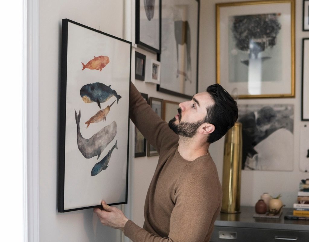
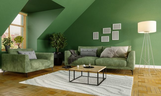
One of the most common aspects of bad interior design is adorning your walls with uninspired, boring artwork. Artwork is a great way to express your personal style while also adding color and character to your room decor. For homeowners in need of decorating a blank wall or who crave more visual interest, artwork can be a fantastic solution. However, it’s easy to pick out any old piece to style your space quickly. But doing so can sometimes leave your design feeling cheap or poorly planned.
Instead, we recommend taking your time and intentionally choosing artwork that blends with your design. Focus on style, color, and the depictions within the art to create a more curated and tailored look for your space. Additionally, consider the frame, the surrounding decor, and whether you want to carry a similar theme of art throughout the rest of the space for a more cohesive look.
Too many throw pillows
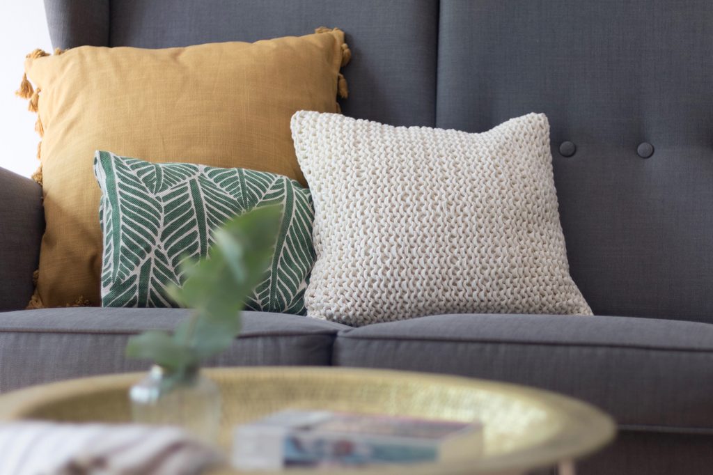
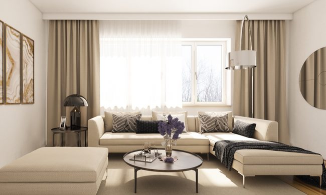
When designing a living room or bedroom, comfort and coziness are a must. One way to achieve a comfy setting, of course, is to use throw pillows. However, experts have warned time and time again that too many throw pillows can weaken a design. While adding two to five throw pillows on a sofa can help achieve a cozy look, it’s tempting to lean into them as a way to utilize an accent color, pattern, and texture. And while we actively encourage you to use throw pillows to showcase your texture or accent color, they shouldn’t be the only space in your design where you do so.
Try limiting yourself to two to six accent pillows on a sofa and two to four on a bed. Anything more could make your design feel cluttered and overwhelming. Additionally, if you’re using your pillows as a way to display accents within your design, be sure to carry out similar textures, patterns, and colors elsewhere to create more cohesion.
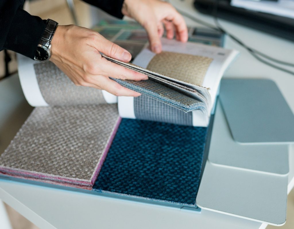
Not focusing on quality
When creating a stunning design, it’s best to focus on quality. Every purchase, from furniture to decor, should be made with intention. Try to use quality items within your decor rather than opting for cheap materials since such pieces can make styles like rustic or traditional appear kitsch.
We recommend using handcrafted items made of quality materials or refurbished to be sturdy and long-lasting. These pieces will add more authenticity to your space and allow you to create a curated look within your design. Additionally, you can rest assured that your decor will stand the test of time while also making your design feel more luxe and opulent.
Lacking textured pieces
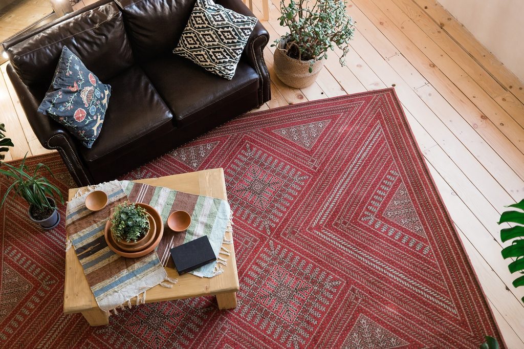
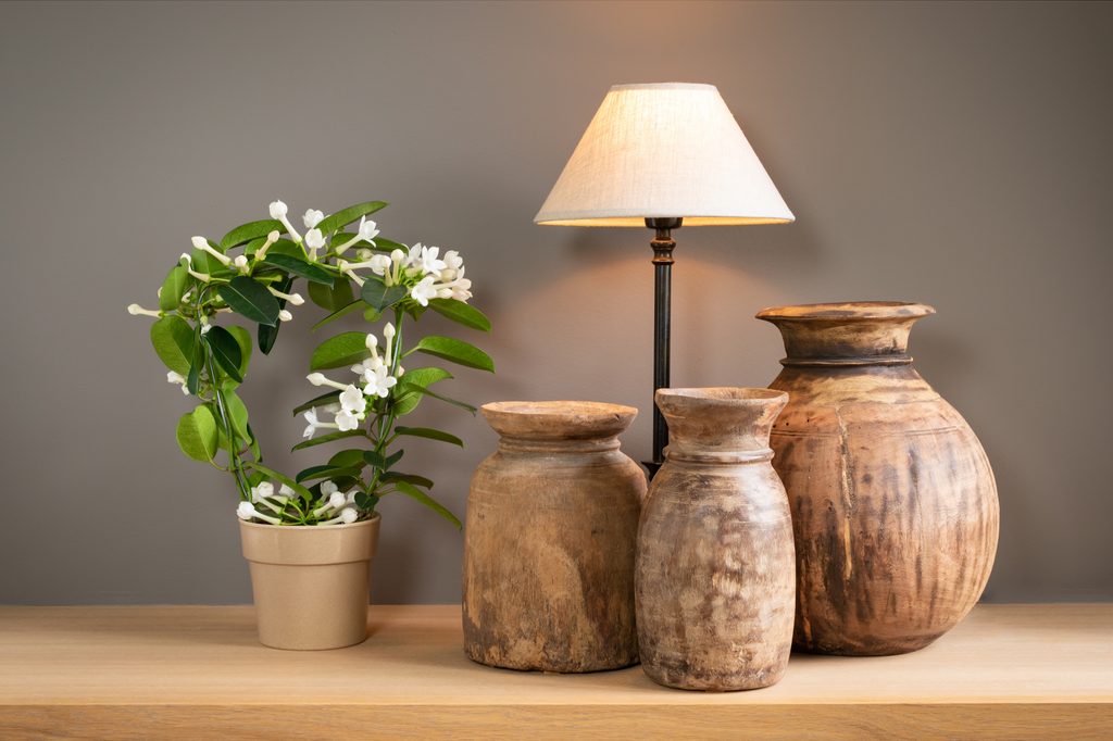
Another key indicator of bad interior design is the lack of textured pieces. Many amateur designers and new homeowners will lean heavily into one aspect of their design to overcompensate for their style. For example, a homeowner might incorporate gray metal pieces into their design for a modern look. However, the gray metal decor might appear cold, harsh, and boring without other textures. So, we recommend adding unique textures to your design for a more balanced look.
Pair metal features with delicate glass or warm raw wood. Or, utilize plush blankets and pillows alongside woven rugs, earthenware, and porcelain pieces. Blending different textures within your design will create a balance between harsh and soft or cold and warm aspects of your space.
Not sticking to your color palette
One of the most significant issues homeowners face when designing the room is sticking to the color palette. Color palettes can range from three to five hues, though they usually don’t exceed six. Generating a stunning color palette is tricky and requires plenty of forethought. Though once created, it provides designers a baseline on how to decorate a space.
Unfortunately, it’s quite common for amateurs to veer away from their color palette. For example, in a minimal home design, pops of green may intersperse with more muted and neutral tones. However, a homeowner may want to include a pink blanket or a blue picture frame within the design because they fell in love with the individual pieces. Unfortunately, the added colors can stick out in your design, making your palette feel unplanned or unintentional. While there are always exceptions to the rule, we recommend trying your best to stick to your palette and aim for only one or two accent colors for a more deliberate look.
The lonely TV wall

One mistake many designers see homeowners making is not dressing up the TV wall. Often, homeowners hang their TV on the wall or set it on top of a console table with little addition to further decorate the space. This creates a sense of emptiness on the TV wall while also heightening the “void effect” of the black television screen, which can be an eyesore in your living room design.
While a picture frame TV might help alleviate the “void effect,” it’s not a practical solution for everyone. Additionally, you don’t have to hide your television in a TV cabinet to spruce up the space. Instead, opt for shelving or gallery photos to surround your TV to make it a part of the design. Alternatively, use slats or another textured wall addition to add more visual appeal. You might even consider off-venturing your TV and adding more artwork or shelving to create a unique asymmetrical look.
Experts say these are some of the most common design mistakes that ruin a good home design. Try to be intentional with your design scheme and consider the finishing touches that will help pull your entire design together. Avoid kitsch or clashing decorations that leave your space feeling boring or mismanaged. Instead, focus on quality and intentionality to create a stunning and cohesive design.