Whether you’ve just installed your favorite oak kitchen cabinets or you’ve decided on a stunning oak wood floor for your home, it can be difficult to find a modern color palette that looks seamless alongside these warm wood tones. While oak wood is stunning with traditional design, modernists who favor its classic appeal might find blending this tone with their existing palette frustrating.
Oak wood has a tendency to look outdated or overly traditional in a home’s design. This happens for several reasons. For example, a dark or brown color palette makes oak look a bit drab in spaces where modernists prefer light or airy tones.
To help ease confusion and stress, we’ve gathered a few amazing paint colors that go with oak wood trim to help you create a stunning modern look in your home. No matter how oak plays a role in your abode, through cabinetry, flooring, trim, or other architectural features, we’ll ensure that it appears refreshing and luxe in your space.
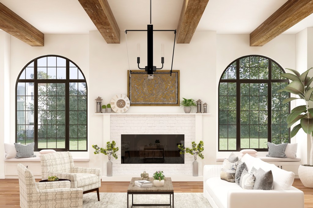
What styles of oak wood are most popular?
Before you can dive into choosing your paint colors, you need to consider what type of oak wood you’ll be working with. Different styles of oak wood come with unique undertones that can influence the color palette you use in your space.
Classic oak
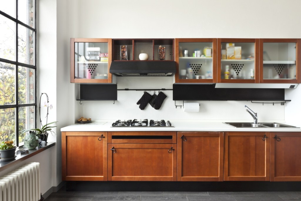
One of the most popular styles of oak wood is the classic mid-tone look. This oak color is a mid-tone brown with visible gray patterns and a gentle undertone of red or orange — though, depending on the type of classic oak trim you choose, yellow undertones can also be a possibility! When selecting paint colors for class oak cabinets or flooring, choose something light to brighten the mid-tone colors or more neutral to bring out the intensity of the undertones present in your oak wood.
Dark oak
Dark oak is another well-known wood tone found in many modern homes. When choosing paint colors for dark oak, we recommend sticking to neutrals or opting for lighter paint colors to help balance the space. Additionally, dark oak tends to have warmer undertones, so cool colors like blue and green can be fantastic paint choices if you plan to modernize the look of your home.
White oak
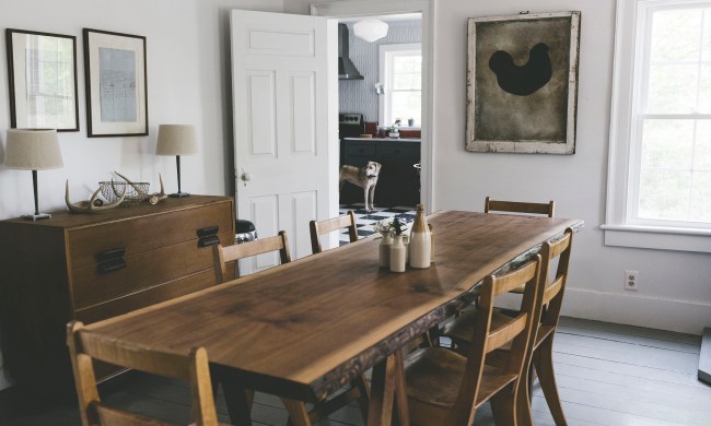
White oak often appears washed-out and subtle. As one of the favored styles of oak wood for a modern aesthetic, this wood tone best suits warmer neutrals and darker-hued paint colors. Pick paints with red or brown undertones, and try to balance the space with a moodier paint color.
Red oak
Red oak is a beloved style for many homeowners. Packing more of a punch than classic oak, red oak has a rosier undertone that helps warm up the look of a space. Pair red oak with cool-toned paints or neutrals to best enhance the subtle red undertones of red oak.
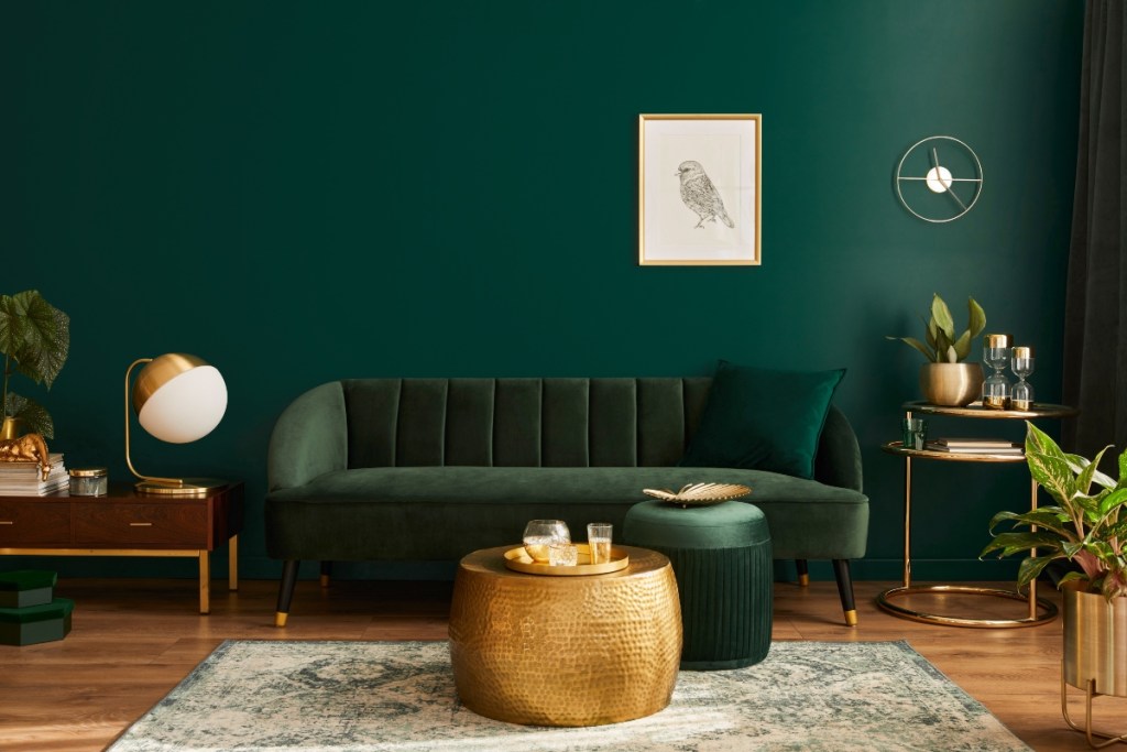
The best paint colors to accent oak wood
Once you know what type of wood you’re working with, you can begin to choose your paint colors. Below are some of the best paint colors to accent oak wood.
Blue
Blue is the perfect cool tone to accent oak wood. Best suited for classic and dark oak, blue paint can make an impact in your space. Lighter blues and whites with blue undertones work best. Conversely, navy and other darker blue tones can look elegant with dark oak when done in moderation. In addition, when working with a mid-tone blue, it’s best to pair it with classic oak.
Green
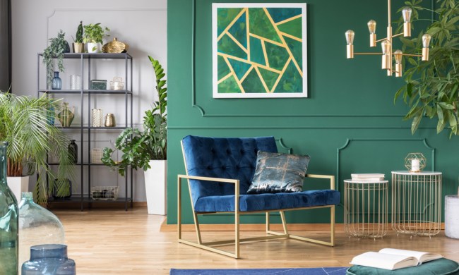
Washed-out greens, muted olive tones, and neutrals with green undertones look best with white oak, dark oak, and classic oak wood. This beautiful earthy color can add vibrancy to your home and invite a lush, outdoorsy feeling fit for homeowners looking to add a modern touch. Muted and subtle greens tend to look best, but we also encourage homeowners to experiment with velvety jewel and evergreen tones as well!
Gray
Both warm and cool grays can be the perfect match for oak wood. Dark oak and red oak styles will favor cool grays that help balance out your color palette. When choosing cool gray paint, look for something with a blue or violet undertone. Classic oak and white oak look better with warm grays with a brown or red undertone. This helps warm up the look of your space.
Beige
Beige is the perfect neutral for oak wood of any style because it allows homeowners to create a subtle backdrop for their oak wood furnishings. However, depending on the style of oak you choose, you may have to opt for a warmer or cooler beige tone. Also, consider whether you want a vibrant shade or a subtle beige color to pair with your oak wood trim.
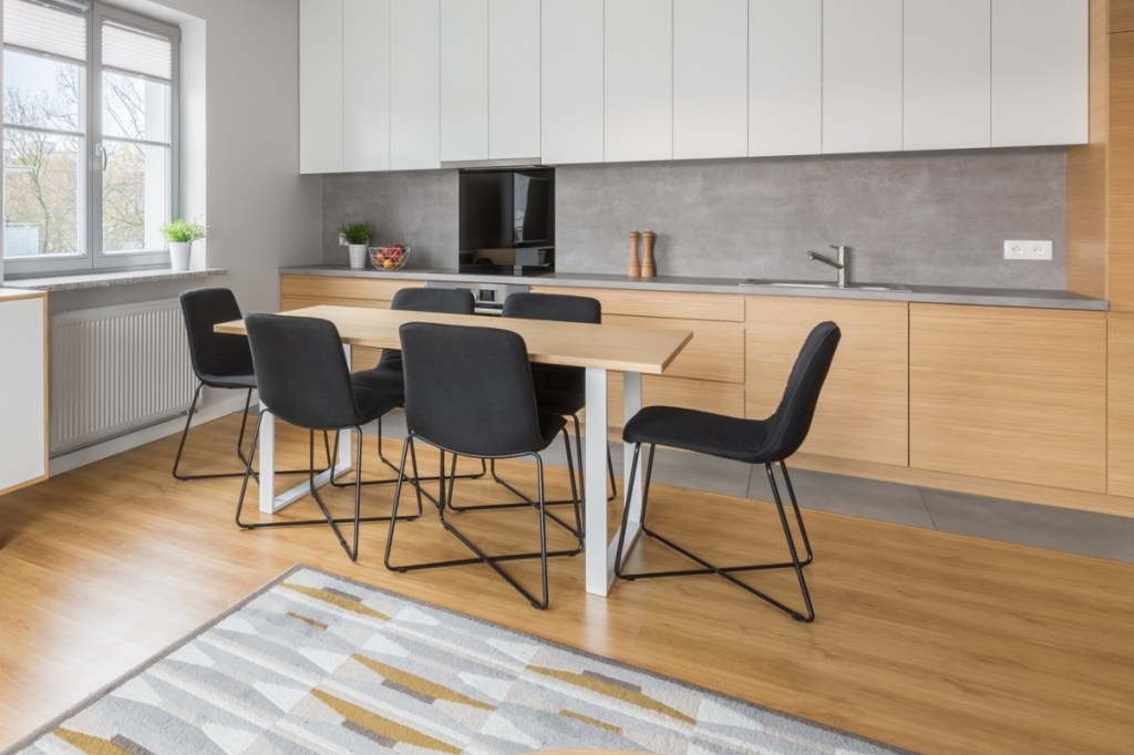
Soft paint colors that neutralize warm wood tones
While color is a fun addition for many homeowners, some designs are better suited to soft paint colors that neutralize the warm wood tones in the home. Below are some of the best subtle colors for an oak wood design.
Cream
Cream colors look stunning alongside many kinds of oak wood because they create a subtle backdrop for the cabinetry or flooring. Cream is a gentle tone that can boast vibrant undertones that help generate a specific mood in the space. Opt for a cream with a rosy undertone to bring out the youthfulness of dark oak. Or choose a cream with a gray undertone to tone down the vibrancy of red oak wood.
Greige
Greige is the perfect subtle shade to add alongside your oak wood, thanks to its muted beige and gray tones that make it the perfect neutralizer. Greige can be both warm and cool depending on the gray-to-beige ratio, so you can pick the ideal hue for your oak wood. Additionally, this muted color is great for making your oak wood a feature in your space, creating a fantastic near-monochrome aesthetic in your room.
Mauve
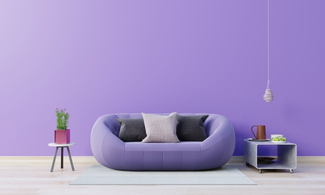
For a more eclectic and trendy look, mauve pink can be a fantastic pairing for oak wood. Particularly best suited for dark or warm oak tones, mauve pink brings a youthful yet elegant touch to the space. Mauve is a good muted tone to add as a backsplash, wall paint color, or even as a pop of color on the ceiling to give your room more personality. Additionally, tones like green and mauve are super trendy today and look beautiful when paired together. So, if you plan on adding dark evergreens on the walls or decorating with plants, this hue will pair beautifully with your existing decor. This muted pink also enhances the natural feel of warm oak woods, adding an organic touch to the space without feeling too earthy.
When choosing a paint color to go with your oak wood trim, it’s important to consider what undertones will best suit your space. Warm-toned wood is perfectly offset by gray or light colors, and muted woods are best suited to warm neutrals that create a subtle look. Experiment with your color palette to create the perfect cozy and modern atmosphere in your room.

