When repainting your home’s facade, the hue you choose is not a decision to take lightly. Your home’s exterior forms your guests’ first opinions and can seriously impact your curb appeal and resale value. Though dark blues and dark greys are trending colors these days, traditional tones are classic for a reason.
Choosing a traditional outdoor paint color may not seem very exciting, but nothing is worse than spending tons of time and money on your exterior paint only for the color to go out of style the following season. Traditional and timeless colors don’t have to be dull. With these tips and tricks, you can give a classic look a new life, dressing up your home and giving it a bit of style and personality along the way.
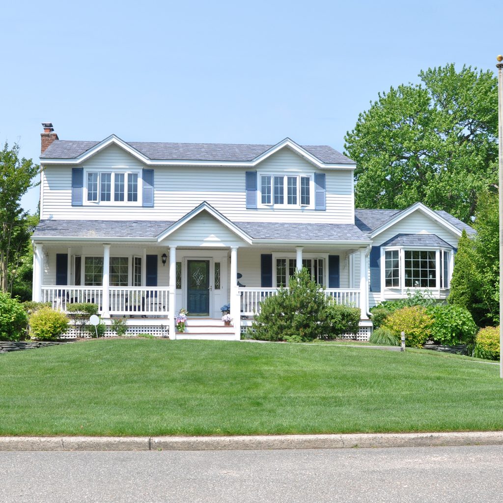
White
White may not be unique or exciting, but it acts as a strong base that makes all of your other accents, fixtures, and features pop. It makes trees look greener, roses redder, and cobblestones just a little more elegant. White is also generally cheaper than other paint colors, and it helps keep your home cool in the warmer months.
A white backdrop can give your home a sense of luxury, conveying crisp cleanliness that gives a sense of elegance and vitality. Keep in mind that white isn’t a single shade. There are thousands of hues ranging from stark white to warm creams to cool hints of grey. Don’t let the abundance of choice weigh you down, though. Picking the exact shade is a matter of personal preference —almost any white that you choose will make your house look spacious and timeless. And, white goes with everything — so feel free to have fun when choosing colors for your trim and front door.
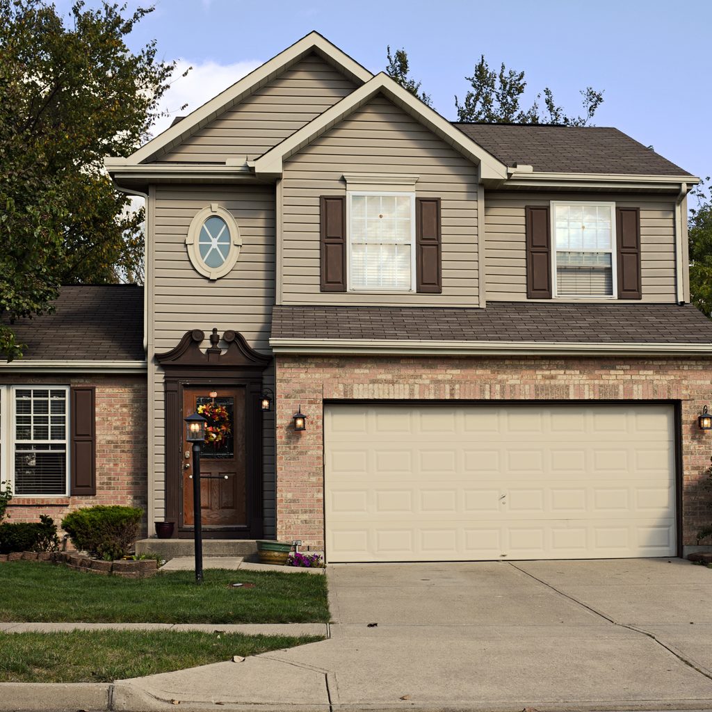
Brown
We know what you’re thinking: Why would anyone paint their entire house brown? While dark browns may be a staple of log cabins and rustic ranches, it’s the light browns and beiges that make homes look contemporary and inviting. These shades work well with houses that have a lot of dark wooden doors, window trimmings, and balconies, as it creates a warm, inviting scheme that says “Welcome home.” Alternatively, brightening up the home with white trim is a little more sophisticated, showcasing your mature design style and classic sensibilities, while dark green accents convey a more biophilic design.
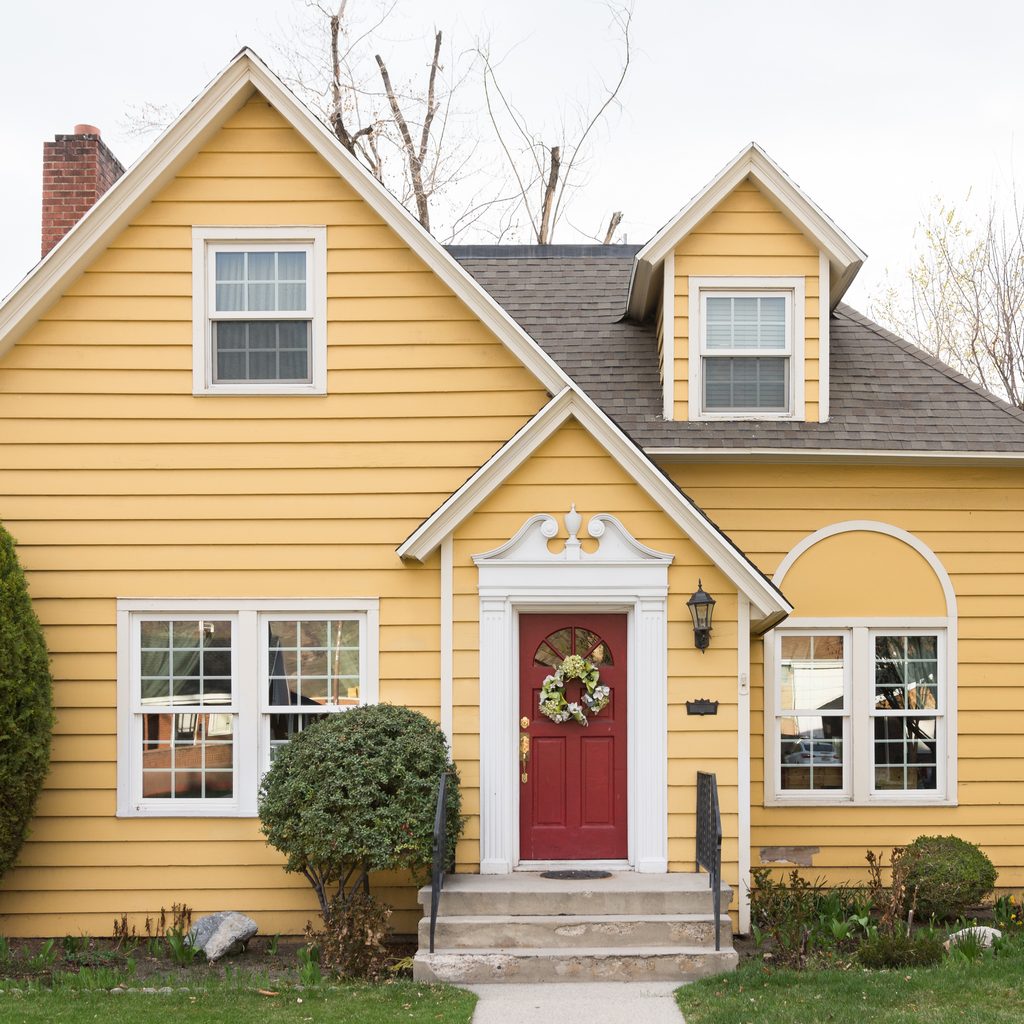
Yellow
Many houses feature a yellow facade because this color can make a home appear larger than it actually is. The brightness of yellows, even paler shades, gives the illusion of more space. Typically, yellow exterior paints adorn traditional-style homes, but you can add this welcoming and sunny vibe regardless of your home’s design.
With yellow as the primary color, consider adding burnt oranges and deep reds as accents to create an energizing, warm appearance. On the other hand, incorporating dark brown stains and wooden accents make the bright yellow tone a little more subtle. For a more contemporary, unique facade, incorporate dark greys or deep blue hues.
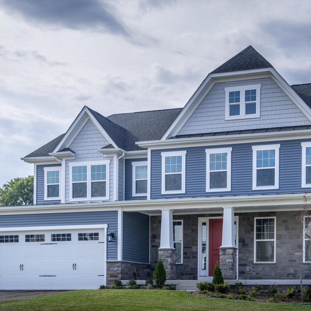
Light blue
Light blue paint is a universally beloved hue that isn’t relegated to homes of a single style, size, or region. While dark blue is a very trendy exterior paint color these days, pale, baby blue shades are softer and quieter, making for a more classic scheme. Feel free to update this temperate tone with darker blues to add some dimension. Deep blue or dark gray shutters, doors, and trim will all pop against the brighter exterior paint.
If you love the trendy, modern dark blue hues, be sure to accent with lighter colors so the house doesn’t end up muted or dull. This is especially important in regions with long winters. Without hours of sunlight to illuminate the paint, the home may end up looking dark and uninviting.
Painting the outside of your house is a big commitment, especially if you’re completely changing the color scheme. While it is tempting to choose a trendy color, traditional may be the way to go if you’re planning to sell your home or don’t intend to repaint anytime soon. If you’re worried that these colors won’t give your home enough personality, don’t forget that accent colors can completely change the game.
Traditional doesn’t have to mean dated — designers have painted homes in these colors for years because they’re fan-favorite shades that won’t go out of style. These classic colors also give you more flexibility in your decorations, as you can add your favorite style of landscaping, trimming, and lighting, and they’ll all pair well with these traditional base colors.