The greatest names in paint are slowly sending out their top picks and trends for 2023. Brands like Valspar, Sherwin-Williams, and Glidden have posted their takes on 2023 color. While 2022 offered homeowners and designers a chance to step into biophilia and explore the richness of natural and organic hues, 2023 is taking a turn toward something more elegant and eclectic.
So what are the trendiest colors these top paint brands expect to gain prominence in 2023? And how can you go about introducing them to your home? We have everything you need to know.
Colors from Valspar
Valspar released their color of the year for 2023 as well as a few other hues to add to your color palette.
Everglade Deck
One of Valspar’s richest colors of the year is Everglade Deck 5011-3. The paint brand calls this luxe blue shade “a midnight blue that balances elegance and calm, creating a restorative space.” The company notes that home design is moving “away from faster-paces lifestyles,” and adds that Everglade Deck can help inspire a calm and rejuvenating space in the home.
This rich blue tone with strong green undertones and a subtle hint of black looks vibrant, elegant, and opulent. Best in bathrooms and bedrooms, homeowners can add marble, gold accents, black velvet, copper tones, and rich, warm leathers to their space for a masculine yet sophisticated and luxurious look.
Flora
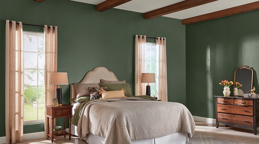
Flora 5004-2C by Valspar is another color that we think will be a popular choice for designers and homeowners alike. Considered to be a “deep, blackened olive, that embodies charm and sophistication,” this hue is full of depth. Reminiscent of the muted evergreens found deep within the forest, this shade is both inspiring and relaxing.
Green was named color of the year in 2022, and in 2023, it looks like it won’t be going anywhere! People have loved the organic feel of this shade, so it looks like we’ll continue to see it sprouting up in home design. Though, with new colors like Flora by Valspar, it’s likely green will get a darker, and deeper configuration than we saw in the past.
To style Flora, add plenty of warm brown tones throughout your space through the use of woods, leather, rugs, tweed, and other furniture pieces. Hone in on the organic and natural feel of textures and pieces that are reminiscent of the outdoors.
Sherwin-Williams 2023 color collection
Sherwin-Williams has shared an array of dark and moody hues for their 2023 color collection. Many of them are inspiring, luxe, and full of depth.
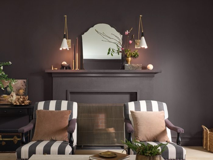
Darkroom
Darkroom HGSW7083 has been named SW’s color of the year for 2023. The brand stated the tone was “inspired by the desire to craft a comfortable, yet elegant and romantic home.” Darkroom is a luxe black with a rich mocha undertone.
This color would best suit a study, at-home library, living room, or home office. Pair this stunning shade with rich copper tones, elegant patterns, creams or other soft neutrals, and plenty of potted plants. Draw out the ornate quality of this color by using stunning vintage pieces like lighting or furniture which give this hue a feeling of deep heritage and antiquity.
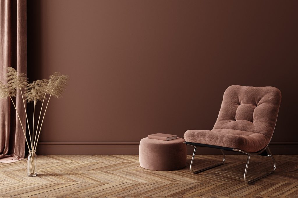
Poetry Plum
Sherwin-Williams Poetry Plum HGSW6019 is a mocha-like shade with deep purple undertones. Perfect for a child’s room, home office, or playroom, this dark hue has a whimsical nature. While still full of depth and elegance, there’s a soft and youthful quality to this muted plum shade.
To style, Poetry Plum looks best with deep evergreens and yellow-based creams. Keep it light by pairing it with off-whites and pale pinks. Or, for a more luxe take, pair it with gold accents, black, and rich mauve tones. SW also suggests styling Poetry Plum “with minimal color and repeating shapes to retain visual harmony.”
Glidden’s colors of the year
Glidden has also expressed their takes on the dark and moody hues coming to 2023. The brand says the trendiest colors of the new year aim to “create a cozy and welcoming environment with a touch of luxe.”

Vining Ivy
Vining Ivy PPG1148-6 is Glidden’s 2023 color of the year. As a deep, jewel-toned blue-green shade, Vining Ivy appears to have a seaside nature with a touch of darkness and mystery. Glidden suggests pairing this hue with other aqua tones or off-white colors. And for a more dramatic look, black furniture and metallic accents could give this deep watery tone a more dramatic effect.
We suggest using this color as an accent in your space. It could look especially opulent in a bathroom with marble accents, gold or silver details, plenty of metallic decor, and rich dark pieces.
Dark Granite
Dark Granite PPG1005-7 by Glidden is another rich brown shade with a hint of black. This coffee-colored paint tone is luxe, modern, and dark. Glidden suggests pairing it with “mid-tone woods and lighter tans” to really let this color pop and become a feature in your space. We also favor a monochromatic-inspired look with a range of unique brown hues throughout the furniture and flooring for a modern twist on dark interiors.
Dark Granite is best for bedrooms, living rooms, dining rooms, and kitchens. Any space where people gather or require a luxe and cozy aesthetic can be a great place to use this elegant hue.
Color is trending toward darker and moodier hues in 2023. People crave a cozy and intimate feel in their spaces as we move away from the light and bright stark-white shades that have been dominating home design in the last few years. Try out these rich and elegant colors from the aforementioned paint brands if you want to spruce up your space and create a luxe feel.