Neutral paint colors are the basis of many home designs. Their soft, gentle touch helps fill empty space, creates a sense of cohesion, and allows you to curate stunning designs with a stellar backdrop. If you’re embarking on a new home project and need some inspiration for paint colors, then you’ve come to the right place. Here’s everything you need to know about neutral paint colors.
What are the four basic neutral colors?
Before you begin choosing your neutral tones to spruce up your home, you need to know the four basic neutral colors.
Black
Black is one of the first neutrals that many people forget qualifies as a neutral. Black tends to get shoved aside when people look for neutral tones, but it’s one of the best shades for adding depth and sophistication to your design. It’s classic, simple, and perfect for inviting modernity to a space.
White
White is one of the most common neutrals that homeowners reach for. It’s clean, light, and great for brightening nearly any room. White can help you enhance the look of your room, creating a more expansive feel. Additionally, it’s a great color for creating a sense of separation in your design.
Brown
In all of its varying shades, brown is another beloved neutral color. From richly toned wood pieces to luxe paint colors, this hue inspires a sense of warmth and earthiness that increases the coziness of your home.
Grey
Last, grey is one of the best neutral paint colors. While it’s sometimes associated with drab and lackluster appearances, grey is a fantastic color to create an elegant and gentle touch to your spaces. Additionally, grey metallic tones are perfect for enhancing the luxury of your room without detracting from your color palette by being too bold or abrasive.
What to know about the various types of neutrals
If you’ve ever been to the paint section of your local home improvement store, you may have seen phrases like “pure neutral” or “near neutral.” Maybe you’ve even wondered, “What are warm neutral paint colors?” Because it can be challenging to know the difference, we’ve compiled a small guide to understanding the various types of neutrals.
Pure neutrals
Pure neutrals are all the colors we mentioned above. Black, white, brown, and grey hues that are fully saturated, meaning they don’t have any tints or underlying tones, are considered pure neutrals. Black and white are some of the most popular pure neutrals, often used as accents or in places where empty space is necessary for a fluid, uncluttered design. Brown and grey are most often used on furniture or in addition to color palettes needing either a warm or cool tone to help ground the overall look of a space.
Near neutrals
Near neutrals are created by mixing pure neutral colors with a primary color. For example, mixing red with brown will give you a canyon or maroon tone that feels more vibrant, warm, and intense than traditional brown. Or blending yellow with white creates a cream tone, perfect for warming up a space. Near neutrals are great for softening the look of a room while also taking advantage of what neutrals have to offer.
Warm vs. cool neutrals
Warm colors like yellow, orange, and red can be blended with pure neutrals to create a more intense, grounding, and vibrant shade. Warm neutrals with cream, brown, and reddish undertones can make a space feel more radiant and soulful. Alternatively, cool neutrals are pure neutrals with an undertone of a cool color such as blue, green, or purple. These shades evoke a sense of tranquility and calm. If you’re looking to create a bright and relaxing space, cool neutrals are the way to go.
What are the benefits of using neutral colors in your palette?
While there are several benefits to using neutrals throughout your home and color palette, here are a couple of our favorites.
Fill the empty space
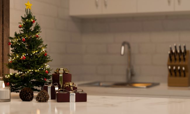
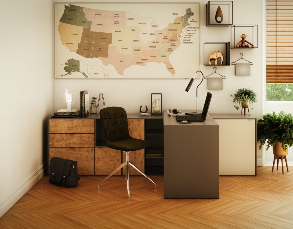
One reason neutrals of all kinds benefit your home design is that they can fill empty space. Empty space is essential for creating a look that feels seamless and uncluttered. While maximalists may find a variety of colors and patterns appealing in the home, not every style shares the same philosophy. Modern, traditional, and rustic styles, for example, might include browns and whites to create empty spaces that help divide up a room.
Create a sense of warmth or coolness
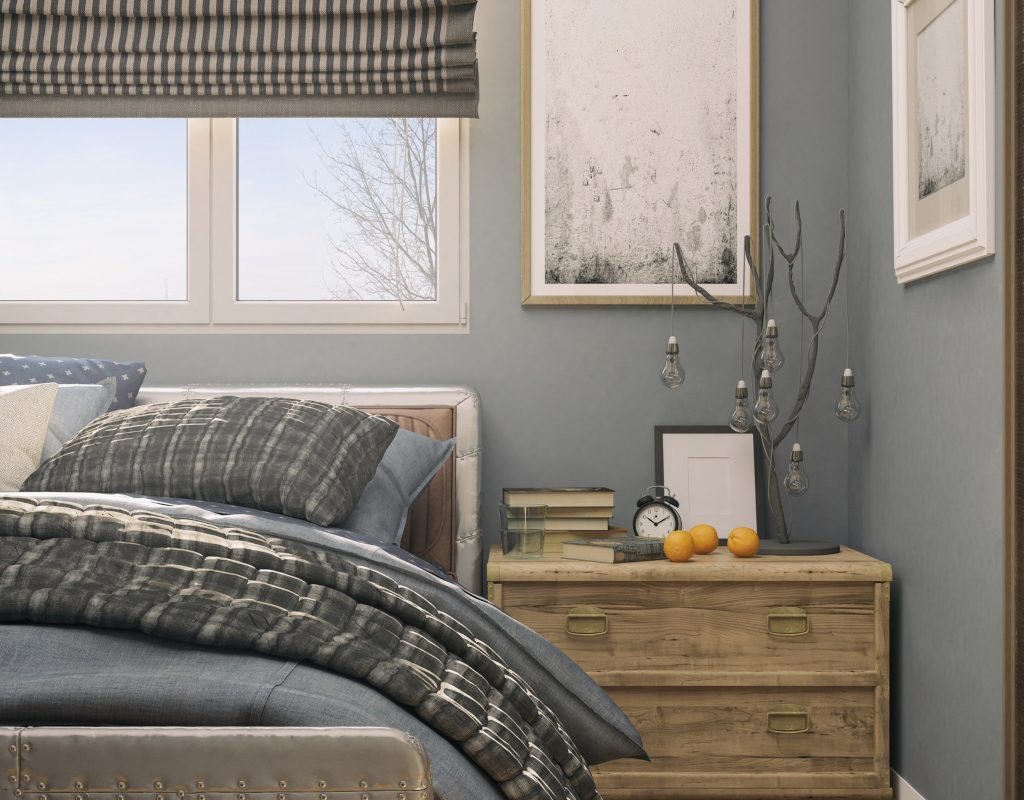
In some homes, adding more warmth or coolness to a space is essential for creating a relaxing environment. For example, bathrooms may favor neutrals with cool undertones to create a tranquil setting. On the other hand, a warm neutral may benefit a bedroom where coziness is preferred. Different design styles also complement warm or cool neutrals. Modern and minimal styles might find warmer neutrals perfect for offsetting a stark white base color, while rustic and Scandinavian styles might use cooler neutrals to balance out the presence of raw wood and brick in their designs.
Neutrals are great backdrops for designs that need a gentle and soft element to ground the interior. Whether warm, cold, pure, or near, neutrals offer you the ability to create a cohesive space and allow other aspects of your design to take center stage. If you’ve been neglecting neutrals in your space, now is the time to consider how you can best transform your home design with these amazing colors.