Decorating your living space is one of life’s great joys. Choosing paint colors and furniture, even when on a limited budget, is challenging and fun. But if you happen to be living in a rental with neutral color walls that you can’t paint, then what? Or say, what if you love gray walls, but you can’t figure out how to spice things up?
Neutral colors will always be popular in interior decoration because they tend to go with everything. However, a room full of neutrals doesn’t do much to catch the eye. Here’s how to incorporate neutrals into your decor and how to make a room with neutral walls exciting.
What is a neutral color?
Most people don’t understand what makes a color neutral. The word is tossed around among interior decorators and graphic designers, but it’s hard to put your finger on precisely what a neutral color is. Hopefully, this explanation will make it clear:
According to The Spruce, neutral colors are thought to have no color. However, what the naked eye sees with this ‘non-color’ is an undertone in the hue. This is what makes the individual see a dull or pale color in the hue.
In basic color theory, colors have three characteristics: Hue, saturation, and brightness. Hue defines what the color is. So, red, orange, yellow, green, blue, indigo, and violet are the primary hues from which all colors stem. Brightness is an indication of how ‘loud’ the color is. For instance, neon green is extremely bright green, fire engine red is bright red, and lemon is bright yellow. On the opposite end of the brightness scale, some examples are kale, which is dark green, delicious apples, which are dark red, and honey, which is dark yellow.
The third characteristic of color is saturation, and that is where we begin to understand neutral colors.
If you think of a saturation scale of 0-100, where 100 is the most saturated and 0 is the least, for all colors, 0 is gray. Another way to explain it is a color photograph is 100% saturated, and if you convert it to black and white, the saturation level is 0. Taking it further, at saturation 0, every color in that black-and-white photo is a desaturated, or neutral, color.
Now, what if you change that photo only halfway black and white? Or three-quarters? You can still tell what the colors were, but they are muted from their original saturation. They are now neutral.
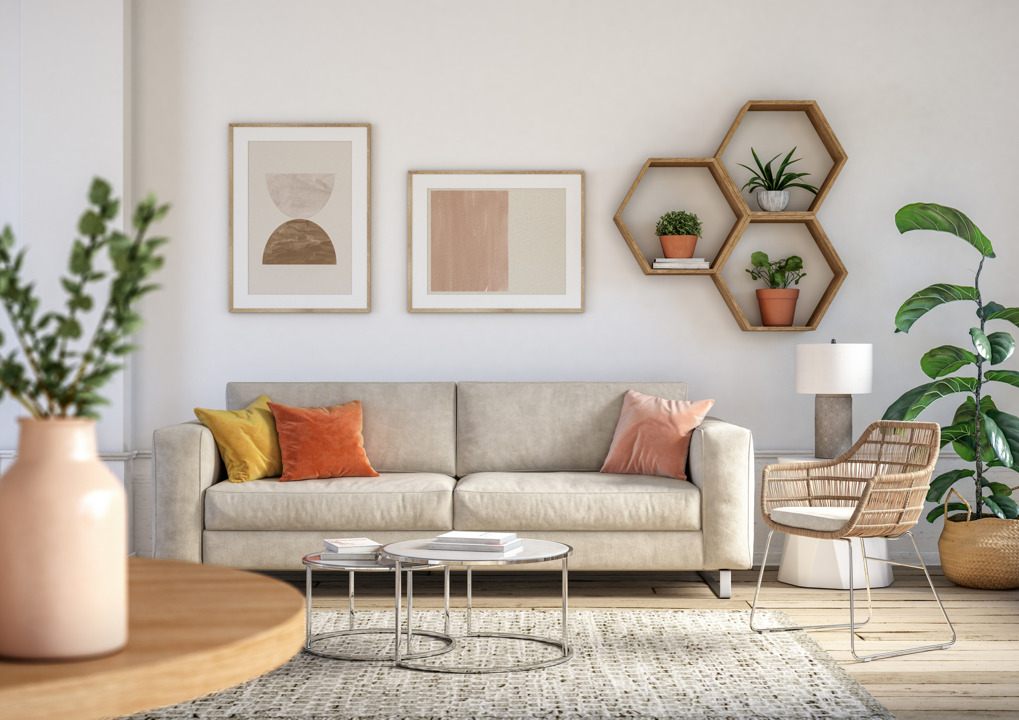
When you look at paint colors, you can tell what neutral colors once were. Beige used to be yellow, heather green used to be bright green, one gray used to be blue, and another gray used to be red. So now, you can decorate around the origins of your neutral colors and make them stand out. Here are a few ways to accomplish that.
Use bright white
Bright-white accents will help your neutral colors stand out and let their inner saturation shine. White cleans out colors so that nonwhite elements look more vivid and colorful. Even neutrals.
Use textures

Strong textures add interest to window coverings, throw pillows, blankets, and floor coverings. Mixing textures like linen, burlap, suede, and fleece/sheepskin make rooms dynamic and exciting to look at.
Use patterns
Matching your neutral color with patterns creates contrast and energy in a room. There are some decorating rules for patterns, so here are some tips:
- Mix your patterns in combinations of large, medium, and small.
- Distribute patterns around the room — keeping them all on one side of the room looks imbalanced.
- Break patterns up with solids so that they don’t overwhelm the eye or each other.
- Keep the colors of your patterns at the same intensity.
Additionally, don’t turn up your nose at animal prints. They don’t have to be loud, and they perk up a living space when employed tastefully.
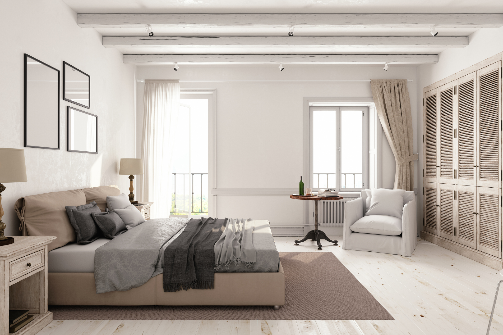
Embrace the quiet
Neutral colors are relaxing and calm by default. Build on that by choosing furniture with soft edges and contours, and pillows with round corners. A well-placed throw over a hard edge immediately softens the look, and round lamps and vases complete this easy-on-the-eyes aesthetic.
Embrace geometrics
On the other hand, geometric patterns against a neutral palette create a chic and modern aesthetic. Square picture frames, striped area rugs, and hard-edged, sleek tables add a contemporary counterpoint to the soft wall color.
Add more neutrals
You can build on your colors by adding elements that are slightly more saturated, but of the same hues as your paint color or upholstery. For instance, a gray sofa can look luxe by adding darker or lighter gray throw pillows. Gray walls can come alive with area rugs that reflect the tones of the paint. Even custom lampshades add interest when the color complements the other neutrals in the room.
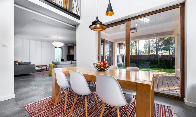
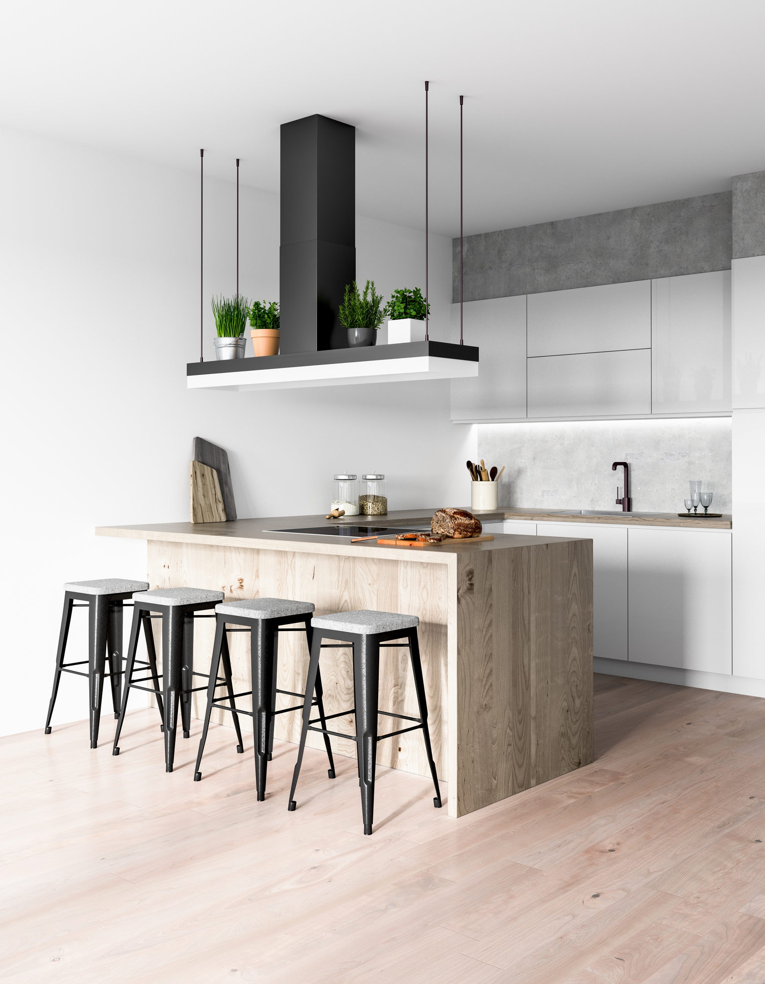
Add wooden furniture
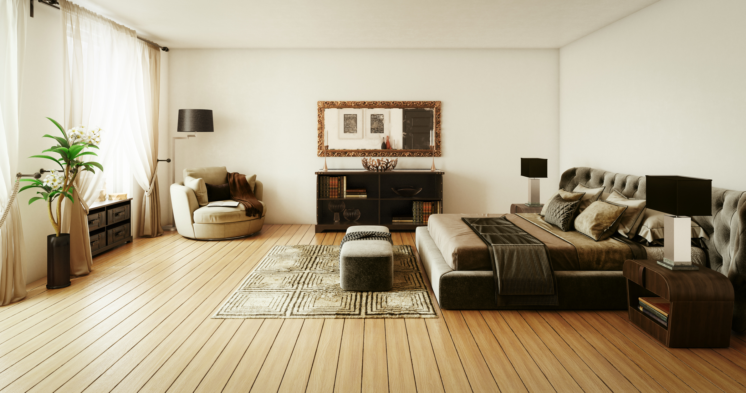
Wood enhances neutral colors with its naturally saturated reds and browns. Warm wood tones bring out the best in any room color and add contrast where none existed before. Wood furniture also adds elegance to any interior design.
Use mirrors
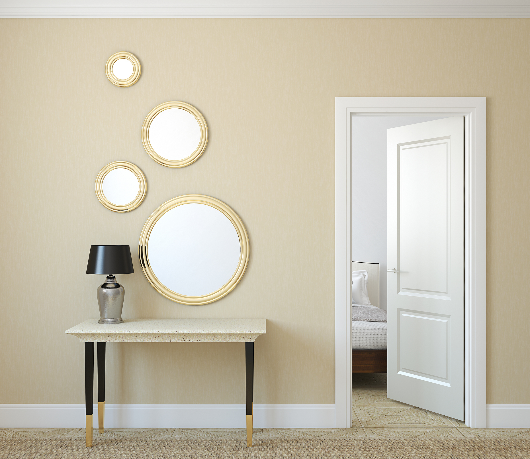
Mirrors are an interior designer’s secret weapon. A well-placed mirror makes smaller rooms look bigger, breaks up flat walls, and generally adds interest to living and dining areas. Add a unique frame, and you have a quick all-in-one way to perk up that neutral room.
Use metallics
Metallic colors and textures add shimmer and richness to boring neutral walls. A gold picture frame or metal wall sculpture brings out the color of the wall and breaks up a dreary expanse of paint, as also suggested by Apartment Therapy. We think a big mirror with gold trimming would heighten the yellow undertones of a neutral color.
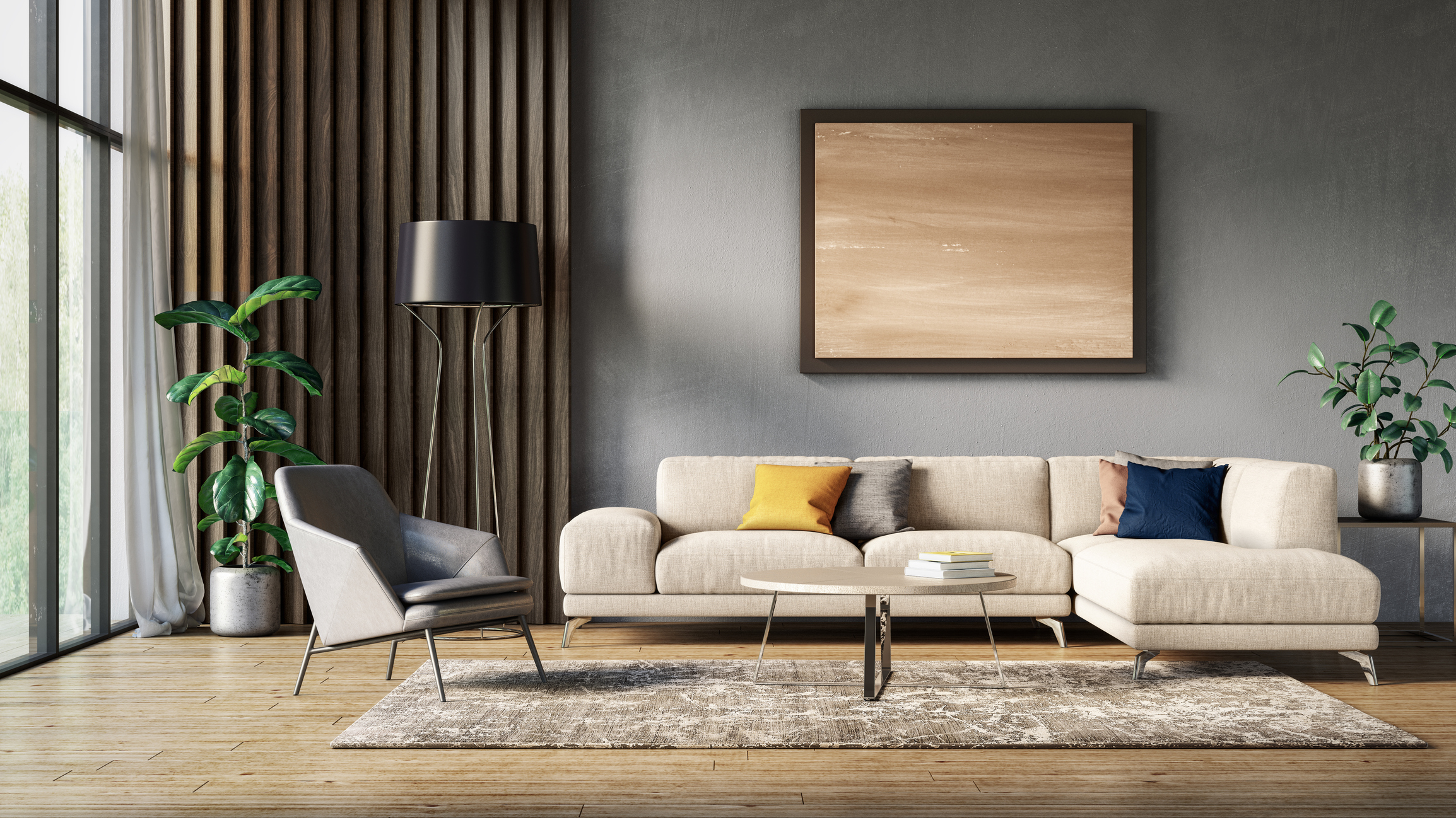
Add super-saturated accent colors
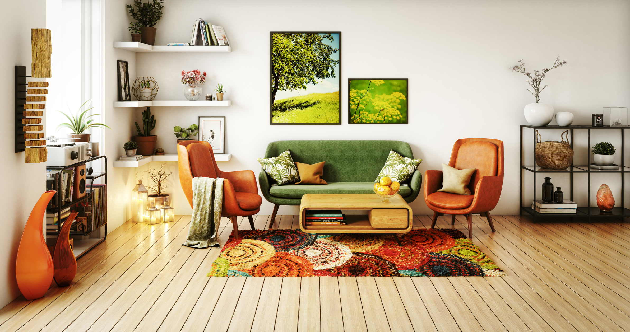
Last but not least, use a classic ‘pop of color.’ When employed with thoughtfulness and restraint, some balanced and complementary saturated color can do wonders to perk up a neutral room. For instance, pairing gray with bright violet or gold cushions looks luxurious and tasteful. Beige pairs wonderfully with deep reds, and the bright green colors of houseplant foliage add color and texture to any room.
Decorating with neutrals can be tricky, but understanding how neutral colors work and what is at the root of their hues will put you at an advantage when you’re making your living space your own. Armed with your new knowledge, you will make your neutral room a beautiful and comfortable sanctuary.