Bringing a baby into the world is an experience filled with many essential decisions, one of which is choosing the color scheme for the nursery. While nursery colors may not seem like a top priority when compared to other parenting decisions, the colors in your baby’s room can affect the mood of both you and your baby.
There are countless studies related to how color affects adults, and though infants can’t see color, they will as they grow older. Most parents want to create a calm and soothing environment for their baby, and choosing the colors for a nursery is the first step in the process. Check out the best nursery color palettes for a relaxing baby’s room below.
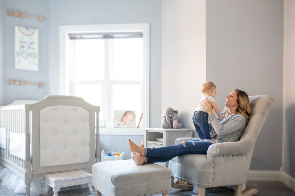
Soft shades for a nursery
Babies can only see black, white, and grey when they are first born, but that doesn’t mean you can’t use colors in the nursery. The best colors for babies to wake up to, according to hgtv.com, are soft shades of blues, pinks, and greens since a baby’s eyes begin to perceive those colors at about the same time in development.
Light blues
The colors of the sea or sky tend to relax the body and mind and provide an overall sense of comfort. Blues have been proven to decrease feelings of anxiety and aggression, making them perfect for newborns and babies. Be sure to avoid dark blues if you want to create a sleepy space since darker blues can have an energizing effect and can prevent sleep. Shades of powder blue, light turquoise, and aqua are your best bet when it comes to blues.
Pale yellow
Pale and pastel yellow tones are classics for any nursery. This color is soft, gentle, and uplifting. Yellow can brighten a dark room and generate a tranquil, airy feeling. Warm creams and yellow-tinted beiges can also do well. However, many parents find pastel yellow favorable due to the effortless pairing of white furniture and pale blue or pink accent pieces.
When it comes to wood tones, stick to traditional oak or darker wood pieces to add more depth and dimension. Lighter wood tones may fade into the background against a pastel yellow backdrop. Additionally, this hue is easy to grow into well into childhood, meaning you won’t have to repaint the nursery as your child ages.
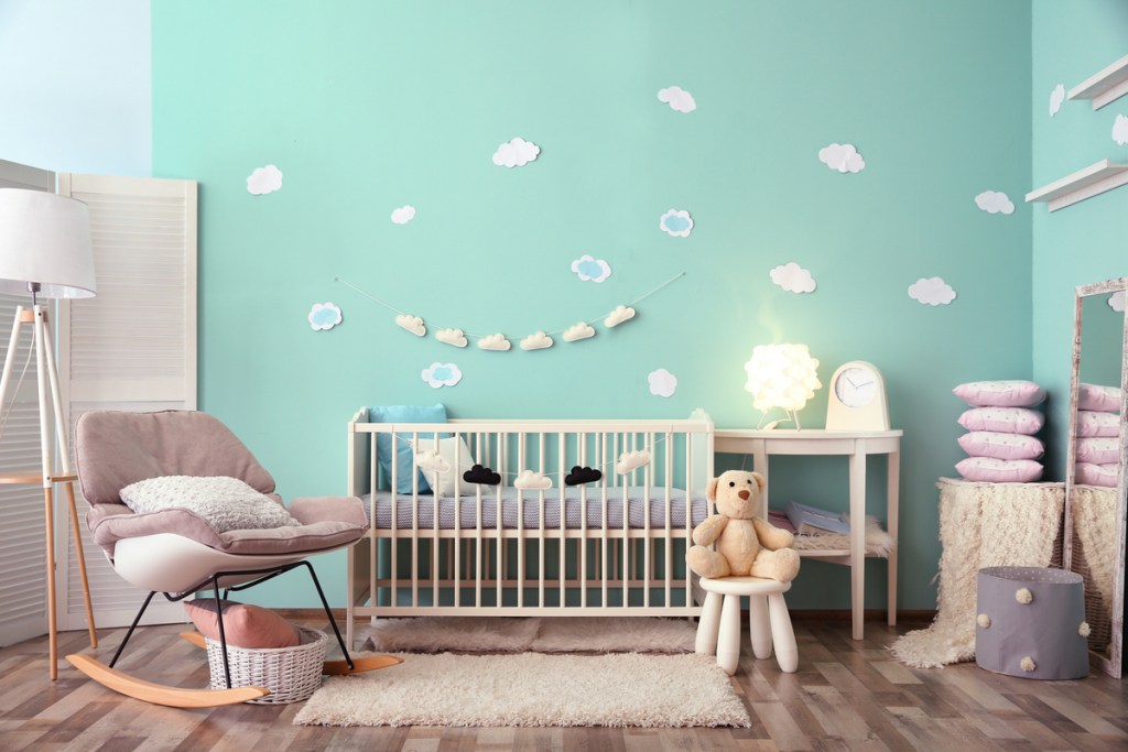
Pale purples
Purple is often associated with royalty and spirituality and combines the soothing feelings of light blues with the nurturing feelings of pale pinks. Soft purples like lilac create a peaceful environment, but choosing a light shade is super important. Purples tend to appear darker than expected once applied to walls, so if you find a color you like in the bright lights of the hardware store, go at least one shade lighter, and you won’t regret it. Remember, you’re going for calm and soothing, not loud or old-fashioned.
Neutral colors for a nursery

Neutral colors come in handy if you’re waiting until birth to find out your baby’s gender — you can add colors as your child gets older. Also, neutral colors work well with both traditional and modern furniture, so you won’t be stuck with one decor style if you change your mind. Neutral colors also provide a canvas for photos, wall art, and bedspreads that won’t conflict with the display.
Soft whites
White shades are good for nurseries since they are airy and soothing and evoke feelings of innocence and purity. Whites go exceptionally well with cozy bedding and fluffy rugs, all of which create a cuddly environment for babies. Avoid blue whites and stick to creamier shades like off-whites to avoid a cold and institutional feel. Adding wooden furniture or traditional-style decor will help round out the vibe.
Earth tones
Natural earth shades have a grounding effect and can create a homey atmosphere. Since your baby’s eyes are still developing, earthy shades give them a break from the overstimulating world of bright colors and contrasts. Stick with light shades of browns, beiges, and even greens to achieve a calming vibe — you don’t want to go too dark and end up with a gloomy room. If possible, use natural light to bring the outdoors in and create cohesion.
Nursery colors to avoid
It’s best to avoid the typical baby shades of blue and pink if you want to create a soothing space for your baby. Also, you’ll be saving yourself a paint job or two as your child grows and their tastes change. Neutral or light colors adapt well to decor changes, while baby blue and princess pink do not. Most experts also say to avoid red walls in a child’s room because reds can evoke excitement and anger, which are the opposites of what you’re going for in a serene nursery.
If you have a baby on the way, you probably have a lot on your mind, and if you haven’t already started nesting, you will soon. Getting the baby’s room in order is part of the process of becoming a parent, and it’s important to most parents to create a calming space for their new bundle of joy. Stick to light shades of calming colors, and you’ll be off to an excellent start in creating a sanctuary of slumber for your baby.