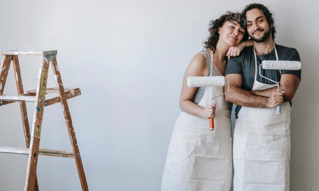
Paint can transform a space. It can elicit emotions, bring back memories from travels abroad, and make you feel relaxed, excited, and calm just by the very hue you choose. Trends come and go, and manufacturers are continuously adding color palettes to their collections so buyers can update their homes as often as the mood strikes.
Having an interior design palette that is pleasing for owners and guests alike is important. You want to feel comfortable and at ease in any space, and colors can help create that. While there have always been “rules” about colors that brighten and enlarge a space, the good news is pretty much anything goes—and that includes a darker palette for 2021.
Black is the new black
Every year, Sherwin-Williams announces the hottest paint color of the year, one that’s agreed upon by hundreds of designers. In 2020, the company picked “the world’s most relaxing hue,” Naval, as the 2020 Color of the Year, which was a slighter lighter-than-midnight blue. For 2021, their choice is similarly dark and inviting.
Their choice? Urbane Bronze SW 7048, a rich bronze color with warm undertones that would look ideal in just about any room of your home.
“The survey results show that design is moving in a new direction. It’s not just about how colors look in a space, but how they make you feel,” explains Sue Wadden, Director of Color Marketing for Sherwin-Williams. “That’s why I think gray is trending out and moodier hues are trending in—these dark, rich colors envelop us and make us feel cozy, turning our homes into the retreats I think we’re all craving.”
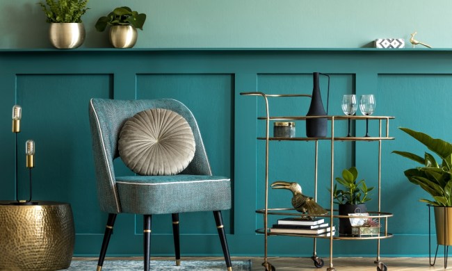
This includes black, charcoal grey, deep emerald and hunter greens, and rich gold tones. Tones that, as many of us spend most of our time at home due to the pandemic, create a soulful, relaxed atmosphere.
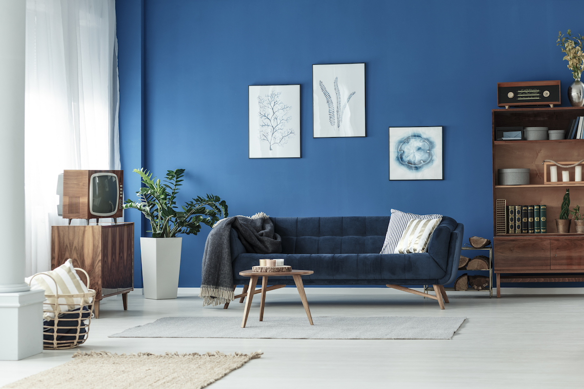
Blue still reigns
In 2021, blue shades like Naval stay on walls, offering a bold accent or overall color for living rooms, bedrooms, and bathrooms. Many of the dark pops of color we’re used to seeing in hotels and at bars and restaurants that we’re not getting to experience right now are finding their way into our homes and interior spaces.
“Continuing into 2021, we’ll see blues dip into the dark hue–bold blue walls and deep accent blues such as Hague Blue from Farrow & Ball,” says Karina Lameraner, creative stylist at Modsy told Southern Living. “We’ll also continue to see blue being used as a ‘subtle accent’ in more neutral spaces, adding a slight touch of color to those safer spaces.”
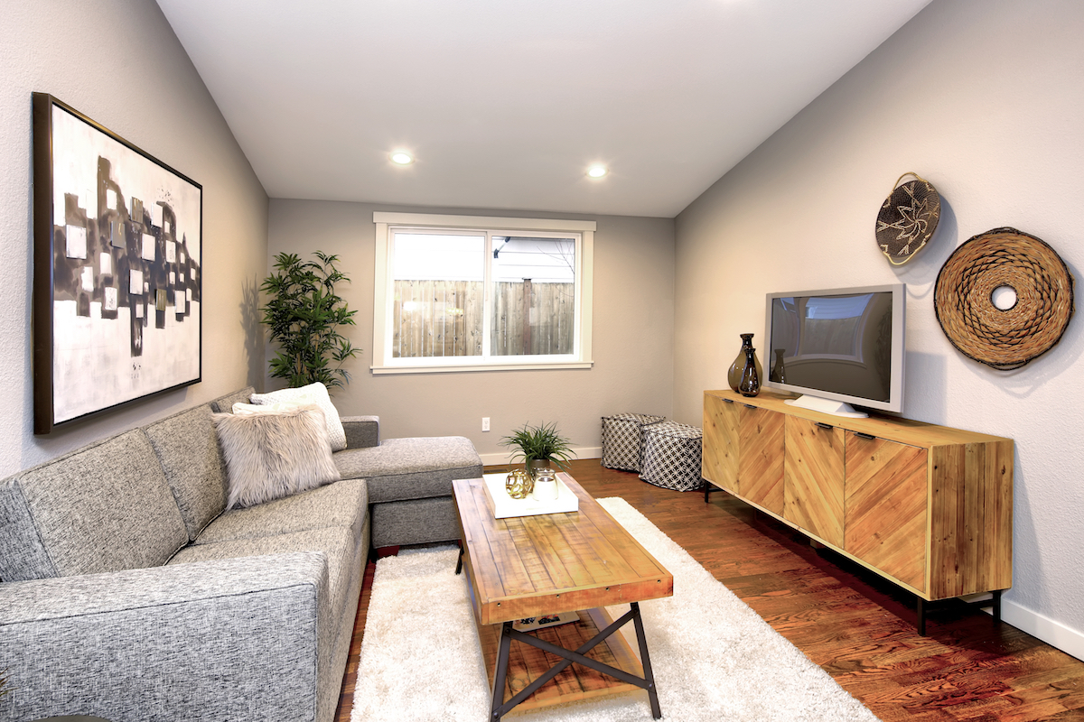
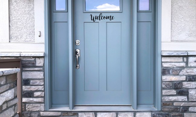
Neutral never goes out of style
Of course, you can never go wrong with a neutral backdrop, especially if you’re bringing in more traditional, embellished designs into a space. Beige, ivory, and light grey tones will always brighten up a space and offer themselves as a backdrop for bold decor and patterned furniture.
While it can often seem like a safe choice, it’s hard to argue with neutral. For 2021, Pantone chose not one but two colors of the year. One is the neutral Ultimate Grey, and a bold yellow called Illuminating. Both feel fresh and clean and leave any space inspiring and invigorating. Obviously, the latter is more bold, less neutral, but the choice shows that anything goes.
Neutrals like light link and beige are also making a comeback, showing the classics will never go out of style.
Get playful
You can also dress up walls by choosing one of the above colors, using it on an accent wall, to cover wainscoting, or even on a ceiling with wallpaper pulling out the chosen color on the remaining walls. The purpose of changing paint is that, well, it’s a relatively inexpensive way to change the look of any room, and it gives you the chance to play with color in a way that’s broader than replacing a chair.
While there are outstanding wall painting trends to find inspiration from, you don’t have to jump on the bandwagon. You can’t go wrong if you find the perfect hue that immediately brings a smile to anyone who sees it. Paint is an experience—and if you do a little research, order a sample to try on your wall before committing to the entire room. Then add decor that brings out the undertones; there’s little room to go wrong or have regrets.