So you’ve been thinking about adopting those fashionable two-tone wall paint ideas for your space. Maybe you’ve been trying to come up with unique wall color combinations to create something rather extraordinary – something that will truly wow your guests. Or maybe you’ve been simply itching for an easy DIY painting project because your walls need a change, except you’re not exactly certain what to do yet. Well, you’ve come to the right place. We’ve researched current and upcoming trends to see what works on a variety of walls and made a list for you to explore. Come see which ideas you think might work in your home!
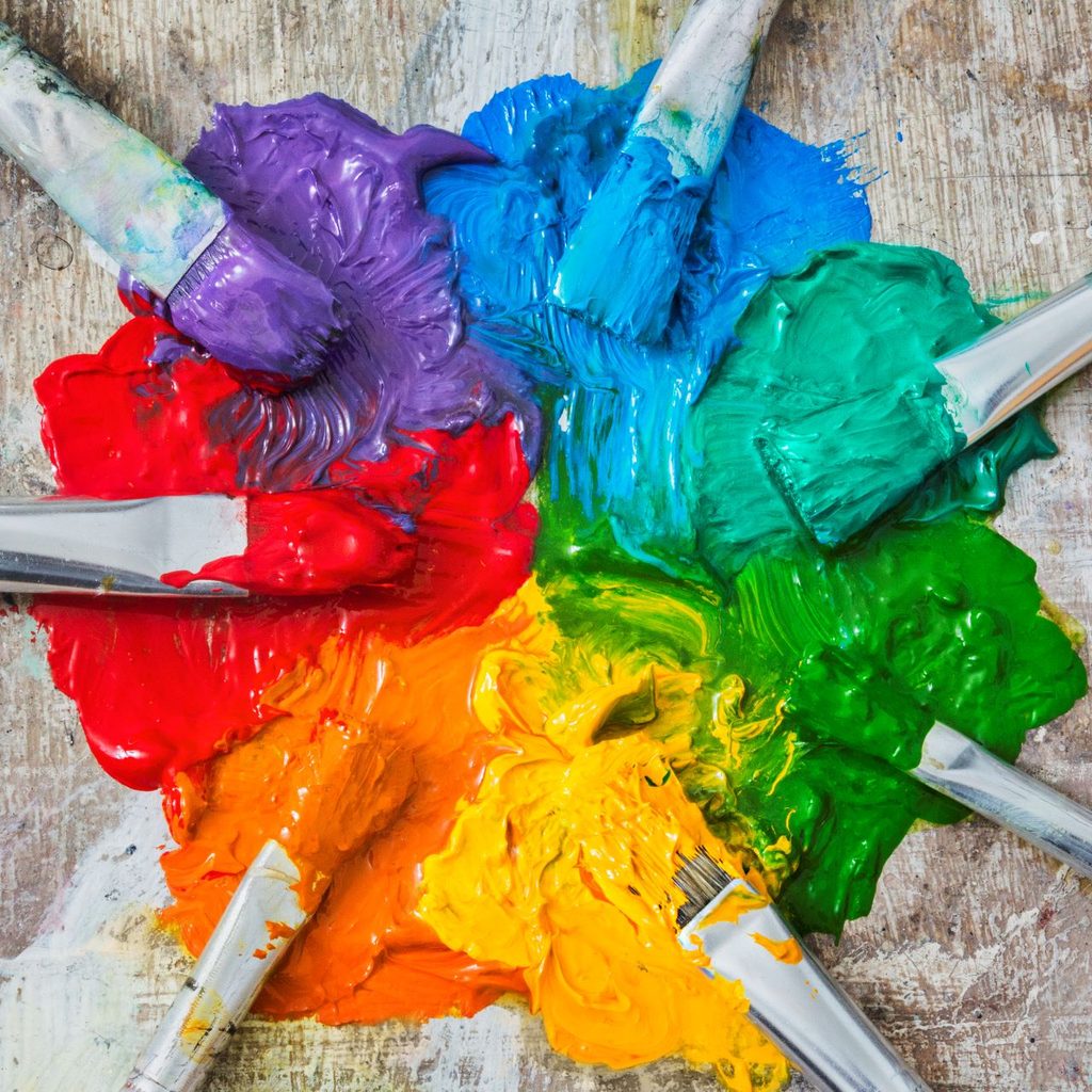
The colors
Goldenrod
Goldenrod is an attractive yellow herb, traditionally grown for medicinal purposes by indigenous groups, that attracts everything from butterflies to birds. Turns out that its color is popular among today’s American homeowners (and renters), too. Can you ever get enough of a rich, deep yellow? A nice creamy maize or mustard makes for an energizing accent color this year, so use this paint wherever you like. It works nicely on window and wall trim, on the wall behind lighter-colored drapes, on trim against a baby blue or beige wall, or as a bold pop peering out from amidst other colors in decorative crown molding. Play with this paint color a little, and see what it can do for your room.
Light green sage paired with gentle earth tones
You might feel like you’re getting ready to indulge in a lavish day spa treatment when you lounge beneath this color scheme. These colors blend beautifully to create an air of serenity wherever you put them. Let your personal color selection be inspired by nature’s earthy chocolate browns, yellow ochres, and burnt oranges, and feel the calm coming over you as you kick your feet up. Add subtle hanging lights or lively hanging plants to play with the colors even more.
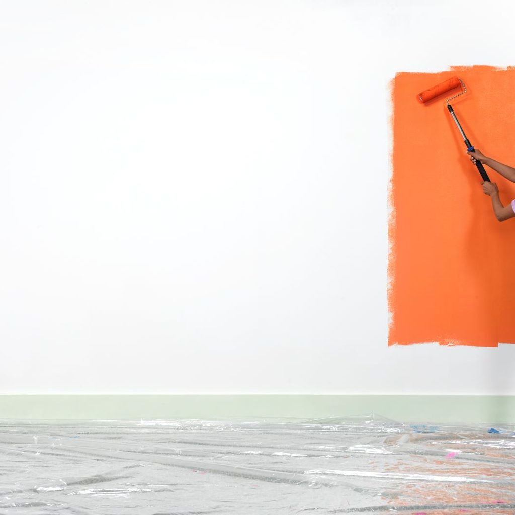
Orange as an accent, or orange with blue
This is a beauty of a combo you can apply anywhere, from bedrooms to bathrooms or full living room colorscapes. Just be bold with your orange, and pair it with blue whenever possible. This is one particularly stunning color combo of the season, perfect for making nearly any area stand out. Try a light orange throw with multicolor braided tassels, a sky blue lampshade, and a couple of bold persimmon pillows with a royal blue love seat. Or, mix a sprite of each color in your featured decor, set against a neutral backdrop.
White background with black accessories and details
Use monochromatic white throughout the space, with random details in black, i.e., fancy doorknobs or window latches, light fixtures, chairs, or some carefully placed objet d’art. Accent a white table, floor, couch, or cabinets with black knobs, black-highlighted coffee table books, or black sculpted artwork.
Cavern clay
Think dusty rose mixed with rich Georgia mud. A uniquely warm and naturally gorgeous color, cavern clay has found its way into the palettes of today’s paint makers, and so it has also made its way into numerous households. Try it on all walls and maybe a few matching decor items as well. When you get started with this color, it’s not easy to stop!
The methods
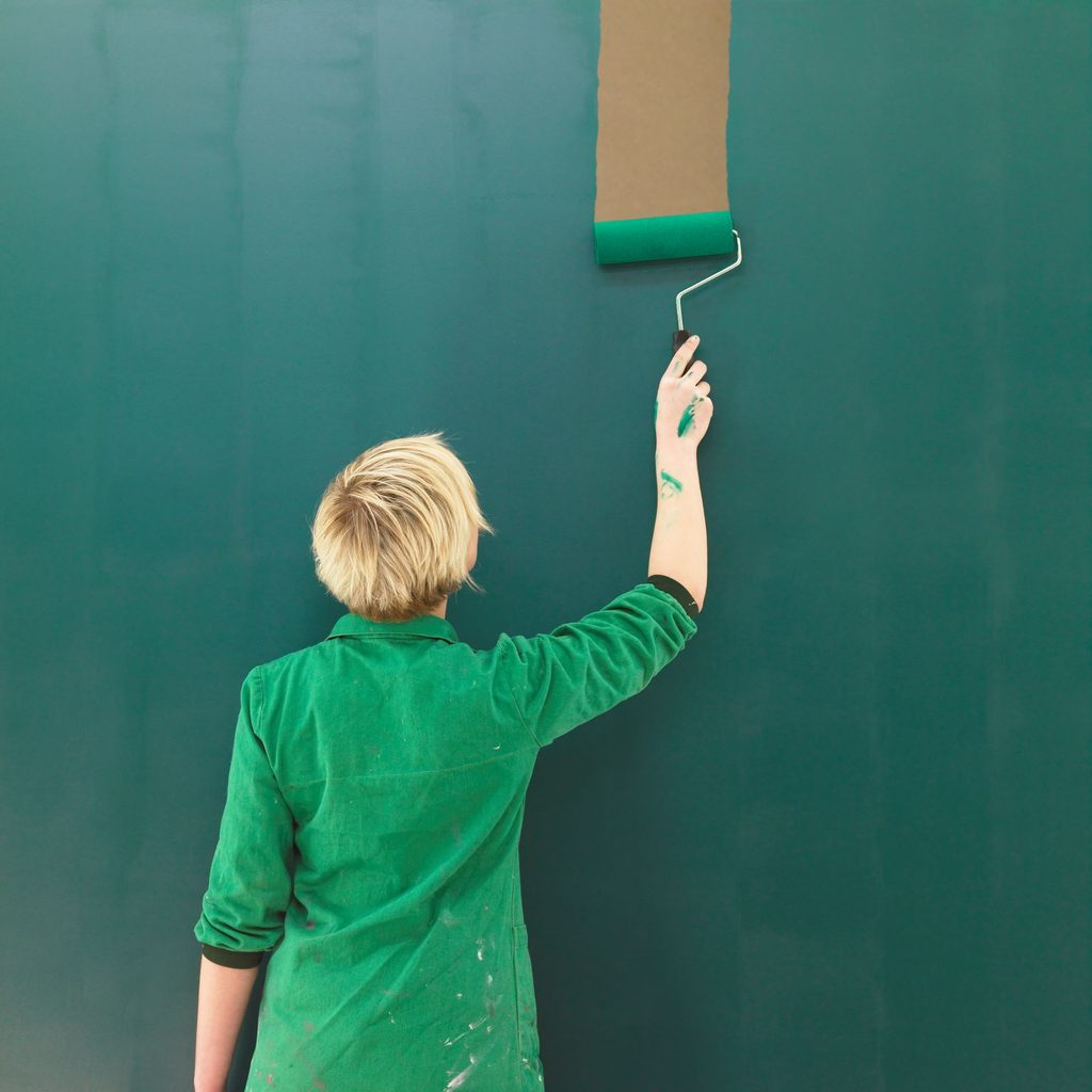
Bold or dark monochromatics
Skip the neutrals and pastels and go for dark monochromatic roomscapes this year. Grab a deep navy or succulent cranberry and place it everywhere for a room with a rich personality. Don’t vary the color — keep it exactly the same throughout the room with only a couple of contrasting items.
Vary the sheen of your paint, not the color
This gives a conversation-starting character to the room. For example, use a dark, flat red paint for your walls and a gloss type for your trim to draw out the richness of the color. Lilac and purple do this well, too. Swap these around or try it with other colors — forest green, orange, and yellow look good this way.
Keep the walls and floors neutral while the furniture goes wild
If you’ve got softly hued neutral walls and floors, your furniture and accessories can go bold. Drag out your most impactful artwork and visually stunning decor pieces to work against the silent background — and use plenty of color. One example might be: When the walls and floors are a neutral sand color, the furniture can reflect your love of the rainbow, the juicy nuggets of a pomegranate, or dark blue leather, while the accessories can be colorful and polished condor agate stones, hand-carved hollowed black stone stools, or any other such contrasting decor to play against your neutral color.
Layer your color
With a similar mindset as monochromatic color schemes, try slightly varied shades of the same color for a decorating theme called color layering. Use a pale pink — nearly white — on one wall, and then gradually change it a bit darker and bolder one at a time on the trim or other walls. Do this until it gets all the way up to a vibrant rouge, and include pieces of each color (five or six different hues) in decor throughout the room. Then, throw in some contrast pieces and colorful artwork for depth.
Add texture to color
Give some thought to the ways you can combine texture with your colors. Add a stone- or marble-looking texture to a neutral beige or brown or a metallic sheen to a maroon or dark red or blue. Toss some sandy texture in with your beige or pale yellow to call up a memory of the beach. See how many ways you can do this throughout the interior of your home.
Now that you’ve got some paint colors and methods to start with, you can be well on your way to sprucing up your home’s walls. You are sure to stand out when you implement a few of these changes. Need more ideas? Check back for updates, and be sure to read the best wall-painting techniques everyone should know about.