Purple represents royalty, mystery, peace, and much more, depending on who you ask. So, why can’t you decorate with purple? There are many ways to work it in if purple is your thing, from purple color combinations to purple accents.
Research shows that people who decorate with purple are most likely to say their home makes them happy, and Pantone’s color of the year in 2022 certainly celebrated the shade. If you already love purple, this is definitely the read for you, but if you need some convincing, this just may be the thing that convinces you that purple is the right choice for remodeling your space.
Colors that go with purple
We have some ideas for every level of purple commitment: If you’re all the way in, we’ll discuss painting a few walls purple and decorating the room accordingly. If you’re purple-curious but not quite ready to take the plunge, we have some great ideas for accenting with purple. Either way, keep reading to find out how to work some purple into your home decor.
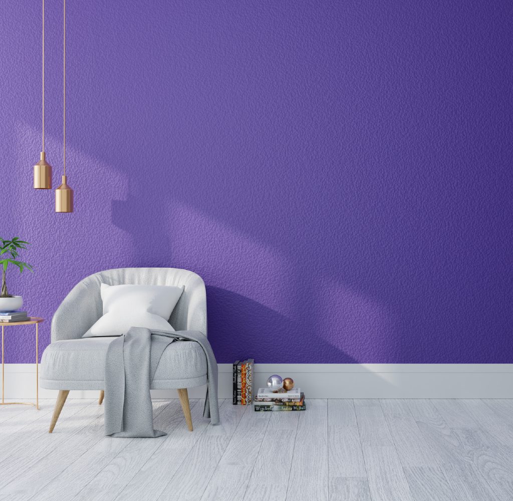
Gray
Since most of the last decade was filled with interior decorating featuring different shades of gray, it shouldn’t be challenging to pair purple with gray in your home without redesigning the entire thing. Since purple is a vibrant color, it pairs well with the cooling tones of light grays. If you have gray furniture, consider painting a wall (or all of them) purple for a fresh new look. If you don’t want to paint and have gray walls, look for a few pieces of purple furniture.
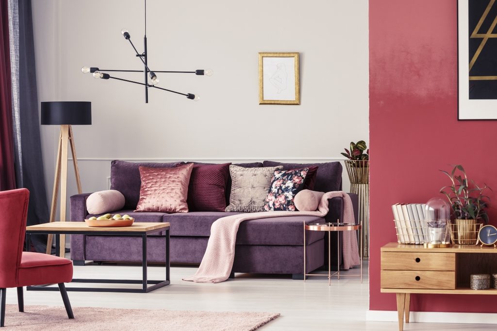
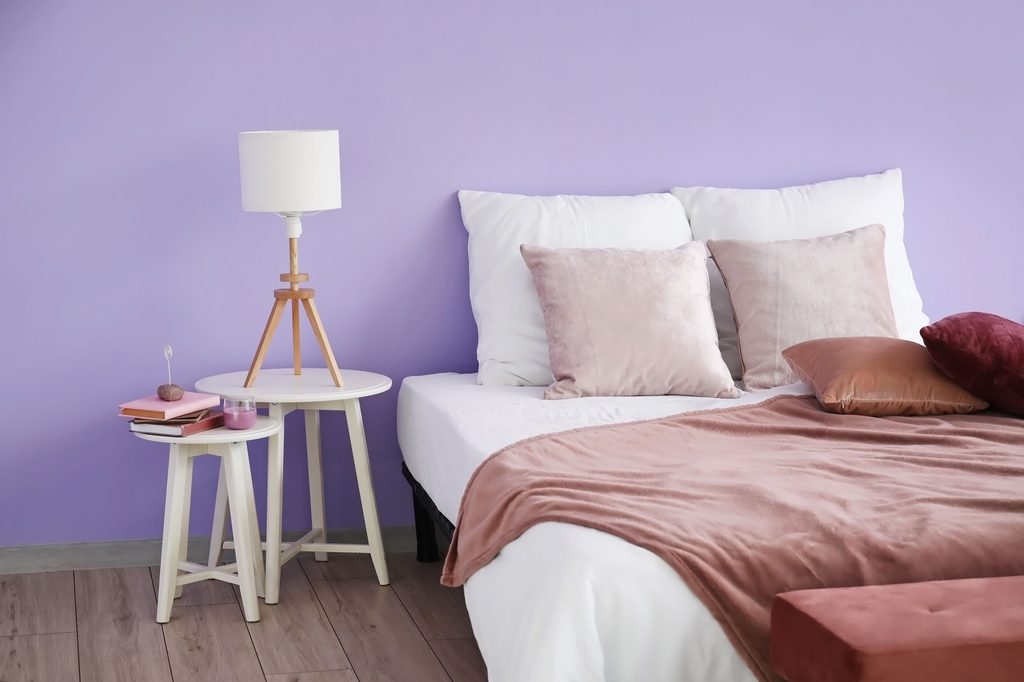
Pink or orange
Pink and orange go well with purple because they are neighboring colors on the spectrum. Pairing purple with orange or pink creates an energetic vibe that evokes happiness. Pink and orange accents in a purple room allow the purple to be the star while still complementing it well.
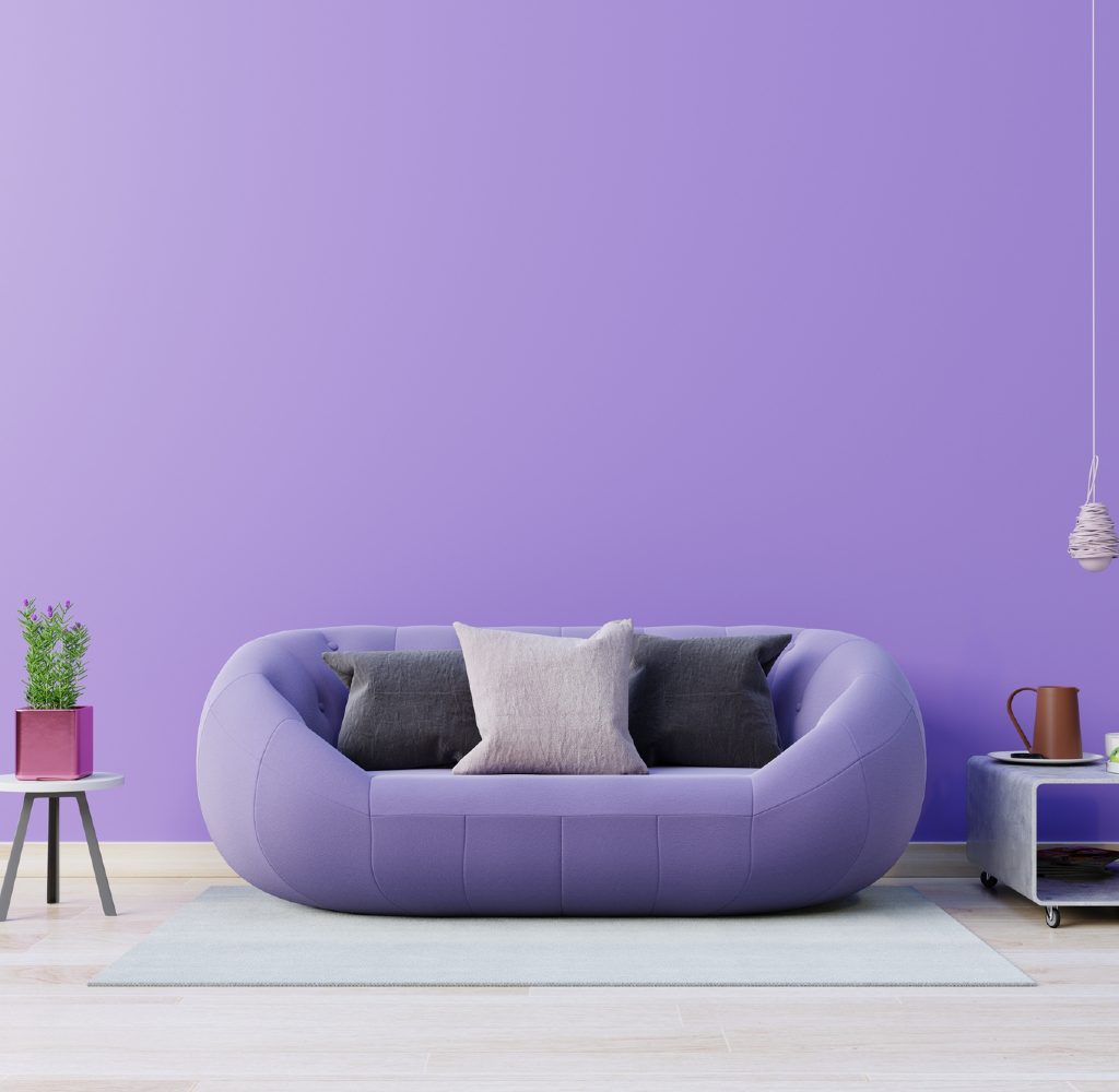
Black
If you’re going for a contemporary look, purple walls with black accents will create a deep vibe that achieves just that. Light purple pairs well with black and won’t make the room too dark. If you want to use a darker shade of purple and pair it with black, try to use a few light pink or cream accents, so the mood isn’t too dreary. Throw pillows or blankets are an excellent way to add accent color without overpowering the room.
Lime green
Purple and lime green have gone together for ages, especially lavender and lime green in nurseries or children’s rooms. But if you’re not decorating a kid’s room and want to try out this look, don’t be afraid to experiment with darker shades of purple paired with lime green for a contemporary look. Since the two colors are drastically different, they demand attention when paired together.
Yellow
Pairing yellow or mustard colors with purple can work and traditionally evokes feelings of royalty. Purple is bold, as we’ve mentioned, so pairing it with a bright color like yellow just works. The key to this color combination is to find a balance, which will take a bit of planning. Yellow walls with purple furniture or purple walls with yellow accents? The decision is yours, depending on what you’re going for, but either way, you’ll be pleasantly surprised.
Light blue
If you want to introduce some purple into your home decor but don’t want to go contemporary or bold, light blue is the way to go. Light blues paired with purple will give you a more traditional or country vibe while remaining fresh and unique. Something as simple as a baby blue lamp with a bright purple lampshade will liven up the room while bringing in a pop of color.
Bronze
Bronze and purple may not be the first color combination that comes to mind when you think “purple decor,” but this pairing is actually quite popular these days. A bronze touch can add a bit of drama to the room and a bit of excitement to the vibe. Even lighter shades of purple will work with bronze tones — you just have to experiment a bit to find the right combo.
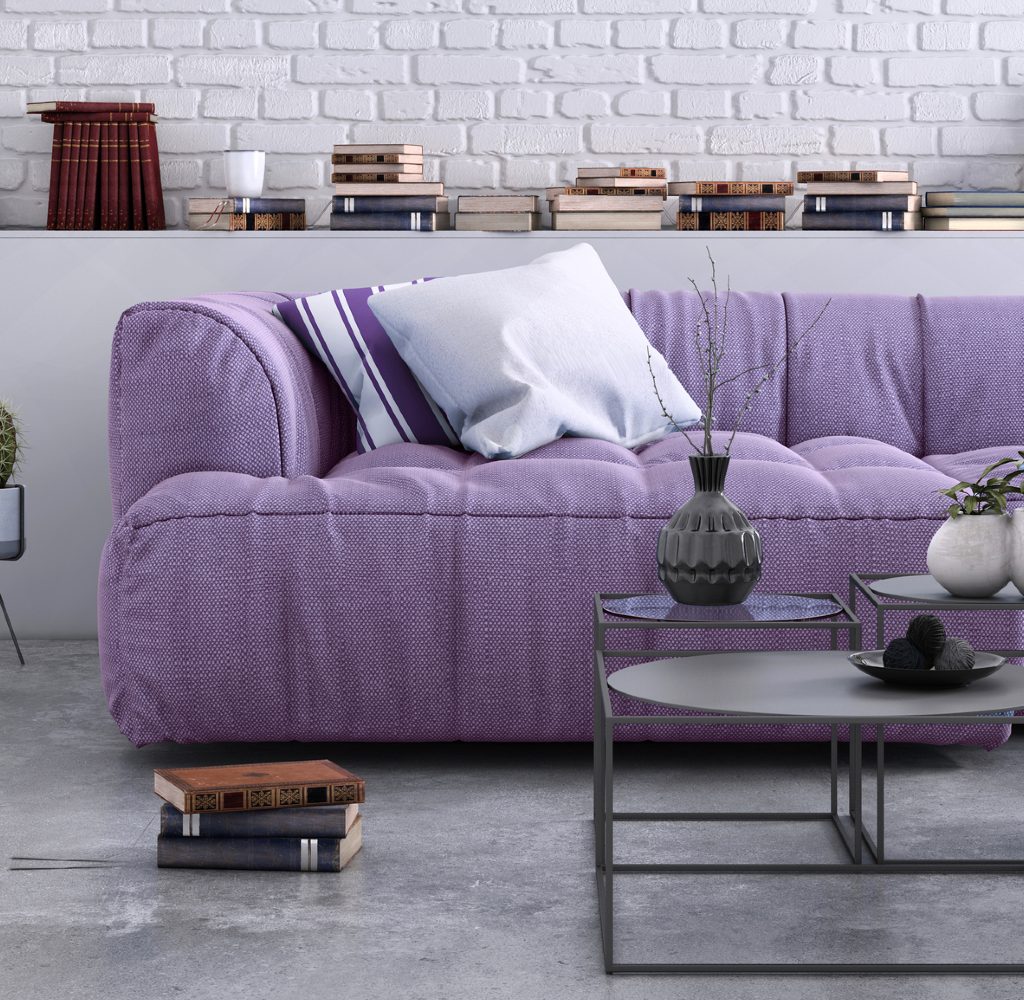
Taupe
Taupe is a neutral color that you may already have in your home. One of the best parts about purple is that there are so many different shades; you can indeed find one that goes well with the shade of taupe you already have. Whether you choose plum, grape, or burgundy, pairing it with taupe will create a sophisticated and chill vibe.
Emerald green
With jewel tones making a comeback, emerald green has become a staple in many spaces. This is a fantastic color to pair with many shades of purple, from blue-undertone lilac hues to rich and deep eggplant purples. Use emerald green and darker shades of purple equally in a 1:1 ratio in your space. With these tones as your main colors, opt for one other neutral base and a metallic accent for a dramatic, jewel-tone flair. Alternatively, use light lilac purple with deep emerald green accents in the kid’s rooms, nursery, bedroom, or living space for an uplifting look.
Part of the reason people tend to stay away from purple as a home decor color is that, most of the time, people aren’t sure which colors to pair with it. For this reason, purple is not the most popular or obvious choice when it comes to decorating. However, purple goes well with several other colors — more than you may realize. With a bit of planning and experimenting, you can find endless ways to incorporate purple into your home decor. Don’t be afraid to get creative with your color choices; you won’t regret it.