 Are you considering repainting your home? Have you always wondered how to seamlessly transition your paint colors so they flow beautifully from one room to the next? It just so happens we have some great tips and tricks to help you get started on your next painting project.
You will want to choose a consistent color palette that flows from room to room, meaning connecting the rooms with color rather than having a disjointed look with different color schemes all over.
Getting to a color connection
While consistent colors and a cohesive color palette will tie the house together, it is anything but boring. How to choose paint colors that flow comes down to selecting the main color, picking your accent colors, and then being selective about where and how you use bolder colors.
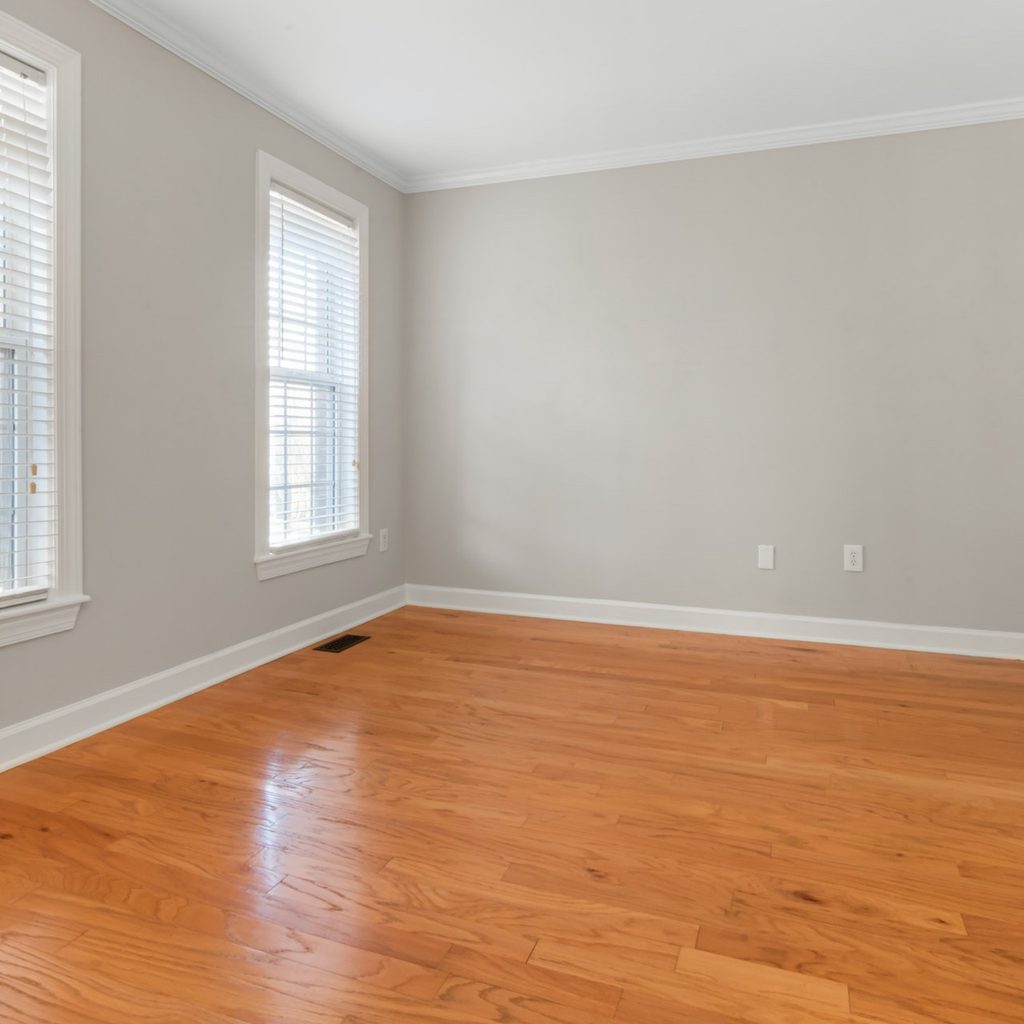
Main areas and areas described as being in the same general sightline should be in the neutral color category. Sightline means just what it sounds like, the areas in your sight when you stand in the room’s main area. For example, if you stand in the living room and see the upstairs hallway, the hallway going downstairs, and the foyer, you should paint those areas the same color.
That color is your neutral, and it can either be a warm or a cool neutral. Warm colors fall into the red, orange, and yellow families: Creams, beiges, or tans. Cool colors are grays, greens, or blues. You may have also heard of the color greige, a gray/beige color that is considered neutral. The warm or cool tone of greige depends on whether or not the undertones are yellow or blue.
 Picking variations
 Picking variations
Paint cards and color fan decks are your friends because they show you gradients of colors that help pick other colors that will work with your neutral. So if your neutral is at one end of the fan, you can go up the fan to find other colors, so you don’t end up with every room in the house the same color.
In an open floor plan, you can go up one or two grades of the same color, and your eye will process it as close to the same color. Painting your trim the same color or staining the trim the same color will also tie all your areas together.
If you have wood-finished cabinets in the kitchen, you can bring those wood tones throughout the house with your trim. If the wood finish has deeper red or yellow tones than you like, a paint store can color scan a drawer or door front and tint up or down to give you a color you like better.
Accent colors
You can pick two or three, or let your neutral pick it by having the paint store darken the neutral you pick. Let’s say you pick green and yellow as your accent colors. You can use a green from the same family (on the fan deck piece) in one room and use a variation of the yellow in another room.
If your accent color is blue, you can use navy, true blue, or blue-gray and still have a cohesive palette. Using the same flooring throughout the house, like a ceramic plank or carpeting, will tie your color scheme together. Use accent colors in hallway runners and area rugs.
You can coordinate your textiles in accent colors or go bold and have them be occasional pops of color that add interest to your decor. A beige throw or rug can be a lot more interesting if you select one that has texture. Chunky knits and frayed fabrics on a throw or rug dress up an area without becoming a jarring color addition.
Do remember that colors are different depending on the light. A stunning jewel-tone purple in the powder room is a great idea, but putting that color in a playroom with three windows will look completely different.
Bring on the bold
 Bring on the bold
If you are going to use bold colors, use them in rooms that are enclosed. Bedrooms, bathrooms and powder rooms, laundry rooms, the mudroom, and the playroom are great choices. And if you are going bold, own it. If your kid wants a deep green room because it reminds them of the woods, go big and paint all four walls, not just an accent wall.
Go ahead and paint a dramatic black powder room and do one wall in a spectacularly colored wallpaper. Use your accessories as pops of color, especially artwork. Don’t shy away from big paintings or large textile hangings. They move a neutral palette to a palette that is your own. Bright fluffy towels in the bathroom can be great accessories, and you can dress your bed in gorgeous colored spreads and accent pillows.
Remember, the color flow doesn’t have to be a bunch of stagnant colors. You can pick a warm or cool neutral and dress it up or down, depending on your taste. Complete the look with accent colors and your choice of complementary colors, and watch your space transform into your own.