If you’re looking for a way to refresh your dining room, adding a new paint color can spruce up your walls and create a luxe feel in your space. While it’s easy to slack on your dining room design, leaving it feeling dull or uninspired, being intentional with your paint colors could transform your room. From rich browns to deep jewel tones, creating a luxe dining space is all about using color to create an elegant and sophisticated touch. If you’ve overlooked this crucial detail for creating a seamless dining room design, maybe now is the time to consider refreshing the look of your space with a fresh coat of paint.
Here, we give you five breathtaking dining room paint colors and tips on how to style them to help inspire you to create a luxurious look in your home.
What colors are good for dining room walls?
No matter your preferred design aesthetic, warmer and moodier tones are often chosen to adorn dining room walls. Dining rooms are meant to provide a sense of comfort and coziness to reflect the intention of the space. As a room where family and friends gather for more formal meals, it’s not uncommon to find these areas decorated with luxury and elegance in mind.
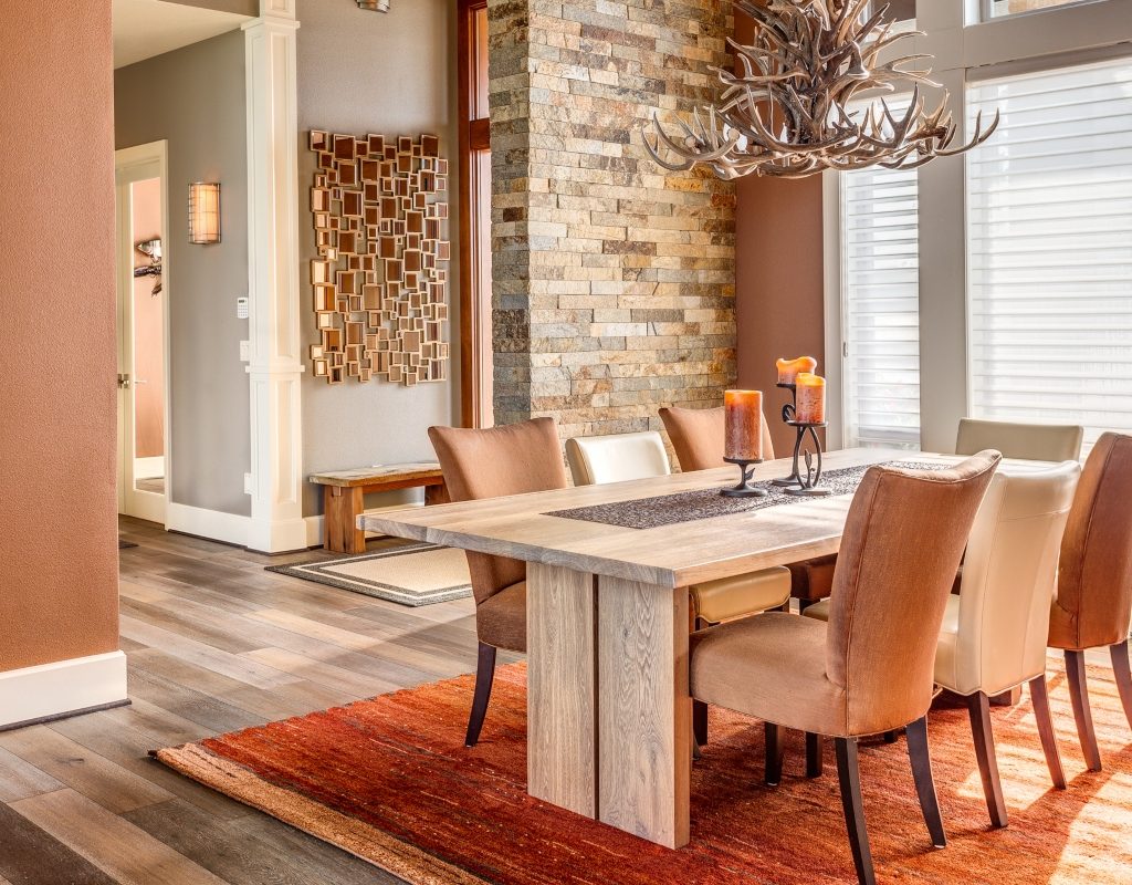
- Neutrals: Most dining rooms gravitate toward a neutral wall shade. Especially popular in modern and traditional designs, neutral tones make the space feel more serene, minimalistic, and curated.
- Moody hues: Alternatively, some rustic, ultra-luxe, and industrial design styles lean toward moodier tones that help accentuate and ground the space.
- Jewel tones: Jewel tones are also popular in the dining room, often reflected as accent pieces through art, chair designs, or smaller decor pieces. Colors like emerald, magenta, and royal blue look lovely in the dining area.
What colors should you not use in a dining room?
Since many homeowners struggle to decorate the dining space to create a warm and inviting environment, we’ll share a few tips on what not to do when choosing a wall paint color.
It’s best to stick with warmer-toned neutrals. So, avoid opting for blue-based neutral colors or shades with a cold undertone, as these colors can leave your dining room feeling dull and uninviting. Cool tones can sometimes look harsh or two-dimensional in the dining room since these shades typically don’t inspire a sense of coziness. However, washed-out blue paint colors with warmer undertones can be a fabulous addition to your room.
It’s better to avoid harsh whites. Bright whites can feel jarring in a dining space, especially beside darker wood tones. Unless you are experimenting with a Scandinavian aesthetic in your home, it’s best to avoid stark white.
Try not to go overboard with color. Often, a luxe dining room is best grounded in warm neutral tones like beige, brown, and black. Adding too much color to your walls can hinder the sophisticated look you’re aiming for. However, boho, maximalist, and some traditional aesthetics can look lovely with a splash of color on the walls.
Which dining room paint colors look best?
If you’re in search of the perfect tones to add to your dining room walls, below are some stunning paint colors that we think will create a luxe and inviting space.
Chocolate brown
If you lean toward a more traditional aesthetic, you may find chocolate brown to be a decadent paint color for the dining room walls. Chocolate brown is rich and warm, perfect for creating a cozy yet elegant dining room aesthetic. Those who like rustic and Scandinavian styles may also find this color to be a great accent along the walls. If you have some handy skills, DIYing a statement wall molding or inserting wooden slats can provide more dimension within your space. Chocolate brown also makes for the perfect accent color alongside taupe, beige, or off-white, where the light colors prevent the room from becoming too dark.
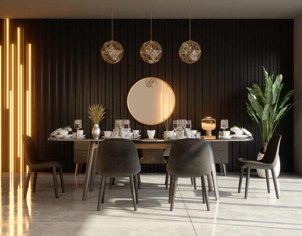
Black and white
Black and white paint colors provide a classic touch to any space. Ideal for luxe minimalist and modern design styles, a black-and-white dining room can appear sophisticated and luxurious. Add black along one wall as an accent color to create more depth and visual interest.
Alternatively, white walls with black accent paintings or a black dining table appear rich and welcoming. For a warmer look in your space, pair black-and-white walls with light wood flooring or other wood accents throughout the room. Plenty of lush green plants can also enhance the look and invite more life into the space.
Cream or taupe
Cream and taupe are other classic dining room paint colors that many homeowners enjoy. Often found in traditionally styled homes, those with boho and vintage aesthetics could also find these tones heartwarming. Cream and off-white shades create the perfect subtle backdrop for a dining room.
These colors are also highly versatile, meaning homeowners can swap out their decor and change up the accent colors in their palette whenever they like. Taupe and blush tones are a great choice for boho or retro styles that favor a warmer and more eclectic look. Pair these colors with warmer browns and other darker hues that help make the space feel more luxe and intentional.
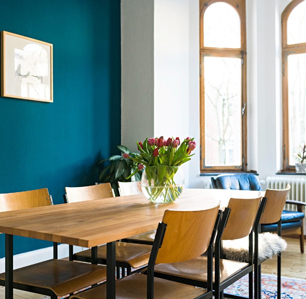
Washed-out blues
A favorite in many farmhouse, rustic, traditional, and retro styles are washed-out blue tones in the dining room. Blue feels airy and bright in the dining space without becoming too overwhelming. The washed-out tones allow the space to feel muted yet comforting and help enhance the white accents used throughout the space. Still, since washed-out blue can come across as detached or unwelcoming, it’s best to choose a hue with warm undertones or pair it with warm-toned neutrals.
Additionally, if you’re going for a luxe look, pairing this washed-out blue with glass or crystal features is a stunning way to create a sophisticated aesthetic. Furthermore, rich wood tones look right at home alongside many blue tones, making the dining space feel more comforting and organic.
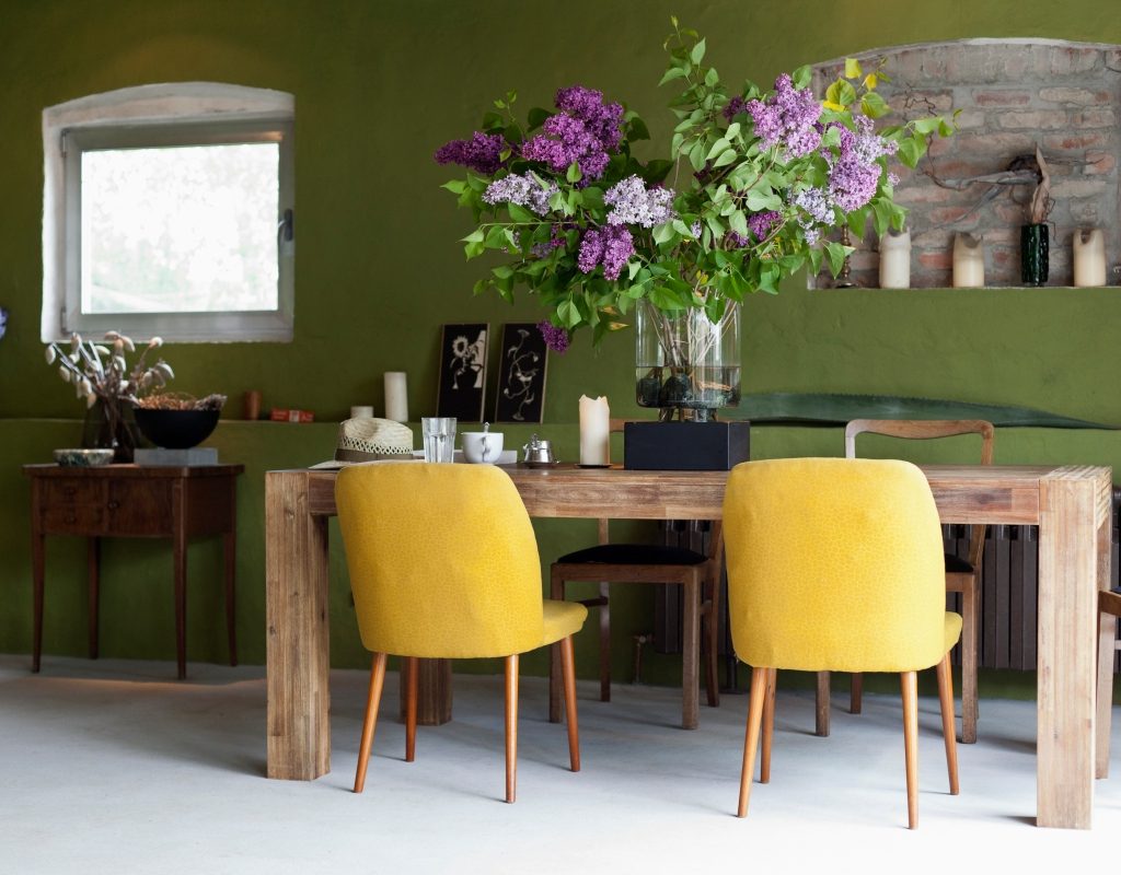
Rich jewel tones
If you want a bolder splash of color that won’t look too overwhelming in your dining room, opt for some rich and elegant jewel tones. Colors like deep forest green, warm maroon, canyon clay, and dark navy can be wonderful moody additions to your space. The trick is to choose a jewel tone with a warm brown or slate gray undertone, as this will calm the intensity of the color.
Additionally, choosing a darker shade than a more vivid one will add subtlety and opulence to your space. When decorating with jewel tones, keep furniture light by opting for light-stained woods, cream linens, or bright metals. Warmer metallic tones like copper, bronze, and gold often better suit the dining room since they appear more inviting and blend beautifully with jewel tones. You might also consider using jewel tones as accent colors or along a statement wall rather than going all-in with the shade if you’re worried the color may be too overwhelming.
Finding the right paint color for your luxe dining space is all about knowing what aesthetic you want to achieve. A light and bright feel is best created through washed-out blues and off-whites, while luxurious browns and blacks can achieve a moodier and warmer look. No matter your style, keeping your space simple and leaning toward neutrals can provide the best luxe aesthetic. But don’t forget to add a few accent colors or jewel tones to tie together the overall look!