This year is all about stepping out of the box and creating a home design that is unique, innovative, and exciting. So it’s no surprise that Pantone’s color of the year for 2022, Very Peri PANTONE 17-3938, upholds all of these sought-for qualities. Very Peri is a shade inspired by the creativity and imagination often seen today as the world and its people move through unprecedented change.
If you’re interested in this trendy shade and are curious about how you can invite it into your home, then you’ve come to the right place. We spoke to the experts to gain perspective on just how amazing this hue could be in your home!
Why Pantone’s Very Peri is so appealing
Pantone’s Very Peri captures the excitement and wonder that reflect the present day. With so many changes occurring globally, the creators of Very Peri were inspired to make a color that encompasses all that is happening around us. Paige Gray, Partner and Lead Interior Designer at Parker & Harlow, states, “It’s a fresh color that seems to lift spirits and add a fresh touch to interiors.” The goal of Pantone was to create a joyous shade that promotes inquisitive and creative thought.
Katherine Cohen, Manager of Visual Merchandising and Photography for Interface Inc. and its premium design brand FLOR, says Very Peri “is playful and modern […] It brings a certain bright energy to any room.” As a whimsical color based on energizing violet and calming blue, this warm berry-like tone is sure to bring a new perspective to any room of the home.
How designers are incorporating this color into their designs
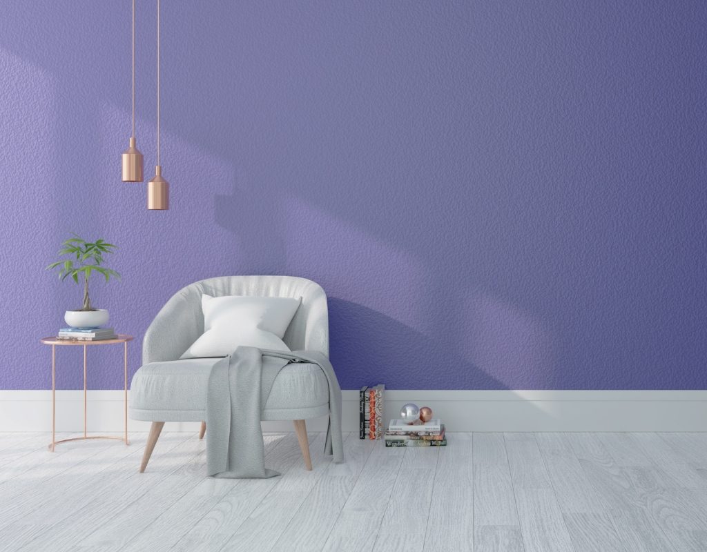
Pantone’s Very Peri is an elegant and subtle blue-violet tone unlike many popular colors in years past. This vivid shade is bright, creative, and courageous. For some homeowners, it can be challenging to include such bold and exciting colors in their space. So we asked the experts for the best ways to include it in your home design.
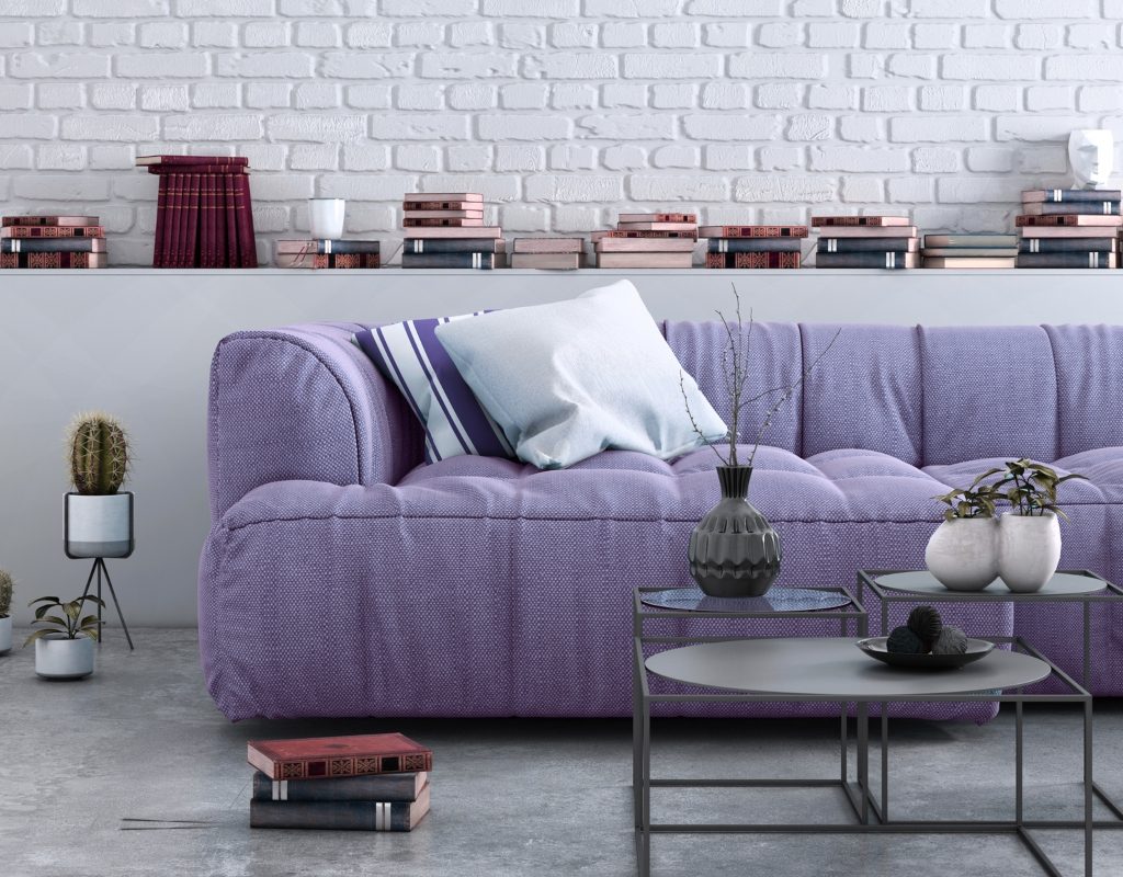
Pair it with neutrals
Many experts have stated that Very Peri would look best in a color palette of neutral tones. Gray says that Very Peri “speaks to a neutral space” and has the potential to uplift neutrals like beige, cream, and gray. Leslie Murphy, Owner and Creative Director at Murphy Maude Interiors, adds that this color would make an excellent accent tone “in a black and white fairly classic room,” where the inspirational blue-violet shade would make a statement in a monochrome palette.
On linens
Linens are another place in the home where Very Peri would have the opportunity to shine. Gray says, “[Very Peri] would be gorgeous in a linen bedspread.” In a beige- or neutral-painted bedroom, a pop of Very Peri on the bedspread could add the perfect subtle accent to the space. The color isn’t too bold or harsh, as it has just enough of a blue undertone to make it relaxing and comforting.
Use it as an accent color
Murphy says Very Peri would look best as “a pop of color on a vanity or a beautiful accent cabinet.” Many experts believe Very Peri would be an ideal paint color to add to cabinets and vanities because it allows the shade to make a subtle statement in your space. This color would be the perfect accent color for modern rooms in need of a bit of creativity.
Gray adds that for a bolder look, you could add Very Peri to your front door as “a welcoming and unexpected entrance feature.”
Try it on the ceiling
Chicago-based Kelly Fitzsimmons, from the website Paint the Town Red, encourages homeowners to “imagine a subtle color on your bedroom walls and Very Peri on your ceiling.” Very Peri has a periwinkle undertone that is soft and elegant. On the ceiling, this shade has the potential to create a stunning accent within the room while also uplifting the appeal of the space. Painted ceilings are becoming a stunning trend in home design today, so taking advantage of this hue in your space could be a great way to participate in these new home design trends.
Pantone’s Very Peri is a wonderful shade for homeowners looking to jump on trendy home design ideas without going too bold too fast. As a subtle, gentle shade, Very Peri allows homeowners to add a pop of color to their rooms without committing to anything too striking. Add Very Peri on your ceiling, vanities, or bedding for a subtle accent color in your space.