
While trends like loud wallpaper, textured panels, and accent walls may go in and out of style, traditional paint colors are timeless, ensuring that your space will never look dated. However, these classic colors don’t need to be boring. While neutral colors don’t fall smack dab into a color wheel-associated color family, they can still come in a range of hues that show your personality and aesthetics.
By opting for subtle, paler variations on standard colors, you give yourself much more flexibility to change up the rest of the space, updating accents, furniture, and other pieces of décor without needing to repaint the walls.
Ready to refresh your space with a new paint job? Check out five of our favorite neutrals below.

Consider using greige
Greige is a mix of beige and gray, two hues that are often synonymous with being boring. However, the warmth of the beige and the luxurious feel of the grey make for a timeless space that still feels bright and classy. Year after year, you’ll find that the neutrality of Greige is easy on the eyes and, when used strategically, can truly transform a space. It’s incredibly versatile and can complement most colors you choose to use as an accent. Because of its timelessness, it also works well with a host of different architectural styles and doesn’t limit itself to a specific decade.
Our favorite shades of Greige come from Sherwin Williams, Benjamin Moore, and Farrow & Ball. Look for Perfect Greige, Revere Pewter, and London Stone No. 6, respectively.
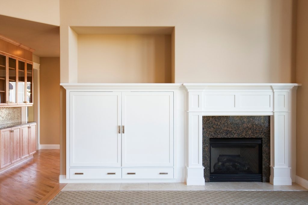
Complex cream can work in many spaces
Another ageless classic is Complex Cream. Creams can be extraordinarily diverse, which is why “complex” is part of the color’s name. Each shade has different undertones, giving your room hints of colors like orange, green, yellow, or pink. Because of these varying undertones, you may have to put some extra thought into your accent colors. However, once you find the hues that work, Complex Cream is sure to enhance the vibrancy of your accents and bring a bit of brightness to your space.
We recommend checking out Alabaster by Sherwin Williams, Cream In My Coffee by Valspar, and Swiss Coffee by Benjamin Moore.
Go bold with fern green
More daring than any neutral color, Fern Green makes a bold statement in any space. The depth of the color makes for an expensive-looking room, perfect for a study or office space. To push this color toward a more neutral tone, consider mixing browns and greys into your green of choice, and you’ll find yourself with a surprisingly neutral shade that still makes a statement.
If Fern Green strikes your fancy, take a look at colors like Soft Fern by Benjamin Moore, Enchanting Ivy by Dunn-Edwards, Hazel by Sherwin Williams, and Dirty Martini by Clare.
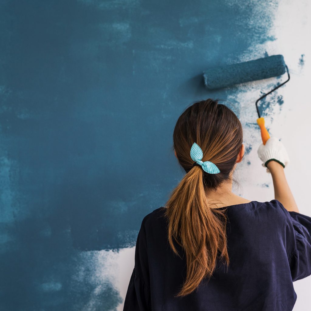
Be brave with navy blue
Across the United States, one of the most common interior colors is Navy Blue. Never out of style, this preppy classic is soothing and complementary to many different kinds of furnishings. It’s a darker, slightly moody color that gives off a sense of both comfort and strength. Don’t limit yourself to just Navy Blue, though — there’s a litany of other shades of dark blue that work equally well as a background color. Like the fern green, mix your favorite deep blue with more neutral shades like grey and beige to give rooms a muted, sophisticated tone.
For this cozy space, we recommend Dark Night by Sherwin Williams, Hague Blue by Farrow & Ball, and Hale Navy by Benjamin Moore.
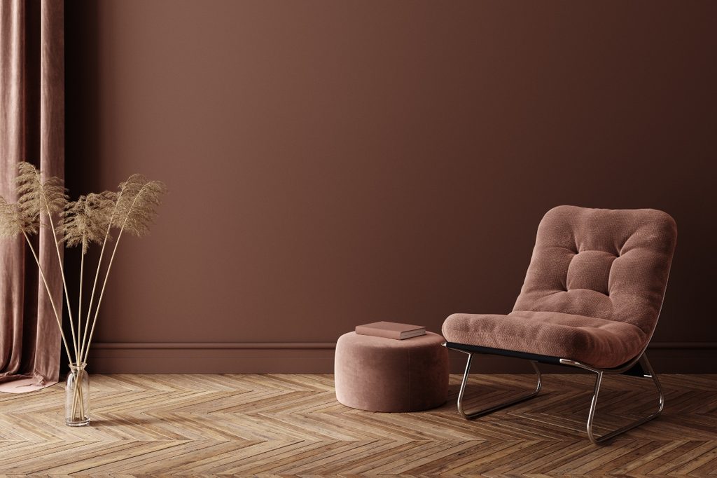
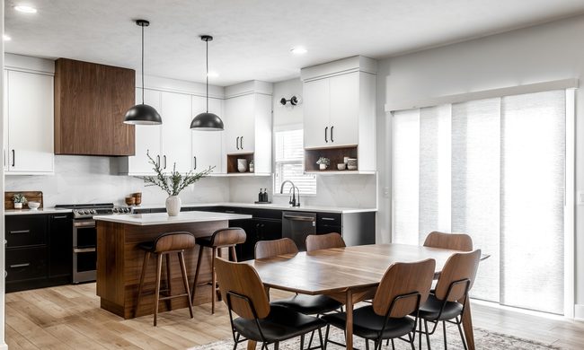
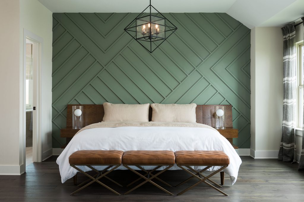
Brown hues offer the perfect backdrop
Brown is a classic home color often accented through wood tones and furniture. However, it is also one of the most popular paint colors homeowners choose to add to their interiors. Like blue and green, brown can make a statement in your design, creating a bold and charming look. But brown hues are also grounded and natural, working like many other neutrals to offer the perfect backdrop in your space.
Brown tones bring warmth into the home while also offering an organic look. Additionally, brown can come across as very luxe and classy if properly styled. Brown shades are also more subtle than some tones we mentioned above. Depending on the undertone, this color can better blend into an existing palette, uplifting bolder tones while still bringing depth to the space.
From dark brown hues to lighter brown shades, there are several options to choose from. We like dark brown hues for a more intimate setting, such as the bedroom or sitting room. Colors like Sherwin-Williams Rojo Marrón or Brown Eyes by Behr are great choices.
For the kitchen and living spaces, lighter brown tones offer a touch of that grounded feel that we crave from the color without being overbearing. A hue like Cabot Trail by Benjamin Moore highlights this unique effect.
Choosing colors that always work
It’s incredibly easy to make mistakes when picking paint colors. Often, the paint on your walls looks different than the swatch, or your color looks gorgeous at high noon but a little dull after sunset. Other times, your decision to go bold with bright colors and loud designs can become an eyesore, just days after you committed to the theme.
By choosing a timeless paint color, you can ensure that the paint on your walls will pair perfectly with your overall color scheme and interior décor. Instead of splurging on the color of the moment, pick a hue that you’ll be as happy with in 20 years as you are now.