Looking to add a bold pop of color to your home design? Orange can be a wildly fun color to decorate with and give any room a fresh, upbeat look—when used in moderation, of course. Orange has a beautiful brightness that can either make a space shine or overwhelm it.
To learn how to strike just the right balance when decorating with orange, we asked experts Eugene Colberg and Elisa Lopez for their advice on how to use this daring color in the home.
Colberg, the owner of Colberg Architecture, is an award-winning, Brooklyn-based architect who for 25 years has designed imaginative architecture and interiors in the United States and internationally. Lopez holds a degree in interior design from the Art Institute of Fort Lauderdale. She is now a real estate broker and the owner of Ocala Realty World in Central Florida, which has been named a top-10 brokerage in Marion County for the past six years.
They each offered some dos and don’ts for how to introduce orange in your home decor and avoid garish design.
Do: Use orange as an accent color
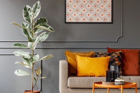
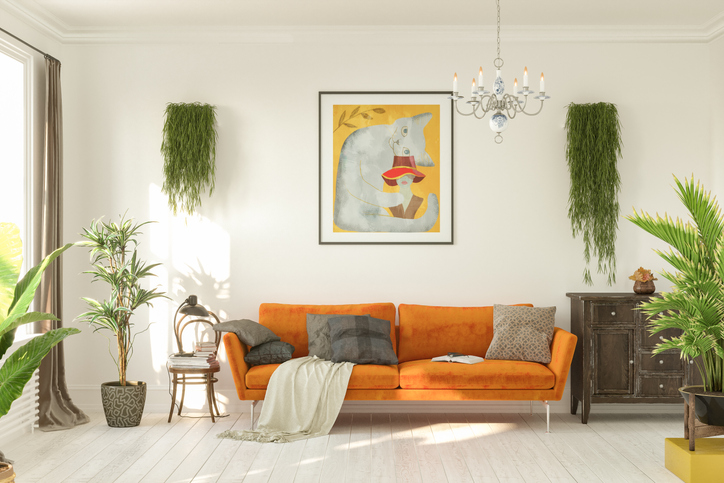
Orange is best used as an accent color, both experts agree. Since orange is typically so vibrant, decorating sparingly with orange accessories will help the color stand out in the room.
“This could be in furniture, fabric, or finishing touches to a room,” Colberg says. “Orange is an amazing color and contrasts very well as an accent. Clients today are looking for a way to stand out and express themselves a little more, and this is a great way to do it.”
Colberg also suggests adding these orange accents in places where they can be swapped out. He calls colors “cyclical,” meaning they fade in and out of style, so being able to move your orange home decor pieces around is key.
“When adding any non-neutral color into your home, whether it’s a trend or something you love, use it in places where you are comfortable from a cost perspective,” he says. “When you’re choosing color, you have to recognize that its popularity might fade—so use it in a place where it can be changed out easily. Cushions, accessories, and art can be moved around.”
Do: Play around with different shades
There’s a reason why orange is so popular right now—people want to set a lively, happy tone in their living spaces, and your classic, primary orange does the trick.
“A lot of people steer away from orange because it’s odd compared to neutrals, but orange is a powerful color,” Lopez says. “For those who like to consider the energy of colors, orange is healthy and vibrant and promotes positivity in a room.”
However, in addition to your typical bright orange, there are other orange shades that can be used in the home that are more timeless, such as a burnt orange color palette.
“Don’t focus just on primary orange,” Lopez says. “Rust and burnt orange never go out of style. Gold and brushed bronze go really well together.”
Be sure to consider all different shades—and even consider using two or more shades together—and see what works for your house design. Pairing a blood orange color with light orange, for example, can be a beautiful contrast.
Don’t: Overuse orange
The only “don’t” with orange is to not cover a room with it. It should go without saying, but using only one color, even in different hues, is overkill. But it’s especially true with orange. It’s a strong color that is palatable as an accent but not as a dominant color, the experts say.
“You don’t want to pile a home in orange because it’s so potent,” Colberg says. “If you have a single, well-chosen piece of furniture or decorative element in orange, it can truly stand out and is also flexible.”
In other words, choose just one or two orange statement pieces. Don’t decorate an entire wall with orange artwork or buy an entire orange furniture set. When used in moderation, orange does exciting wonders for a home.
“Don’t dip the whole room in orange,” Lopez adds. “It should be an accent color: throw pillows, a vase, or a comforter. Sometimes people forget about the sheets, but that can be a subtle surprise. Play off the artwork on the walls that you already have.”
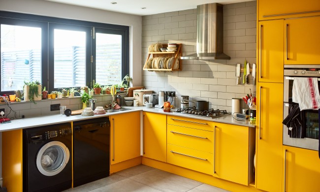
Orange can be a great addition to any space’s home decor. Whether you want to give your bathroom a sizzle, your bedroom some shine, or your kitchen some extra pop, incorporating orange is a solid idea from a design perspective.
Your orange additions should be used in moderation, though. Using orange as an accent, experimenting with new shades of orange, and not making it a dominant color in the room will help guide you toward a stylish orange color palette in your home.