Pantone released its color of the year for 2023, one of the boldest and most lively tones we’ve seen introduced to interiors in quite some time. Viva Magenta is Pantone’s 2023 color of the year, bringing vigor and vivaciousness into the home. This striking bold hue adds excitement and a sense of fearlessness in home design, something many homeowners and designers have been craving since neutrals have taken over the interior design landscape.
While this tone is certainly not for the meek and wary, it could be the perfect way to experiment with color in 2023. Or, this bright hue could redefine how we express ourselves through our interiors.

Pantone’s color of the year: Viva Magenta
Viva Magenta is a velvety red hue, similar to the luxe jewel tones that have been springing up in home design over the last year. This tone, in particular, looks bright red, vibrant, and cherry-like, but with a hint of a deep and vivid purple undertones that give it a more elegant and fruitful appearance. It’s reminiscent of KitchenAid’s color of the year for 2022, only brighter and more exuberant rather than mysterious and moving.
Leatrice Eiseman, the executive director of Pantone Color Institute said, “PANTONE 18-1750 Viva Magenta descends from the red family, and is inspired by the red of cochineal, one of the most precious dyes belonging to the natural dye family, as well as one of the strongest and brightest the world has known.” Pantone wanted to introduce a color that was both bold and exciting while also drawing people back to nature. Viva Magenta achieves just that.
Why did Pantone choose such a bold shade?
Pantone remarks that Viva Magenta is “a new signal of strength.” This bold and vibrant tone is meant to empower homeowners and designers alike. Pantone added, “It is a new animated red that revels in pure joy, encouraging experimentation and self-expression without restraint.”
In 2023, many interior decorators are excited to experiment and add more color to their homes. While years past donned minimalism and neutral palettes, a new era of home design is emerging, and it favors color, pattern, texture, eccentricity, and authenticity.
Home design is also shifting to a more biophilic aesthetic with a focus on natural items, organic materials, and textures that remind us of our connection to the outdoors. Eiseman stated, “Viva Magenta reconnects us to original matter. Invoking the forces of nature,” making this the perfect hue to incorporate into the home for a lively natural touch.
How can homeowners style Viva Magenta in 2023?
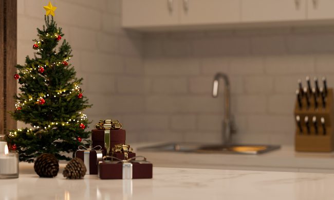
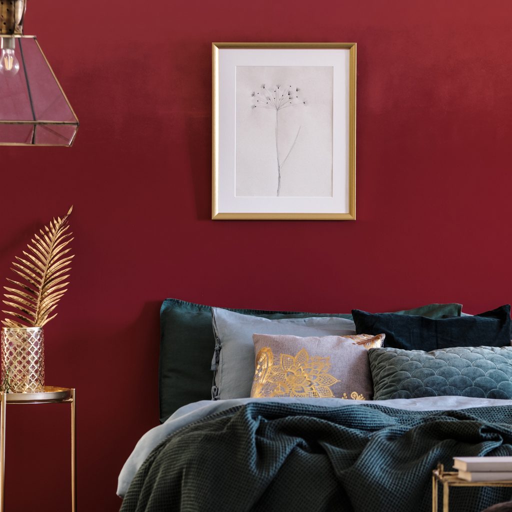
With a new age of experimentation in home design, you could use Viva Magenta however you like. For the bold and fierce, consider painting a room with this tone, both the walls and ceiling! Or, opt for a large area rug to put a modern twist on the classic pink carpeting of the 80s. For homeowners feeling more inspired with their experimentation, painting the bathtub, kitchen cabinets, or fireplace in this hue could create a fun maximalist pop of color.
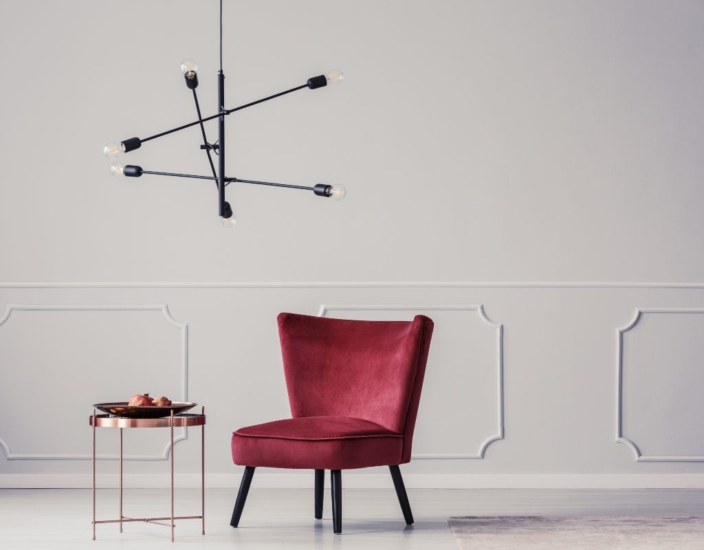
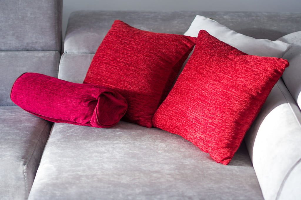
For those who want to jump on the trend but prefer more subtlety, a couch in the shade of Viva Magenta can make a statement in the room. Additionally, using this color as an accent tone with throw pillows, painted picture frames, blankets, plant pots, or on an upholstered armchair can add this rich and luxe hue to the home without going overboard.
What colors go with Viva Magenta?
When working with Viva Magenta, it’s important to understand what hues look best for a cohesive color palette. Thankfully, Pantone features a few of its favorite shades to blend with this bold and enticing tone.
Muted greens
Muted greens like Pantone’s Agate Gray 15-6307 and Pantone’s Sage Green 15-0318 are lovely colors to pair with Viva Magenta. Muted greens accentuate the natural feel of this vibrant color and uplift it by giving Viva Magenta a softer backdrop to really make the color pop.
Sandy hues
Pantone also shared a few sandy-toned shades in its compatible colors for Viva Magenta. Gray Sand 13-1010, Pale Khaki 15-1216, and Fields of Rye 15-1115 all made the list of compatible tones for Pantone’s color of the year. These warm and earthy neutrals are still favorable in 2023 in styles like Japandi, biophilic design, and more nature-inspired interiors. So, it’s no wonder Viva Magenta would pair beautifully with these organic hues.
Pale pink tones
Pinks are a great way to create a monochromatic effect with Viva Magenta. Monochromatic palettes are always trendy, offering homeowners and designers a way to get ultra comfortable with a color. Pale pinks, in particular, can be a perfect pairing for Viva Magenta. For example, Pantone’s Pale Dogwood 13-1404 is an excellent peachy shade that leans into an earthy brown undertone, giving it an authentic and organic feel. Or, homeowners can opt for truer pinks like Pantone’s Soft Pink 12-1209 to create a seamless monochromatic look in the home.
Pantone’s color of the year for 2023, Viva Magenta, is undoubtedly taking the spotlight. It’s bold and fierce and it encourages determination. For anyone looking to experiment with their interiors this year or who wants to feel empowered whenever they step into the room, Viva Magenta is the color to choose.