  1. Home
  2. Hacks & How-to's
  3. Evergreens

The best cocktail napkins for some functional and stylish decor

Add as a preferred source on Google

Planning a wedding or party? Renting out a space with a bar for the gala? Then, you should have a lot of cocktail napkins on hand. These types of napkins can provide a lot of assistance when serving drinks.

From plain to personalized — especially for weddings, graduation parties, or showers — cocktail napkins are available in many forms and colors. Which one might best suit you? Perhaps one of these attractive and affordable cocktail napkins.

TROLIR Cocktail Napkins

Best overall

Image used with permission by copyright holder

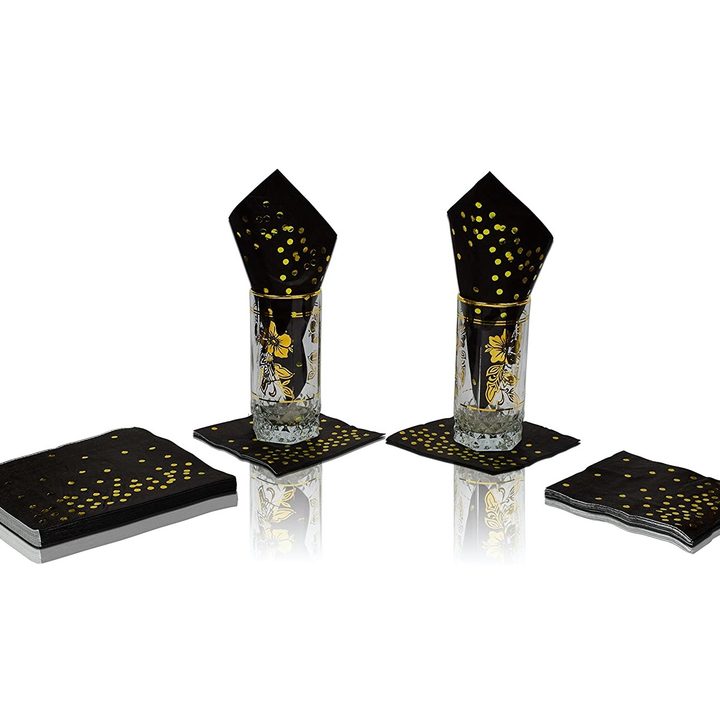
What’s a top-notch napkin? How about a three-ply black one stamped with sparkly gold-foil polka dots? That describes TROLIR Cocktail Napkins, which are designed to be sturdy and well-absorbing. They are produced from virgin wood pulp with food-grade ink.

Crisky Wedding Napkins

Best for weddings

Image used with permission by copyright holder

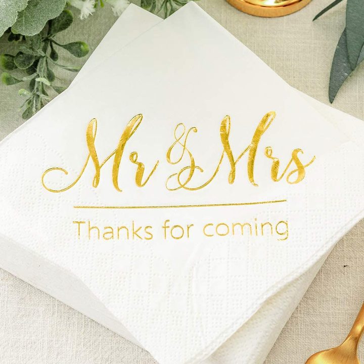
Weddings require festive and memorable cocktail napkins. That aptly describes Crisky Wedding Napkins, a top choice after tying the knot. The 100-count napkins can be printed with an attractive “Mr. and Mrs. Thanks for Coming” message to acknowledge guests.

Perfect Stix 1Ply Cocktail Napkins

Best value

Image used with permission by copyright holder

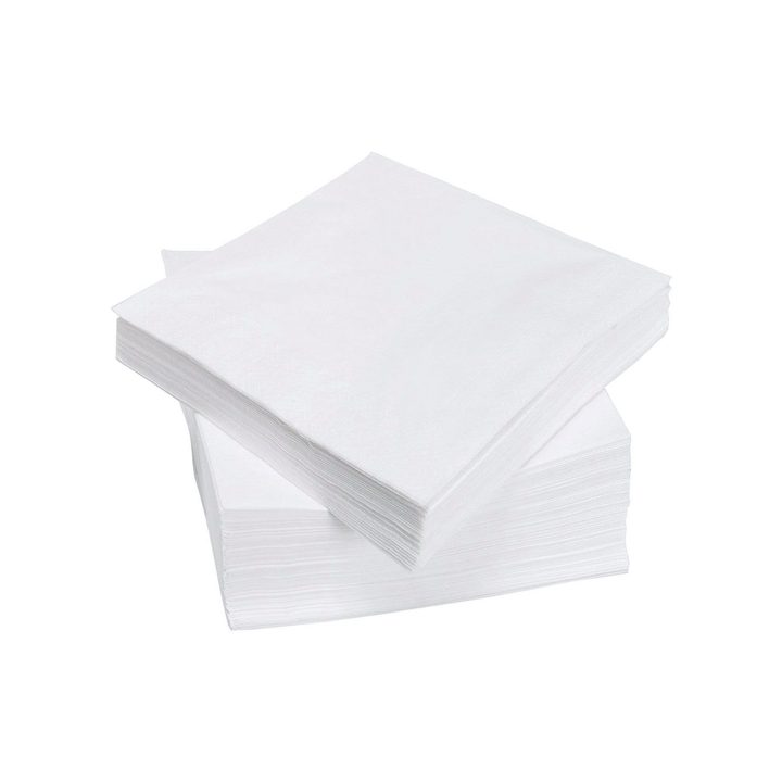
Weddings and parties can be expensive to put on. To rein in expenses, get an affordable cocktail napkin. Perfect Stix Cocktail Napkins are just that. Available in packs of 500, they’re ideal for big parties or large gatherings of any kind.

Cocktail napkins might not seem like a big consideration when planning a wedding, party, or large gathering, but they play an important role while serving as a coaster or additional decoration. Consider these cocktail napkins when you’re seeking the perfect addition to your event.

The Easiest Way to Set the Table
Cutlery, Fork, Spoon

Have you ever wondered why the fork sits on the left and the knife on the right? Or why Europeans eat “Continental style,” holding the fork in their left hand and the knife in their right, while Americans cut, switch hands, and then eat? It turns out there’s a reason for all of it, and once you understand the history, setting the table suddenly feels far less mysterious. Before beautifully layered place settings and Pinterest-worthy tablescapes, dining was far more practical. Medieval feasts were less about etiquette and more about survival. Plates were often shared, forks were nonexistent, and eating with your hands was the normal standard. Tables were filled with trenchers (pieces of bread used as plates), and the idea of “proper placement” simply didn’t exist.

By the mid-to-late 1800s (around 1860–1870), European dining evolved again as meals began to be served in courses. This shift introduced what became known as the Russian style of dining, where utensils were laid out intentionally and used from the outside in. The fork stayed in the left hand, the knife in the right, and the table itself began to reflect structure, rhythm, and order. This approach eventually became the “Continental style” still used across much of Europe today.

Read more
5 tips to de-clutter your kitchen for the holidays
kitchen holiday

'Tis the season for holiday gatherings, which means your kitchen needs to be organized to avoid unnecessary stress. Here are some handy tips to follow.

1. Refresh your fridge and freezer

Read more
Color Drenching: The bold hue movement that is sticking around in 2026
Green living room walls with velvet green sofas

What is color drenching?Color drenching is an interior design trend where a single color is used on every surface in a room. This includes walls, trim, doors, and even the ceiling, creating a cohesive and immersive atmosphere. The technique can make a small room feel larger or a spacious room feel cozier, and it often extends to furniture, radiators, and cabinetry for a bold, unified effect.

While the term color drenching is relatively new, the concept has deep roots in design history. The look can be traced to historic European interiors where monochromatic schemes added depth and luxury. Even in the Victorian era, richly saturated jewel tones were often used in grand spaces such as libraries and parlors. It reappeared during the 1960's and 1970's as well. Designers have long understood that a single, enveloping hue can create a striking sense of mood and continuity.

Read more