
Fine, we’ll say it: The new HomePod mini colors are absolutely hideous

Today, Apple announced a slew of new products with significant updates to its MacBook lineup, interesting new chipsets for those computers, and new AirPods. Apple also announced new colors of its incredibly popular HomePod mini, and despite what our friends at sister-site Digital Trends think, we say two of the new colors are simply dreadful.

Keep in mind the new colors aren’t fronting new components. It doesn’t seem as though Apple upgraded the speakers or chipset found in its HomePod. Rather, the Cupertino-based company is wrapping the HomePod mini in some new colors in an effect to resurface it in the news.

Recommended Videos

So, here we are. Let’s give Apple what it wants and talk about the new HomePod mini colors.

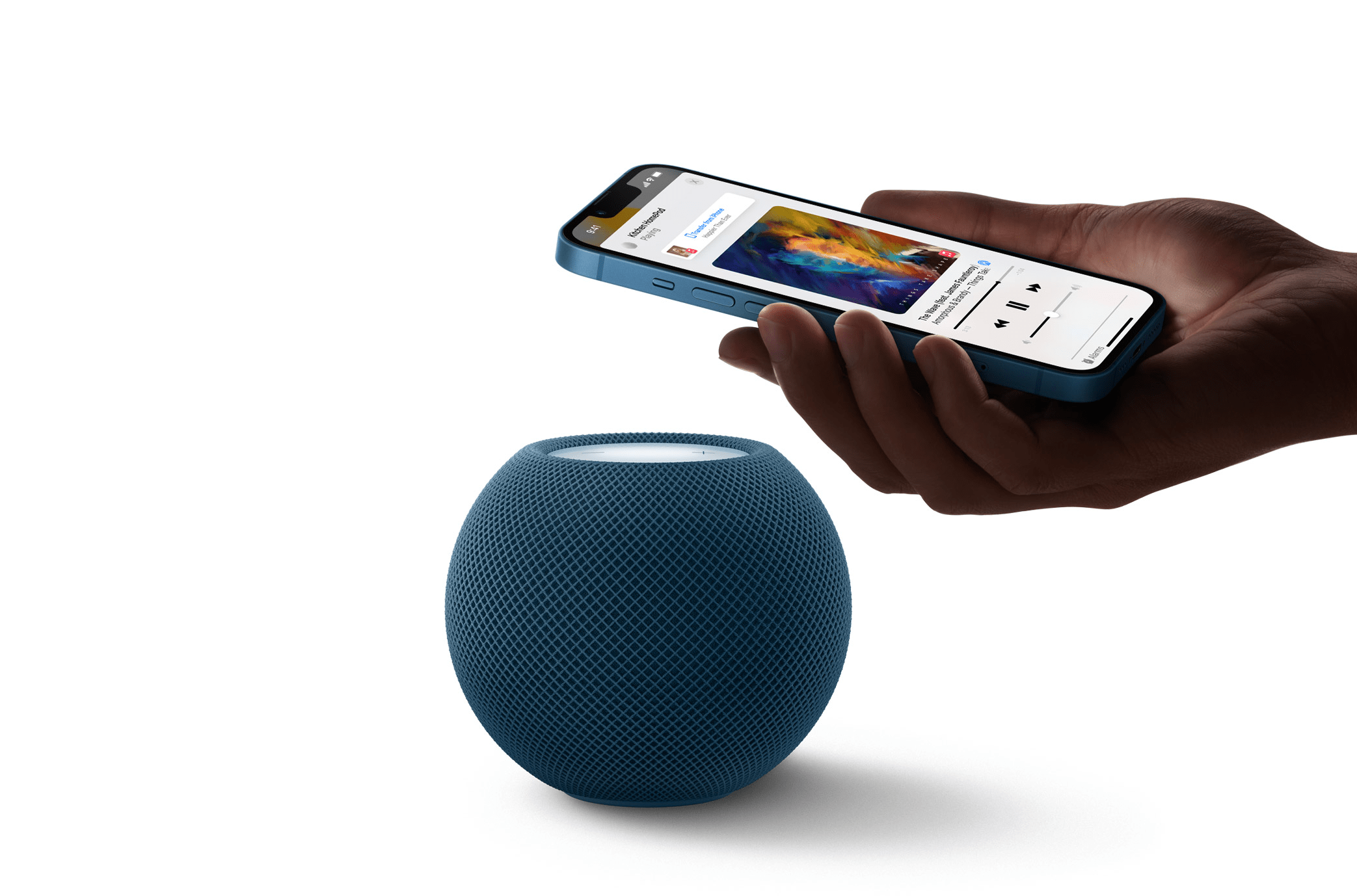
In addition to the black and white HomePod mini already launched, Apple has introduced a sort-of-midnight-blue, bright yellow, and day-glow orange. The only passable color here is blue, which can make itself at home in so many ways. While we’ve not seen it firsthand yet, the choice of blue here is classy, refined, elegant, and would go great with a lot of room-scapes. Good job, Apple.

Yellow and orange, though? Not so much. We can make the argument neither will go with the color of the year for 2022, which is a modest green, but that would be misguided. Apple makes choices on its products months (if not years) in advance. It definitely didn’t account for the design cues other brands would announce.

When HomePod mini colors match devices people actually have, it’s pretty special Image used with permission by copyright holder

Still, we wonder who Apple did consult, if anyone, for yellow and orange HomePods. Neither color is a fit for any modern design trend, and would simply look jarring in most rooms. Both seem to be products you buy on a whim in the store because they are new and fun, then regret hours later once you see them in your home.

It’s a bit of a tragedy, too, because the HomePod mini is a sensational product. Siri is smarter than ever, and HomeKit is our favorite smart home platform. We also bet those most interested in the HomePod mini have iPhones, iPads, MacBooks, and the Apple Watch. We concede the new HomePod mini colors coincide with two new iMac colors but ask yourself if you want an entire home office awash in orange or yellow. More to the point, why wouldn’t Apple release more HomePod mini colors if this was the plan?

And hey – why not red, or some sort of rose gold? If we’re trying to match device colors, why doesn’t HomePod mini match options for other devices? More people have iPhones than iMacs, that’s for sure. (At least the pretty-alright-new-blue-HomePod-mini matches the new iPhone Pro blue.)

Where a small yellow or orange orb fits into the home we just don’t know. These colors are bad and Apple should feel bad about them. Let’s just hope this is some sort of clumsy test and we’ll get some interesting and beautiful options next year.

Until then, stick with black and white – or give blue a shot.

Nate Swanner
Former Digital Trends Contributor
Nate is General Manager for all not-Digital-Trends properties at DTMG, including The Manual, Digital Trends en Espanol…
These are the colors that go with green: Design your home around this hue
What color complements green? Here are some amazing options
Green living room with gold accent pieces

The color we're talking about today is rich and vivid green. Several well-renowned paint companies like Sherwin-Williams, Behr, and Glidden have named different shades of green the color of the year. A natural and lively color, green is peaceful, luxe, and vibrant, making it the perfect new addition to your space.

With its delicate ties to nature, this color is the perfect addition to home design and will have you considering switching up your existing theme. Whether you want to revamp your kitchen, dining space, bedroom, or bathroom, green is a versatile tone with several complementary color combinations.

Read more
7 things designers say everyone gets wrong about rustic farmhouse style
Expert tips to avoid kitsch and instead curate a sophisticated design
Rustic farmhouse dining room with a dog

Rustic farmhouse design has been incredibly popular for quite a while now. And while some predict that the trend is on its way out, the aesthetic still dominates both cozy apartments and spacious homes. To get the lowdown on rustic farmhouse interior design, we spoke to Saloni Ingle, an interior design architect at Nitido Design, and Anna Franklin, an interior designer at Stone House Collective. Here’s what the two experts said everyone gets wrong about the design style.

Assuming rustic can’t be sophisticated
There’s a specific image that comes to mind when people picture a rustic farmhouse home. “People often assume that a rustic farmhouse design is all burlap, roosters, and quirky decor that only belongs in rural or country homes,” Franklin said.

Read more
The best greige paint colors that will completely refresh your home
Try these greige paint colors for a change of scenery
Greige living room with brick wall

In the realm of interior design, finding the perfect neutral hue can transform a space from ordinary to extraordinary. Greige, a sophisticated blend of gray and beige, has emerged as a timeless favorite for its ability to effortlessly complement a variety of styles and aesthetics.

Whether used as a wall color, trim accent, or foundation for decor, greige offers a subtle yet elegant backdrop that enhances any room. If you’re searching for the best greige paint colors, we’ve got you covered! Keep reading to find out why it’s a great color, how best to use it, and some of our favorite greige paints.

Read more