Your living room sets up the mood for the rest of the interior. Is it urban chic, traditional, minimalist, or neutral so it can flow into color in the next rooms? Homeowners gravitate to the tried-and-true colors — they may be lighter or darker — but certain colors don’t ever get outdated. How do you choose the paint color for the living room?
There are a number of things to consider including size of the room, windows, the transition to the next room and if there’s a focal point you need to concentrate on.
First the colors
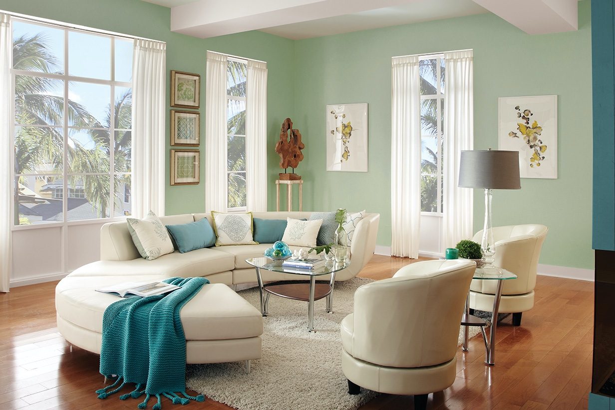
Green is the color of harmony, renewal, and it is good anywhere. It’s the perfect option if you find neutrals a little too unimaginative. Gray is gracious, elegant, serene, and provides a great backdrop for vintage decor. Gray is like if blue became more businesslike, it would be gray.
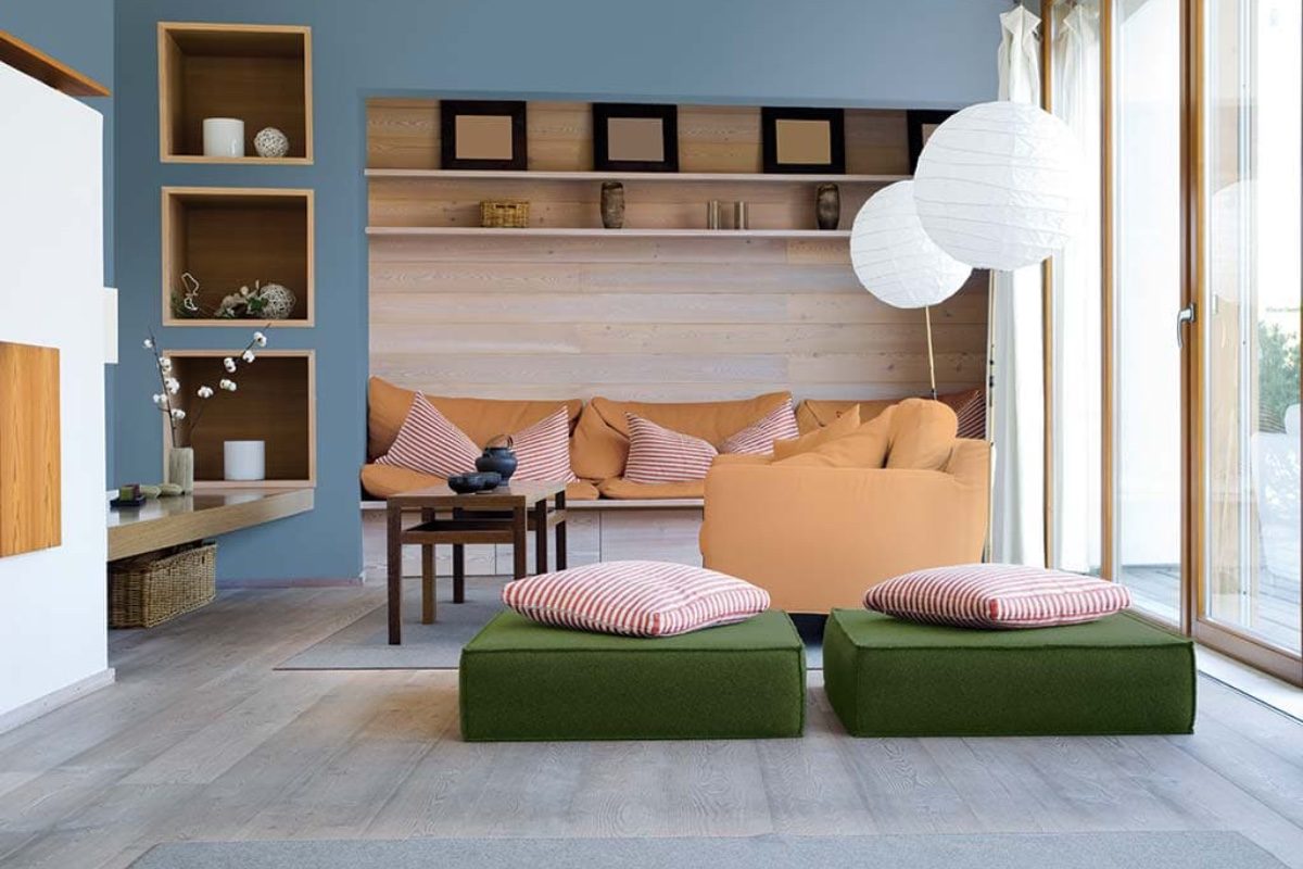
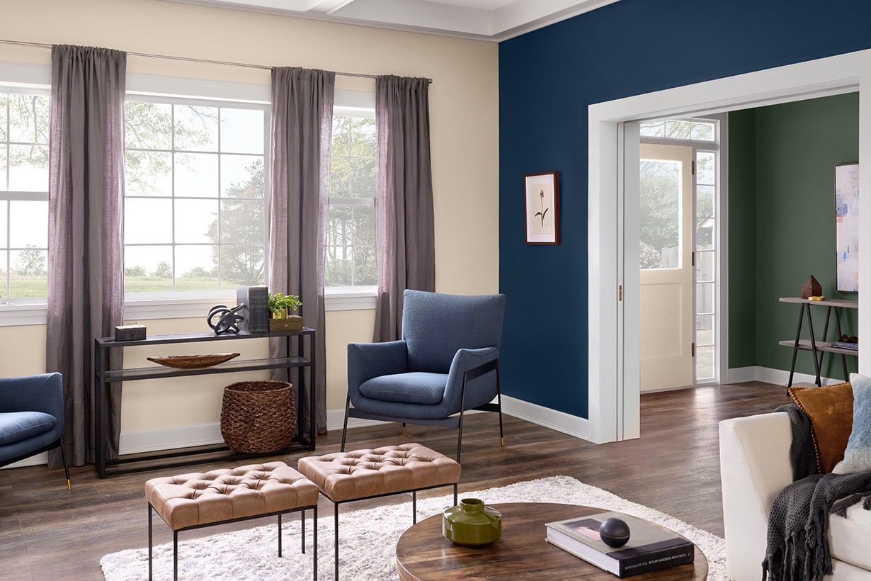
Blue is America’s favorite color. It is a stabilizing, calming color, and it goes well with neutrals like brown and cream.
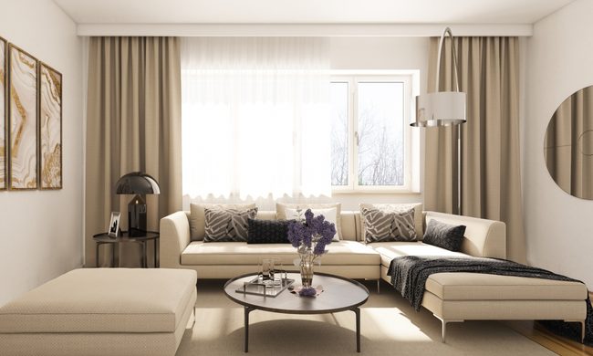
Beige is that color designers go back to again and again. It is perfect for the minimalist look, but it can be layered with organic touches like textured throws, pillows, rattan floor coverings, and wicker to bring it to a whole new level.
If you are going for the drama — black is your go-to color for the living room. It draws your attention to the architectural detail of the room because black adds dramatic shadows. It is unexpected, sophisticated, and elegant.
Yellow has been popular since the Colonial times. It has a formal vibe and looks good in any room.
Red is rich and formal, good for a den or a masculine office space.
Orange is happy and relaxing. It is an “informal” living room option.
Brown with red undertones is relaxing, too. It’s an easy color to be around. Dark brown is more formal and refined.
Purple is an eclectic choice and feels very luxurious. Use neutral accessories with a pop of green or black.
Some pairings
There are a multitude of unique wall color combinations that will transform any space into whatever vibe you’re going for. Beige and green or peach and green will make the living room pop. Paint the walls beige and use green drapes, throws, and other textile accents in green. Paint the walls green and bring in a peachy sofa, print chairs with a hint of green in the print, and an area rug that has both colors.
Navy blue and white is calm, crisp, and clean. With dark blue walls, use white furniture and furnishings. Navy and white is also a great option for bathrooms.
Orange and white makes everyone happy. Use white or gray furniture and accessories with this combination.
You can’t go wrong with black and white. It’s a no-fail combination. Use raw wood accents, natural wood, and terra-cotta to warm the space up.
Let’s look at the space
If it’s a small living room, neutrals are going to make it seem more spacious. Neutrals provide a blank canvas to display dramatic artwork and furnishings.
The lighter wall colors move your eye around, so the room will seem bigger.
If most of your room furnishing are neutral, however, you can and should go with a more vivid color on the walls.
Your color choices also might be dependent on where the windows are in the room. If the room gets lots of sunlight, it can handle a darker color. Lighter colors would tend to wash out. If the windows face north, you can paint a cozy space with warm colors.
You can add design interest and drama without overwhelming the room with an accent wall. Pick a wall that makes sense. If the fireplace with its beautiful stone or tile and hearth is the focal point of a wall, and there’s nothing else there — that’s a good candidate for an accent wall.
The remaining walls can be painted a lighter version of the accent color.
It makes no sense to make a wall with a lot of windows or doors an accent wall. Not only will you have to tape and paint around those obstacles, the idea of an accent is diluted by all the breaks in the area.
Several of the paint companies have visualizers where you can take a picture or pan the space and try out several different colors with your furnishings. An empty room is a blank canvas, and sometimes it helps to bring your chair, a couch cushion, and some accessories in after you’ve painted a block of color on the wall while you are trying to make your decision. Do make sure if you paint several colors on the wall to decide which you are going to pick that you look at them at different times of the day. Also, you can check our satin vs. eggshell paint guide to decide on the right finish for your living room.