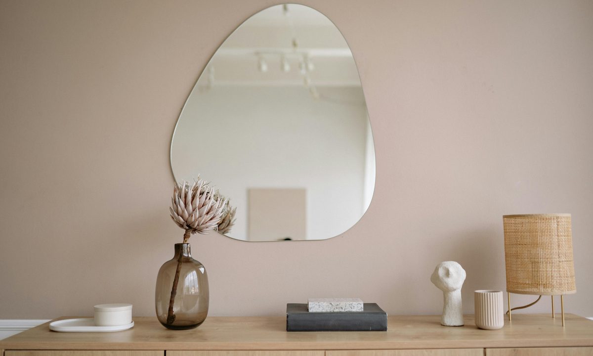
With a range of dark and light shades to choose from, taupe is a versatile color fit for sleek wall tones, soothing accents throughout the room, or simple shades on furniture. While some people avoid this neutral tone, worried that it will appear drab or dull in their spaces, knowing how to use taupe in your home design will help you best take advantage of this stunning neutral color. And whether you love this hue or not, knowing what colors go with taupe can aid you in choosing the right tones for your color palette, especially if you need a gorgeous neutral backdrop.
So, if you love taupe or are eager to incorporate it into your design, then we have a few tips for you. Below are some of the best complementary shades for taupe, as well as the most striking ways to style it in your home.
What color is taupe?
A common question that homeowners often ask is, “Is taupe brown or gray?” And while it may sound confusing, the simple answer is that it is a bit of both. Taupe is a blend of both brown and gray tones, similar to what many designers call “greige.” However, greige is much lighter than taupe, which typically has a heavier undertone of brown. Taupe is also more than a single shade. It can appear colder or warmer depending on the hue, saturation, and other colors nearby that influence how it looks.
What colors go with taupe?
Since taupe can range from cooler and lighter brown-gray tones to darker, warmer shades, this color can often be a challenge to decorate with. Luckily, taupe’s versatility creates plenty of opportunities to find color combinations that create stunning palettes.
Does gray go with taupe?
Gray is an excellent accompaniment to taupe. Some may be concerned that these colors look too similar to work well in the same color palette, but these two hues are commonplace in traditional, modern, and minimal designs. When using taupe and gray together in the same palette, try using warmer taupe tones, like those with green or rich brown undertones. Then, choose a darker charcoal gray or a warm, true gray for the accents.
Is brown a good color pairing for taupe?
If you prefer a warmer look, include a rich brown shade in your taupe-based palette, using brown hues with red or orange undertones for extra warmth. Yellow browns can also bring out the subtle gray and green undertones of taupe. For a 1970s boho aesthetic, use an orange or red-based brown to add a touch of vibrancy. Softer browns and muted taupes can also be fantastic, particularly for more traditional design aesthetics.
Is black or white a better pairing for taupe?
Black and white are both common accent tones paired with taupe in a color palette. Black offers a moody, sophisticated look, while white helps to brighten and freshen up a taupe design. Depending on the room and aesthetic you’re going for, both can be fabulous options.
When using black with taupe:
- Add black through metal accents
- Use other metallics like copper to create a luxe appeal
- Keep the other colors in the palette moody
- Avoid adding too much black. Instead, let the taupe be the dominant color
- Use black and taupe in bedrooms, dining rooms, and bathrooms
When using white with taupe:
- Use wall trim and wainscoting to introduce white to a taupe-based palette
- White furniture can also look great with taupe
- You might choose to add more white and use taupe as an accent color
- White and taupe are best paired in kitchens, living rooms, and entryways where you want a brighter, lighter look.
Can blue and taupe go together?
Blue is a bolder pairing for taupe, as the neutrality of taupe balances the excitement of bright blue. Cool, muted taupe hues look beautiful alongside a rich royal or navy blue, whereas warmer taupe tones look best beside pale blues like periwinkle and seafoam shades. When using blue and taupe together, it’s best to use taupe as the base color, then add blue accents throughout the space. This adds sophistication without detracting from the subtle beauty of the taupe, creating a beachy aesthetic that brings the seaside right into your own home.
How to use taupe in your home design
Once you’ve chosen the hues for your color palette, it’s time to incorporate them throughout the space. Below are some inspiring ways to bring taupe to your home.
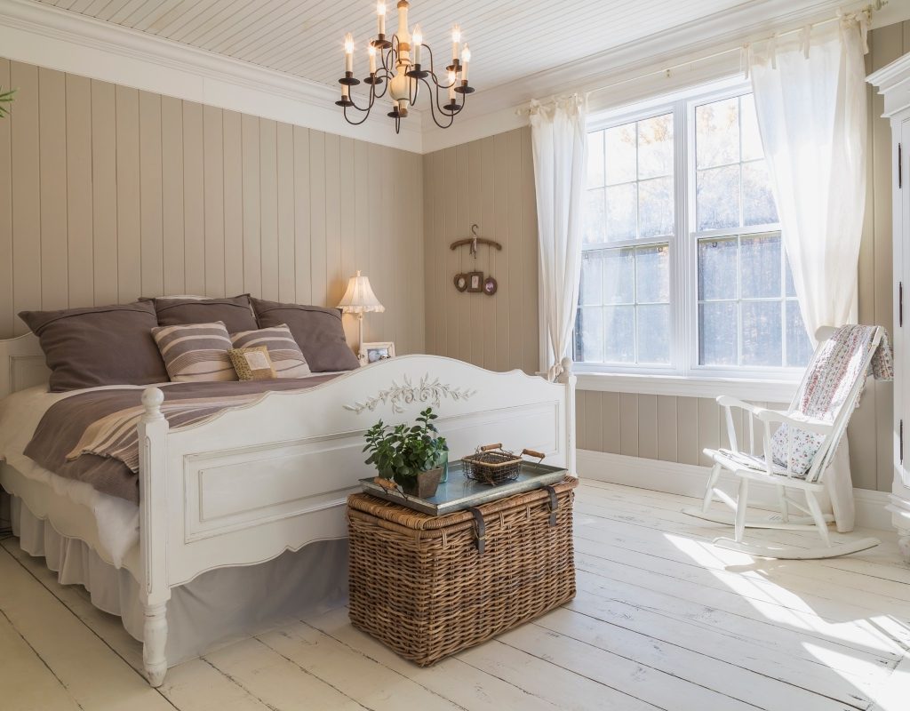
Pair it with rich neutrals
As mentioned above, taupe looks very boho-chic when paired with rich and warm neutrals. You can’t go wrong with strong accents of deep reddish-brown so, for a contemporary monochromatic look, experiment with including various shades of earthy and rustic browns in your decor. Whether you’re decorating an office, bedroom, or common space, this style is sure to bring a luxe maturity to the space.
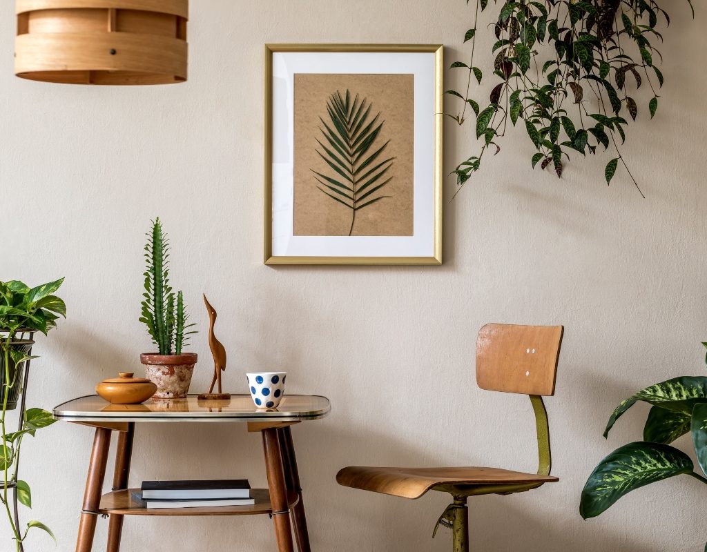
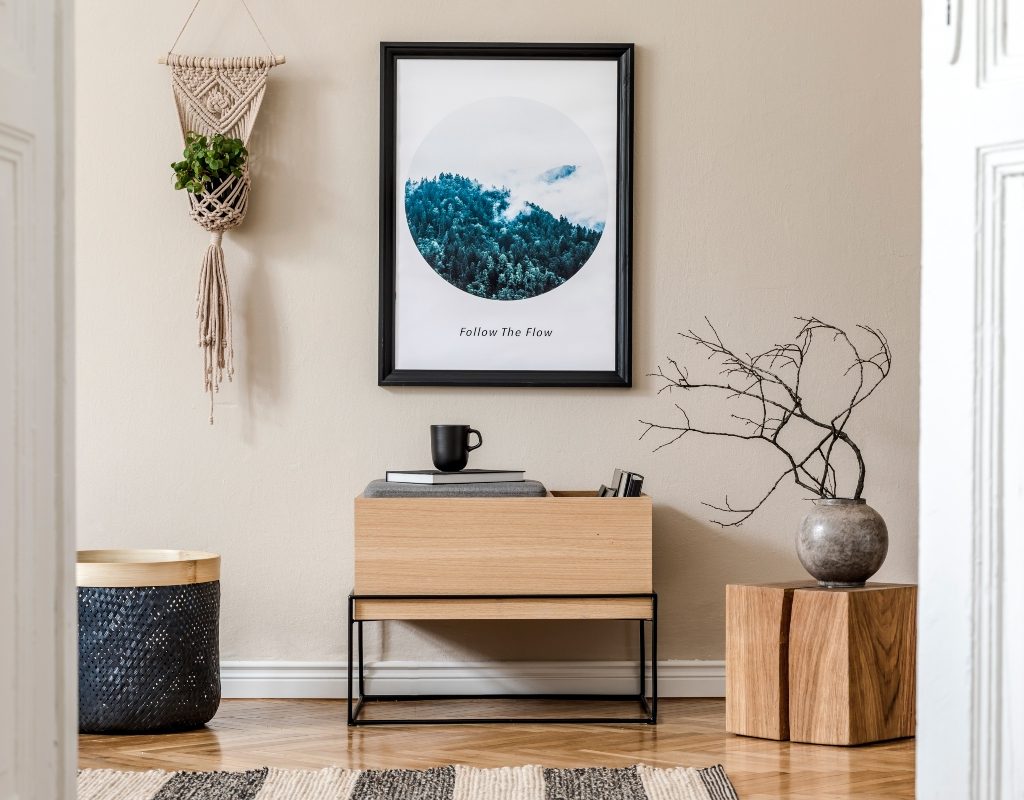
Add lush green decor
Since taupe is a neutral tone, it can look a little boring without a bold accent. To bring this shade to life, spruce up the look with lush tones, incorporating vivid green plants, dark emerald accents, and olive shades. If you’re working with a cool-toned taupe, try adding sage or olive green accents to the space and use gold metallic details to bring a sense of luxury. Or, use dark jewel tones like emerald green, rich red-brown shades, and black accents to decorate a mature study or lounge.
Use light-colored curtains
One question many homeowners ask is, “What color curtains look best with taupe?” Understandably, there’s a concern that white window trimmings may wash out the walls, and dark curtains won’t pop against the neutral hue. That being said, taupe works well with other neutral, light colors like whites, creams, and soft browns, but we recommend choosing fabrics with a little bit of color, like pastel blue or mint green. Keep the curtains light and airy rather than opting for room-darkening or bulky fabrics. This elevates the look of the taupe and adds a gentle touch to the design.
Which metal accents go with taupe?
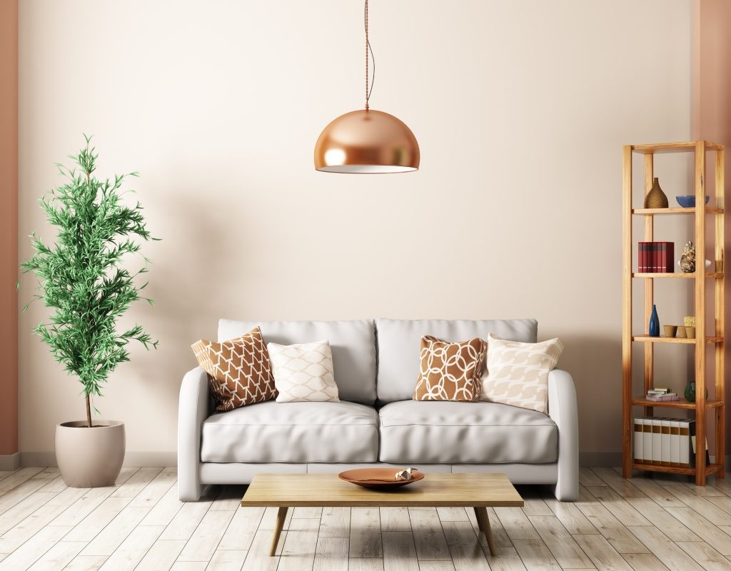
Metal accents can look fantastic with taupe. As a neutral tone, taupe will greatly benefit from shinier metals, which add a hint of elegance and luxury to the palette. Typically, warmer metallic tones like copper, bronze, and gold will pair better with taupe. This is because they heighten and accentuate the already warm nature of taupe, bringing more vibrancy to your space. Use warm wood tones in conjunction with flashier metallic accents to best take advantage of a taupe background.
Taupe is a versatile neutral, and its flexibility enables homeowners to create an elegant and sophisticated look with this muted hue. Just remember to lean into bolder, warmer, and flashier tones so you can enhance taupe’s natural look. Whether you want to use taupe as a background color or create an organic and monochromatic look, this color is fantastic for achieving a calm and luxe aesthetic.