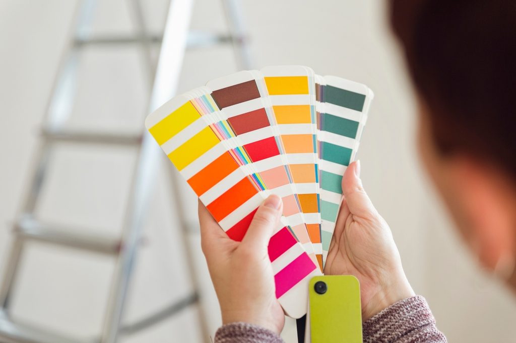
It’s easy to spend hours in the paint section of a home improvement store, flipping through endless swatches to find a good color combination. You want the colors you choose to be the perfect color combo while still reflecting your style and personality. However, this time-consuming activity may leave you feeling defeated during your remodel. That’s why designers like @whataboutdesign on TikTok have color combinations you don’t want to miss.
@whataboutdesign A small inspiration for yoz home ❤️ #interiordesign #interiorinspiration #decoration #interiordecor #interiortip #design #homedesigntips
Fresh and modern
If you want cool colors that offer a fresh and modern palette for your home, you can’t go wrong with sage and white. Sage green is crisp, natural, and adds a hint of biophilia to any space without being overwhelming, while white adds a light touch. @whataboutdesign shows off some modern looks with sage green walls, painting with a unique wavy pattern, and cozy eggshell white furniture that keeps the room looking minimal and clean. The second photo also proves how this color combo can look fantastic in kitchens, especially when you want to take advantage of vintage and retro styles in an updated way.
Earthy and organic
Stucco and brass may be the perfect color combination for lovers of Japandi and Scandi designs. These interior aesthetics favor an earthy, organic look that feels luxe, warm, and grounded. The designer shares a stunning bar space with stucco textures, slatted walls, curved furniture, and plenty of brass accents to show off how beautiful this pairing can be. These tones are great for accompanying stone sinks in bathrooms (as seen in the TikTok video) or any other natural and organic decor, such as handmade pottery, warm-toned tile flooring, or concrete features.
Moody and regal
If you prefer a moodier color palette, a masculine touch, or a hint of regality, then white and burgundy may be the color scheme for you. The video shows that an all-white kitchen with a burgundy center island, accented by leather bar stools and copper decor, can look simple, full of depth, and ultra-luxe. Burgundy is a rich and dark tone, perfect for making a space feel luxe and cozy. This makes the hue great for rooms where intimacy and warmth are a must. Aside from kitchens, try a dark burgundy wall in the bathroom for a sultry look. White accents help brighten the space and prevent it from feeling too heavy, while the burgundy gives the room an elegant and mysterious feel.
Sometimes opting for simplicity is the best choice when working with color combinations. These color schemes feature a cool or light base like white or stucco with a splash of color that enhances the mood you wish to bring to the room. Consider trying one of these combos for a creative and gorgeous look in your home.