Before you can launch into your next remodel and start planning a new layout for your space, you need to decide on the color palettes. Color can have a great impact on the aesthetic of the space, and it can even impact the mood of the people in the room. For this reason, deciding on your home’s color scheme can be tricky. You want something fresh and lively that doesn’t look too dated or so trendy that you’ll get sick of it in a few weeks.
If you’re overwhelmed in the paint aisle of your local home improvement store, make it easier on yourself and choose one of these fan-favorite color designs.
Start small

Start small, picking one color that you truly love and designing the space around that. Whether you want this hue to be the primary color or just an accent, it gives you a good starting point. Similarly, you can also pull inspiration from a statement piece of furniture or wall art. By picking one aspect as the anchor of your design, you can narrow your options and ensure your design is clean, simple, and focused.
To give yourself a little more room to work with, expand from focusing on one color to designing a palette with three hues in mind. We recommend choosing one as a base color and using the other two as accents. While some designers favor bright, attention-grabbing pops of color, you can still add color and interest with muted shades of grey, forest green, or navy.
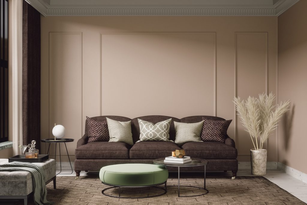
Opt for monochromatic
Monochromatic designs are becoming increasingly popular, especially in more contemporary homes. Decorating a home with one color may sound a little dull, but if you fill the space with different textures, shapes, and patterns, it can become a very striking look. To add a little dimension, it’s also best to pick about three slightly different shades of the same color. While neutrals like white, cream, black, and grey are many designers’ go-to shades, you can add a little more excitement by filling your home with blues, greens, and violets.
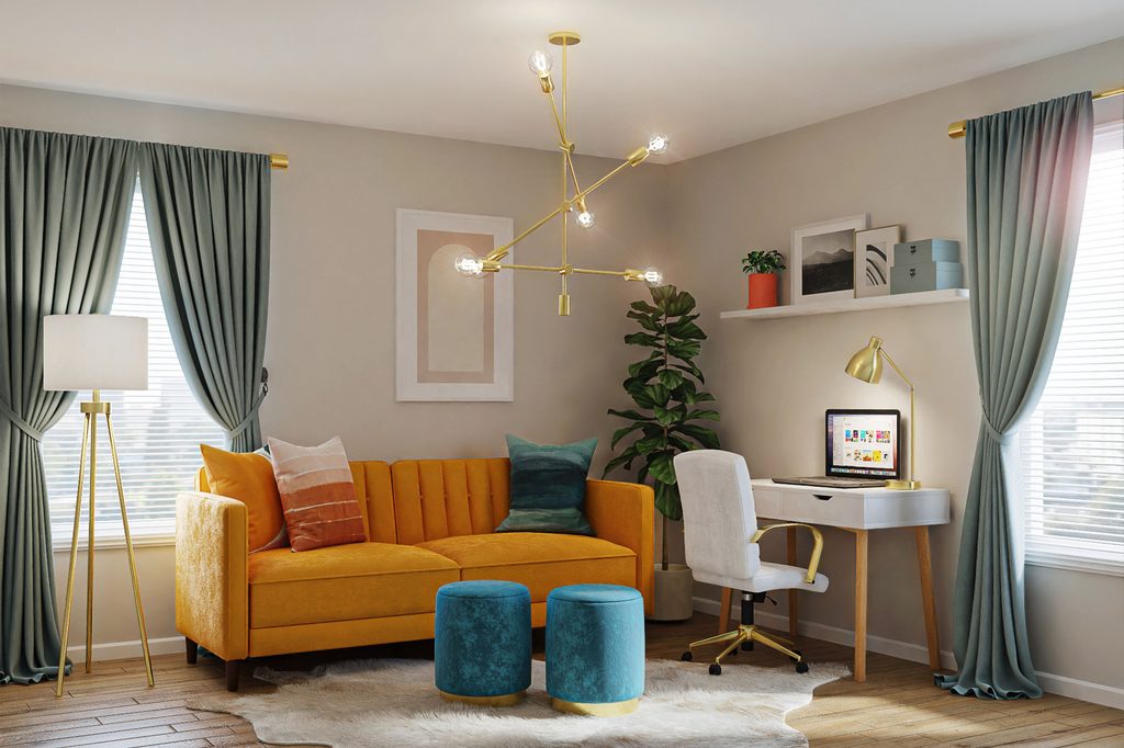
Complementary colors always look fresh
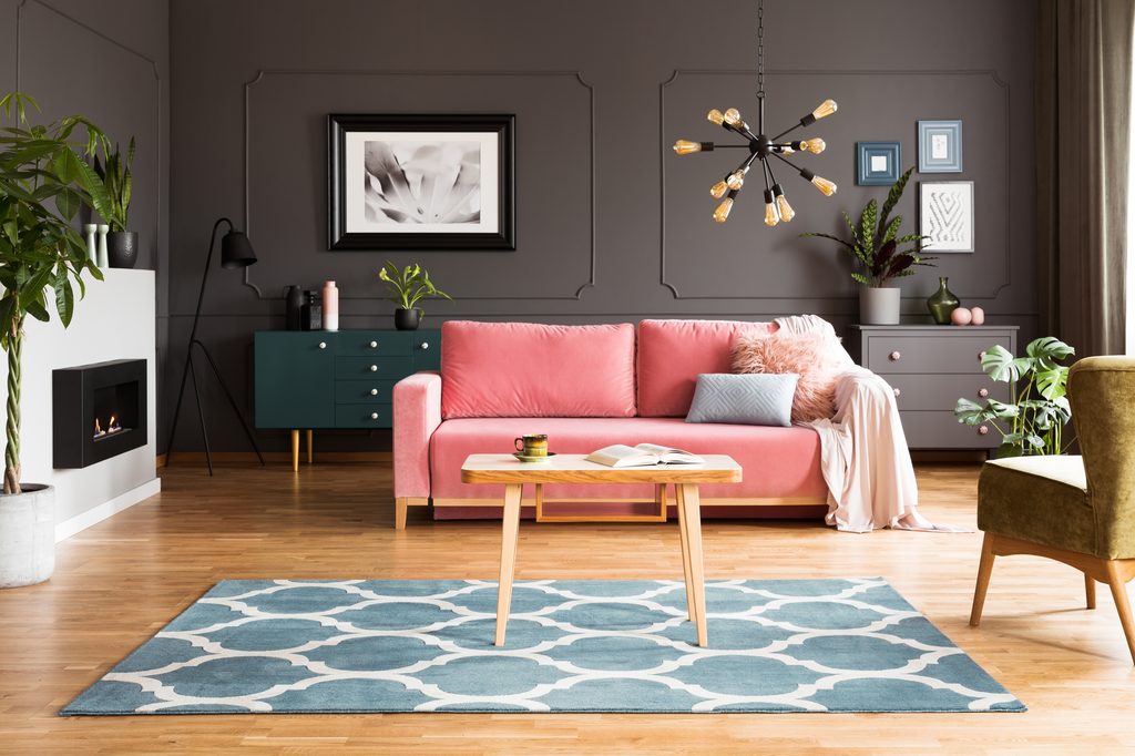
Complementary colors, like red and green, purple and orange, or blue and yellow, are opposite each other on the color wheel. When placed next to each other, they create an eye-catching contrast. For modern and eclectic homes, brighter complementary colors match the youthful, fun style, so consider accenting the space with true blue and bright yellow. On the other hand, traditional styles look best with more muted options like soft sky blue and pale yellow.
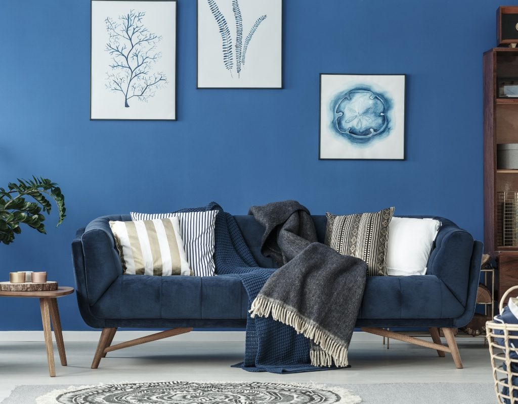
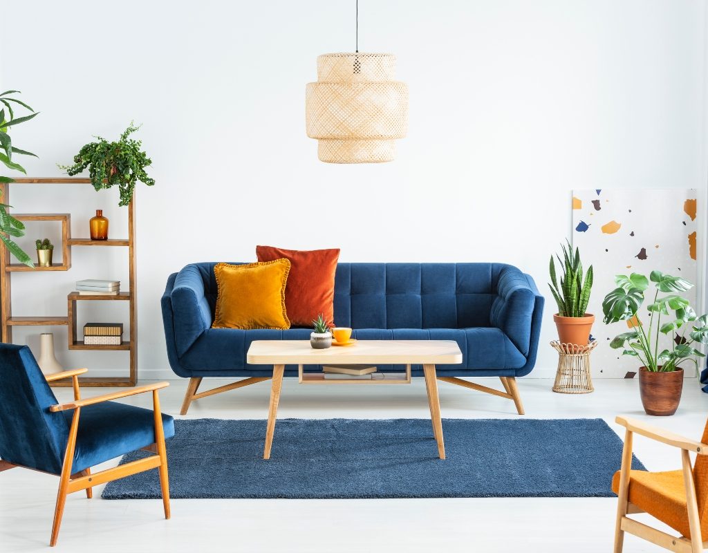
Analogous shades can be exciting
Analogous colors refer to shades that are adjacent to each other on the color wheel. In the 1970s, analogous shades were a popular choice, as this psychedelic era favored pairing red, orange, and yellow together for a rich, vibrant look. Moody, luxurious spaces, on the other hand, look great with deep purples and blues.
Triadic colors have a modern edge
Triadic palettes are made up of three colors that are equally distant from one another on the color wheel, forming the shape of a triangle. The primary colors (red, yellow, and blue) are triadic colors, but so are pink, orange, and light blue. This way, you can add various colors to your room, and you don’t have to worry about them clashing. As long as you stick to the triadic color pattern, it will look bold and smartly designed.
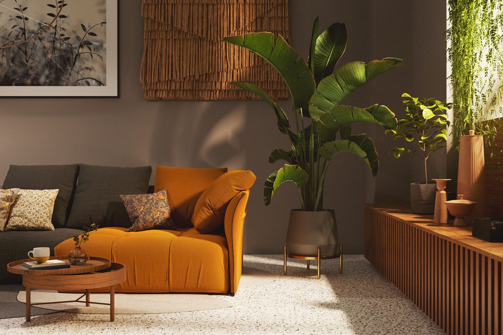
Split-complementary works for adventurous decorators
Split-complementary schemes use a base color and the two colors adjacent to the base’s direct complementary. For example, if your base color is blood orange, the complementary color will be teal. The two colors adjacent to teal are blue and green. Thus, your split-complementary palette will be blood orange, blue, and green. Unlike monochromatic or complementary palettes, this style allows for more opportunities to create vivid and distinctive designs.
Tetradic is a spin on triadic
Tetradic colors are similar to triadic ones, except this palette involves four colors rather than three, all of which are equidistant from one another. For example, you can style a room with green, light orange, red, and deep violet. Because of the inclusion of so many hues, this style looks great in eclectic spaces. You can make the room look full and exciting using a variety of colors that are aesthetically pleasing.
Warm vs. cool tones: Which is best for you?
As you create your color scheme, consider whether you prefer warm or cool tones. The hues on your flooring and walls will greatly influence which you choose for your space. Typically, a balance between cool and warm tones is best. For example, if you have a rich wood floor with hints of a red undertone, lift the palette by adding lighter, cool tones to your space. Alternatively, a cool-toned bamboo floor might be better paired with a warm palette.
Consider your existing space and ask yourself whether it has warm or cool undertones. Warm tones are red, yellow, and orange, while cool tones are blue, green, and purple. While it is generally recommended that you balance cool and warm tones, you might also consider leaning to either extreme to create a unique look, as design styles like Scandi (cool tone) or Japandi (warm tone) aesthetics often do.
Choosing a color scheme for your space can be daunting if you aren’t sure where to start, so understanding the basics of color theory is a good place to begin. This way, you can choose one or two of your favorite colors and use the color wheel to determine which others will look best. Don’t be afraid to experiment with different shades and bolder color choices, either. After all, if you don’t like it, you can always head back to the drawing board and try again.