Kitchens remain one of the most popular home remodels of all time. If you’re planning to join that club this year, you’re probably looking through trends and classics, deciding what will look great and stay that way for a while.
Trends come and go, but there are a few forward-thinking colors you can choose for your kitchen that reflect your personality and won’t look massively dated in six months. Here’s our take on what experts think will be the biggest kitchen color trends this year and which ones may stand the test of time.
Black makes a statement
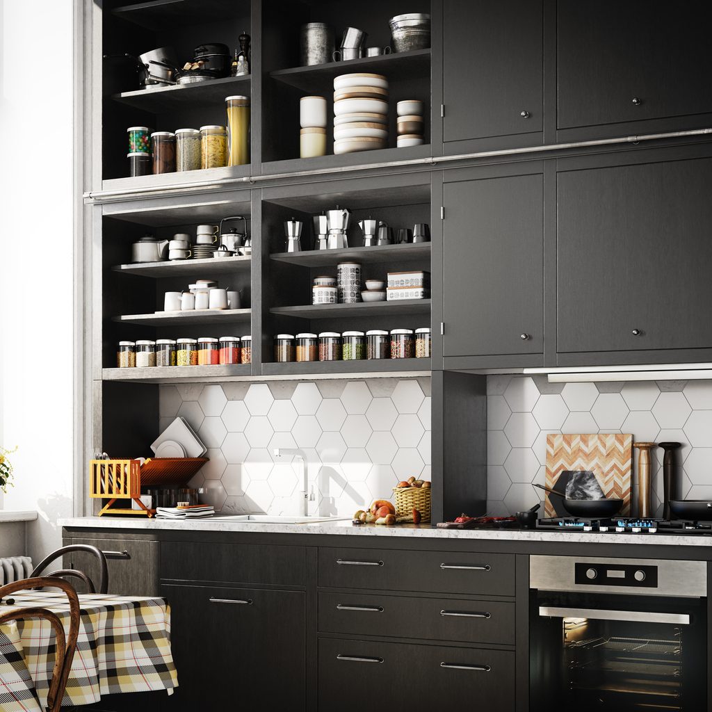
While a white kitchen will always have its place, designers lately have focused on the exact opposite of the all-white kitchen — matte black cabinets.
Matte black is a bold choice designed to offer some Old Hollywood glamour while hiding dirt, grime, and kitchen grease. They tend to be lower maintenance and can make your kitchen feel like high fashion rather than country charm.
If you aren’t feeling the commitment of black cabinets, there are ways you can get the same feeling without going all the way. Sherwin-Williams’ color of the year is currently Urbane Bronze, which delivers a dramatic, dark finish, coupled with an earthy, natural feel that delivers warmth.
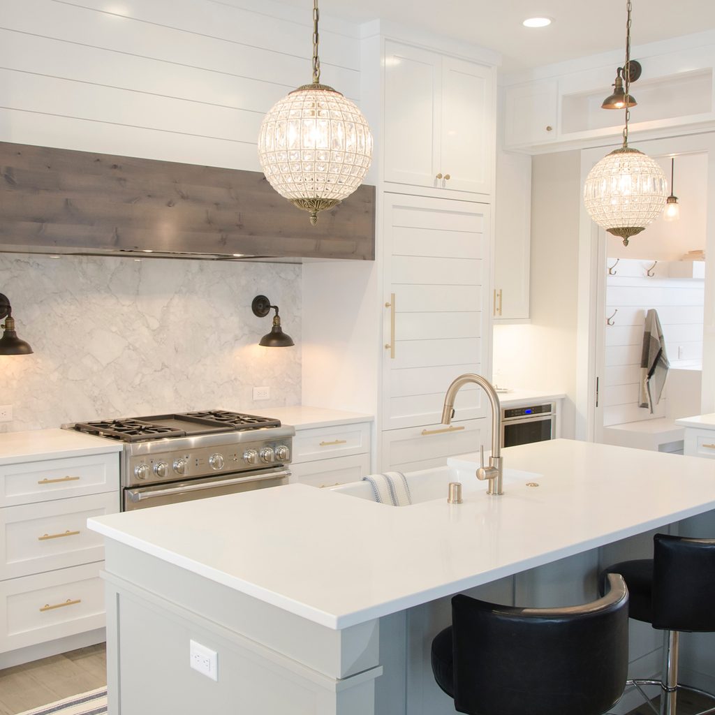
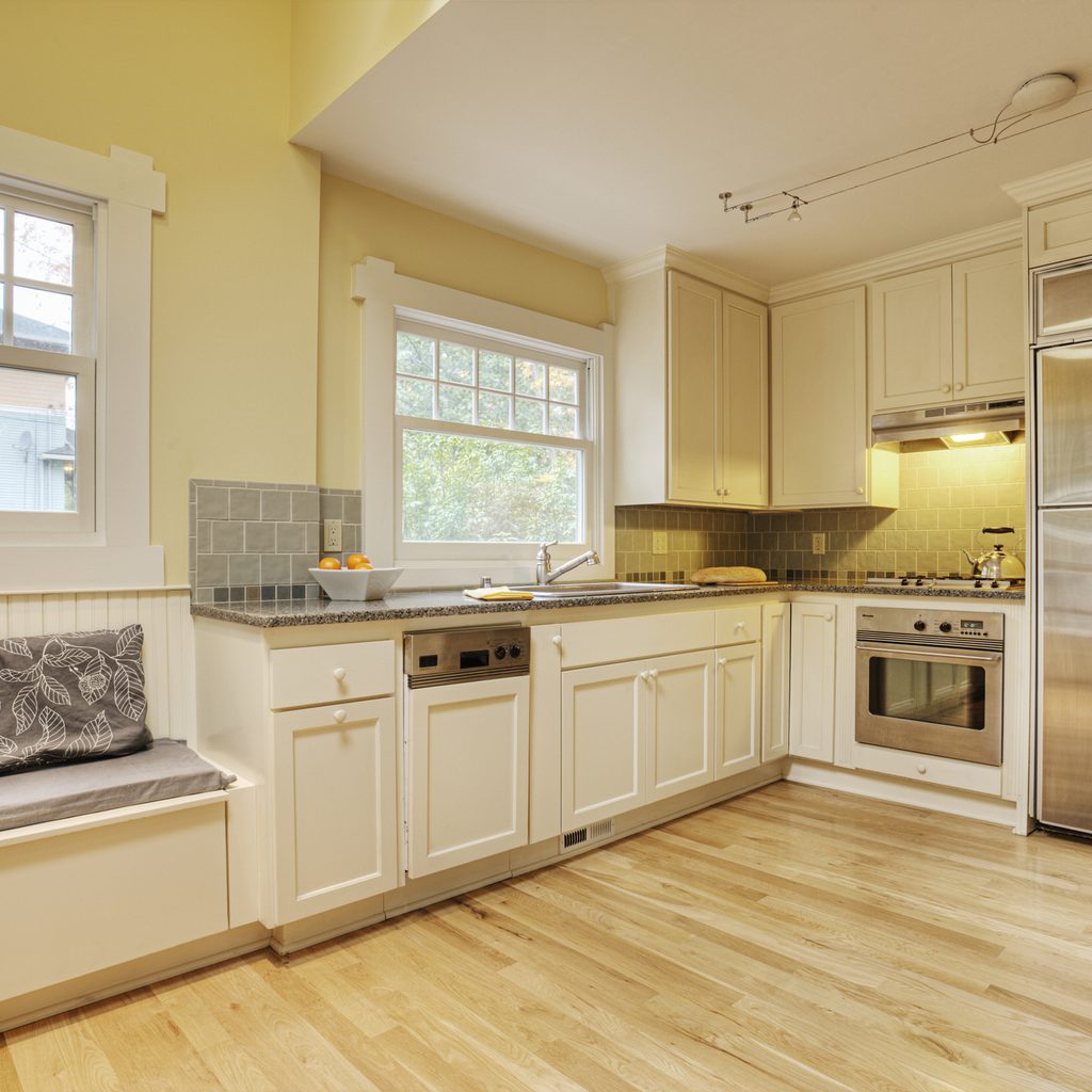
Still dreaming of white?
If you love the idea of an all-white kitchen but want something more trendsetting, you can achieve the same look without committing to a trend that’s on its way out or waiting until it comes back in.
While consumers seem to be trending toward moody colors as a response to the all-white kitchen craze from a few years ago, not everything is dark. Taupe is finding its resurgence lately, as is cream. Both offer the airy feeling of white without being overly clinical.
Another option could be a perennial classic, sage. This silvery green harkens to colors in nature and is one of Restoration Hardware’s best-selling paint colors of all time. It looks great with a variety of accent colors and takes on light as well as dark spaces with flair.
Behr’s pick for color of the year, Canyon Dusk, delivers a grounding neutral that avoids being bland.
Go blue
Blue is a versatile color, but most shades have a calming, soothing effect. Benjamin Moore’s color of the year, Aegean Teal, is a blend of blue-green and gray that offers up the happy vibes of blue in a more muted shade that won’t feel out of place in a kitchen. Pair it with buttery yellows, off-whites, and creamy neutrals for the perfect combination.
Or, if you want to be a bit more daring, you could also take advantage of your kitchen’s layers to paint an island aqua or sky blue while keeping the rest neutral, or accenting a set of cabinets with the color. The leeway you have with what to paint no longer rests in using a uniform color throughout your kitchen — and you can deliver a retro feel without overwhelming the space.
Go warm
Trends are also moving away from the cold, minimalist, industrial finishes that have dominated design the last decade or so. Warm colors are making a comeback with plenty of gold and yellow to go around. These colors have an Old-World charm and can take your kitchen from a sparse, difficult-to-keep-clean space to something inviting and realistic.
Warm colors fulfill this shift because they can hide a lot — fingerprints, dust, and natural kitchen grime — without a massive tax on your daily labor. And since open-floor plans are also heading out, mimicking the kitchen spaces of old European apartments and country houses could be just the answer we need.
The most important? personality
Design has shifted a lot in the past decade or so to be less about what designers and the masses are looking for and more about what makes you feel good about your own space. The resurgence of anything-goes color schemes and finishes meant to stand up to the everyday lives of working professionals without live-in staff means you have a lot of leeway for what you love.
Look at the rest of your space and decide what design elements you already love. Is your living room a beautiful neutral that makes you feel good to be in the space? Chances are that carrying it over to your kitchen would produce the same effect.
Does neutral make you want to claw your eyes out? You don’t have to follow the taupe trend just because magazines are doing it. Choose a complementary color to what’s already in your space and go with it.
The ease of paint
Unlike a full kitchen renovation, paint colors are great for experimentation. Just a can of paint and a weekend can transform your kitchen from dull to fabulous with very little commitment. And if you find that you’ve made a mistake in your color choice, you can change it.
Color is a great way to experiment with the look and feel of your kitchen before you launch into massive remodels. And if you don’t own your space just yet, paint can be a way to make the kitchen yours without investing in something you can’t benefit from later.
These kitchen-color trends are great places to start when you’re thinking about your colors. However, take a good look at the things you love around your home and decide for yourself, not for trends. That’s the secret to excellent kitchen design.