There are plenty of “unspoken” rules when it comes to interior design. Over the years, certain trends have dominated the design landscape and have created a bit of a rule book for homeowners and designers looking to revamp their spaces. However, some interior design principles have become more limiting than inspiring. So, today we’re going to help you break out of the status quo by showing you just which design rules you need to ignore.
Assuming you can’t paint your ceiling
One of the basic interior design principles that has stood the test of time is the idea that you shouldn’t paint your ceiling a non-neutral color. Where this idea stemmed from is hard to pinpoint, but many people find painting their ceiling to be a terrifying endeavor! However, painting your ceiling with a bright color can actually add more depth and visual interest to your space. For example, suppose you paint your room a lovely terracotta shade. Rather than leaving your ceiling white, which might seem out of place in your color palette, try painting it in the same terracotta color for a more cohesive look.
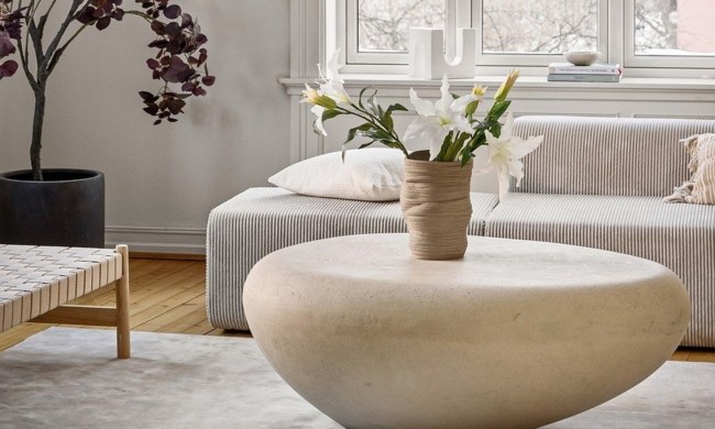
Refusing to mix too many patterns
Another design principle that many people follow is limiting their design to only two or three patterns. There is an assumption that too many patterns in a space will create a kitschy or clashing design. In some ways, this is true. However, if you’re strategic, you might be able to pull off several patterns in the same room! For example, maximalist designs can look stunning with a vibrant blue-and-white vintage wallpaper alongside a rich pink floral sofa or on top of a black-and-white striped rug. The key is to find patterns that look good together and share a similar color palette or design style. Breaking this principle can be tricky, but when you nail it, you’ll have a space that is sure to wow your guests.
Opting for only one feature wall
When it comes to feature walls, the world of interior design is split. Some designers find feature or accent walls outdated, while others argue it’s a chance to show off some creativity. Either way, when people consider bringing feature walls into their space, there’s a tendency to opt for only one accent wall. But what if we broke this rule? Some designers have begun to create two or more accent walls in the same room. For non-rectangular spaces, this can create a grand transformation. If you have an asymmetrical space, play off the architecture by creating one feature wall with a fun wallpaper pattern and then perhaps painting your other walls in different shades of the same color. For example, you opt for a fun blue, gold, and black marble wallpaper pattern and then transition between different shades of blue throughout the space. The result will be lively and artistic!
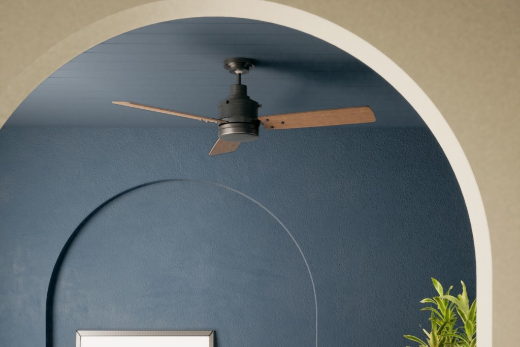
Thinking white is the only way to achieve negative space
Another strange principle in interior design is the idea that white is the only color you can use to create negative space. When designing a room, negative or empty spaces are essential for creating a cohesive flow. If too many textures, colors, or patterns dominate a room, the design can feel cluttered and restless. However, many designers push the idea that using white walls, light-colored flooring, or other “blank” aspects is the only way to achieve negative space in design. Instead of following this unspoken rule, why not create negative space with dark colors? Black is a sleek and elegant color perfect for transitionary or “empty” spaces. Alternatively, fun pops of color, especially jewel tones, are wonderful for creating negative space.
Only using light colors in a small room
Perhaps one of the most significant “rules” of interior design is that you have to use light colors in a small room. This is mainly because light colors can open up a space. And for many small rooms, especially those with minimal lighting, lighter colors can help create a sense of expansiveness. However, it’s possible to use dark colors to open up a tiny space. If your room has adequate lighting, why not paint your walls a rich and velvety black? Alternatively, a small living room might benefit from a deep evergreen that extends onto the ceiling as well. The trick is to understand how light plays a role in your space. For example, an already dark bathroom with a small window may not be the best fit for a dark color palette. However, a dining room with large southern-facing windows may be the perfect place to introduce darker tones.
Knowing basic interior design principles is crucial for creating a fluid and curated space. However, not all design principles work in every space. At times, it’s OK to break the rules and experiment with different design styles. Home design is an art, and sometimes the best thing you can do for your space is play around and try something unique and unconventional. Try some of these rule-breakers in your space, and see what a difference it can make for your home!