Inspired by shows like Bridgerton, Jane Austen novels, and a love for European regality, Regencycore has become a fast trend in home design. This elaborate yet delicate style has entered many homes, creating a luxe and refined look that feels romantic and youthful while also paying homage to history and antiquity. Considering implementing Regencycore into your home design? Check out these expert-approved tips for bringing this luxurious style into your life.
What is Regencycore?
According to Saloni Ingle, Interior Design Architect at Nitido Design, “Regencycore is a trend in which people design their houses and/or dress in the style of early-nineteenth-century England. It’s just how you’d envision a main character’s home and closet in a Jane Austen novel to look.”
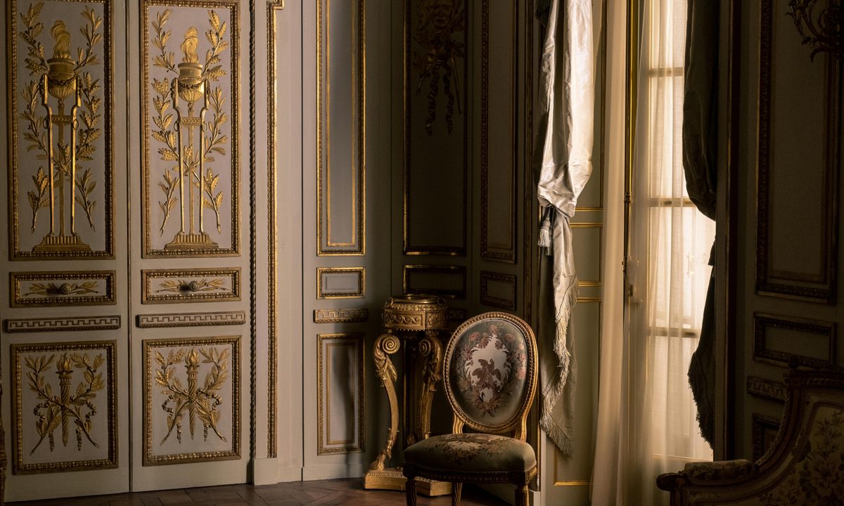
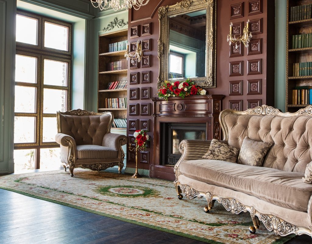
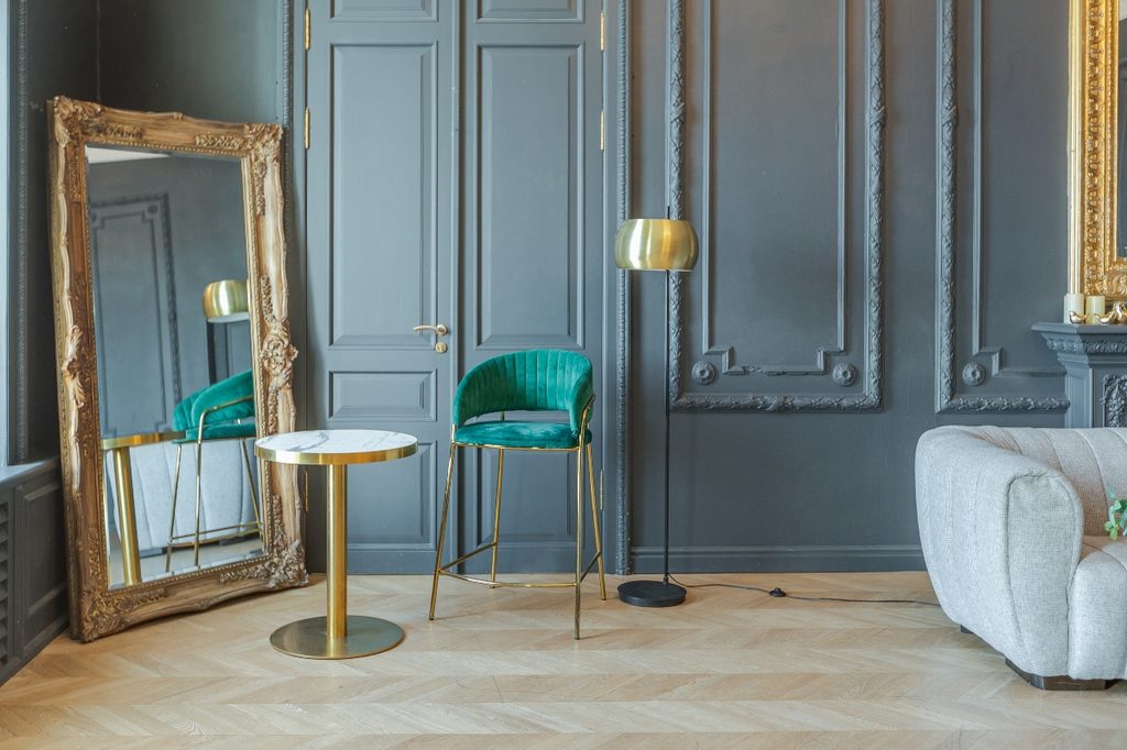
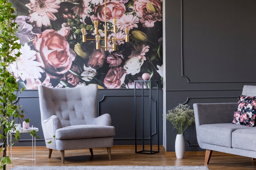
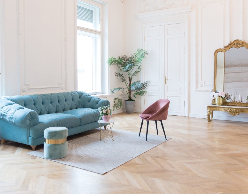
Regencycore incorporates regal and luxe pieces from nineteenth-century Europe to create a more elegant and sophisticated look. Noted by its “gilded mirrors, fainting sofas, flowered porcelain, and patterned furniture,” says Ingle, Regencycore expresses a sense of old-school romance. Colors like light blues and greens dominate the palette, while delicate textures and floral patterns are also present.
Suzi Dailey, Real Estate Agent at Realty ONE Group, says, “To me, it is enhancing and enriching your decor to bring some of Bridgerton’s style (European style) into our modern-day homes!”
How does it compare to the cottagecore aesthetic?
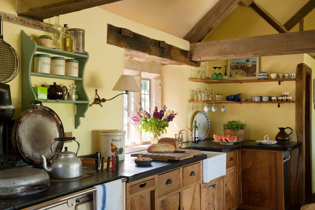
At the beginning of the COVID-19 pandemic in 2020, home-bound designers began embracing “cottagecore” as a way to escape the synthetic confines of the modern home. This aesthetic features elements of the English countryside, often depicting cottage homes, flower motifs, and other natural and simple themes relating to farm life.
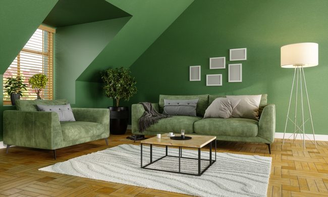
According to Ingle, Regencycore is “essentially a dressed-up version of cottagecore, with certain components overlapping.” For example, flower patterns, soft pastel colors, and vintage pieces are present in both styles. However, Regencycore focuses more on early-nineteenth-century regality and nobility, so there are more ornate items, gold finishes, and luxe materials. Cottagecore, on the other hand, focuses on simple farm life, with more down-to-earth textures and simple, often inexpensive, pieces.
How can homeowners make Regencycore feel modern?
While adorning your space to align with the Regencycore aesthetic is appealing for many, it’s not possible for every homeowner. In some instances, a full-blown Regencycore aesthetic can look overbearing, gaudy, or kitschy. If you don’t want your home to look like the set of a period drama, add a modern touch to this opulent style.
Dailey suggests, “Instead of leaving the dark colors on the walls or lots of gold detailing, today’s trend is to preserve the details and decorative ormolu on the walls and paint it all white.” For homeowners working with ornate early-nineteenth-century builds, this is a great way to add a light and bright touch to the space while still honoring the beautiful detailing and architecture of the home.
More recently built homes can benefit from small touches that give a slight nod to the Rengencycore aesthetic without going overboard with Pride and Prejudice glamour. “It’s all in the details,” says Ingle, “You can use a single Regency-era piece of furniture while keeping the rest of the room muted and simple. Alternatively, you can incorporate modern art or wallpaper while combining various Regencycore pieces.”
Finding a balance between the Regency-era aesthetic and more modern pieces is key. Instead of forcing the room to fit a specific theme, blend ornate elements with more simplistic touches for a subdued look.
Tips for a Regencycore design
If you want to invite the Regencycore aesthetic into your space, there are a few decor must-haves that you don’t want to overlook.
- Light, pastel colors: Pastel blue, pink, and green are classic colors to add to a regency-inspired design. Creams, soft beiges, and off-whites are also good choices. Keep the color palette light, airy, and playful.
- Pattern drenching: Regency-era decorum used plenty of patterns. Choose sofas and chairs with ornate and glamorous patterns that speak to the time period. You’ll also want to consider mixing and matching patterns to achieve the classy, vintage effect.
- Wallpaper: Damask wallpapers or other wallpaper with elegant, intricate patterns is best. Try to aim for something with a light, airy hue.
- Ornate furniture: Choose pieces that look vintage and have grandiose silhouettes. Gilding, velvet, pattern, and silk touches can also add to the luxury.
Gilding everywhere: From gilded mirrors to gilded picture frames, go all out with gilding—the more ornate, the better!
Is Regencycore going to be a lasting trend?
Regencycore is all the rage right now, but will this style last, or will it be just another short-lived fad? After all, it can be frustrating to redecorate your entire home only for the aesthetic to go out of style. However, due to the lasting power of similar aesthetics like cottagecore, it’s fair to assume that Regencycore will be around for a good while.
Dailey adds, “I actually think it could have staying power and evolve into a rebirth of appreciation of objects and art which are enjoyed in a more fresh setting.” Vintage and antique pieces from many eras are regaining prominence in home design as homeworkers are turning to nostalgic pieces and decorum to bring a sense of history to modern space that lacks personality. This shift toward vintage decor, paired with emerging styles like Regencycore, maximalism, and grandmillennialism, are good indicators that intricate, romantic designs are here to stay.
If you’re looking to revamp your space into a more luxe and elegant environment, Regencycore could be the way to go. Gold details, ornate frames, delicate color palettes, floral motifs, and vintage furniture can bring a touch of opulence, maybe even inspiring you to buy a hoop skirt and head to a ball. Whether you’re recreating the grand halls of European estates or just adding a few antique pieces, now is the time to hop on this beautiful trend. You won’t regret it.