Summer is in full swing, which means there’s still tons of time left to spend with family and friends on the patio. If you’re planning to throw evening dinner parties or Sunday brunches, it’s crucial that you bring all the comfort of your dining room out onto the deck by incorporating rugs, couches, and decor into this outdoor space. Regardless of your design style, try to have fun with the color schemes and pick palettes that complement all the natural surroundings and make your guests excited to spend some time in the fresh air.
From reds to blues to sage green and more, your patio should be a warm and inviting space that’s versatile enough to host an adults-only cocktail hour one day and a kid’s birthday the next. Since you want to spend as much time as possible soaking in the sun, give your outdoor deck a facelift so you and your guests can reap all the benefits of the summer season. Design an outdoor space that reflects all of your character and personality with these color schemes.
Pick a central color
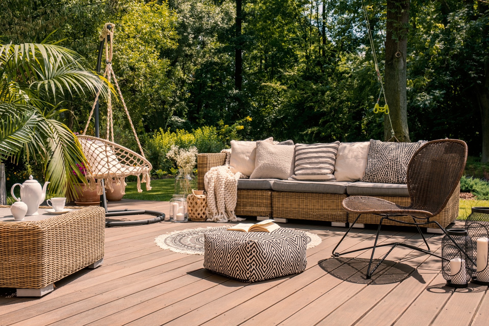
Before you settle on accent colors for your pillows, rugs, or throws, first determine one color to anchor your design and incorporate this hue into your dining table or conversation set. This 7-piece outdoor conversation set has a more contemporary design with tons of seating for guests, and it comes in five colors, including red, three shades of blue, and khaki. Once you decide on a color, you can accent accordingly to add some visual interest. If you don’t have the space for such a large sectional, consider this smaller set, also from Wayfair, that comes in beige or brown. With a more neutral central color, you also have more flexibility to play with other colors and patterns in the rest of the decor.
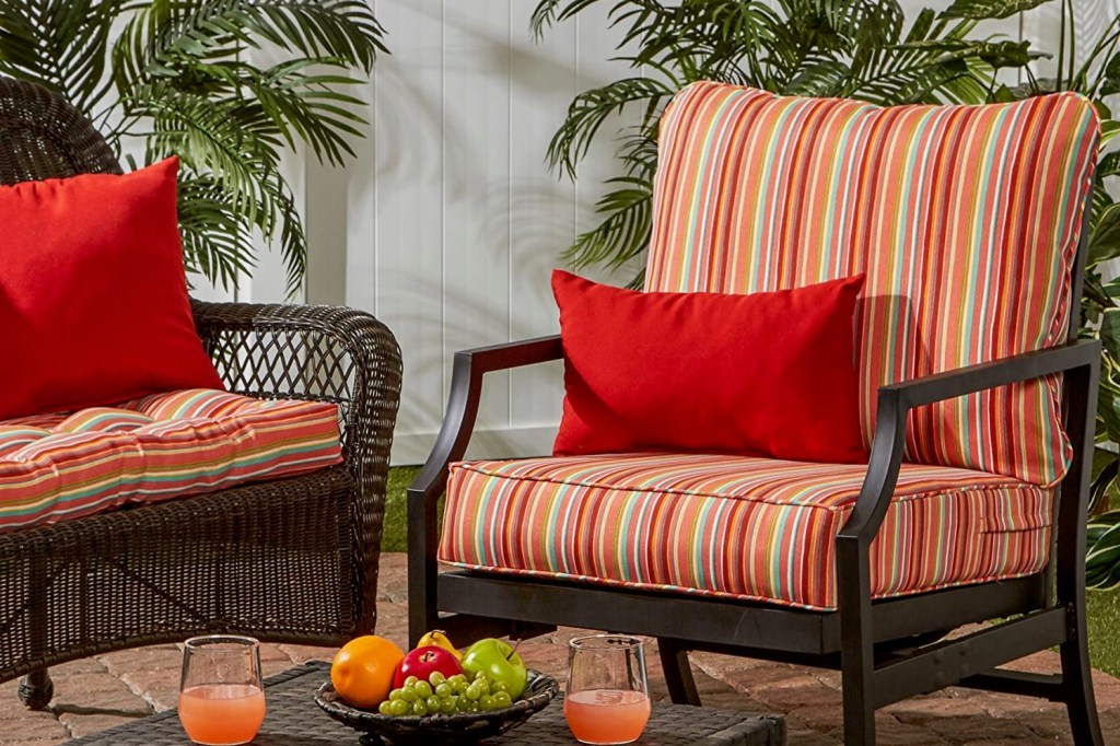
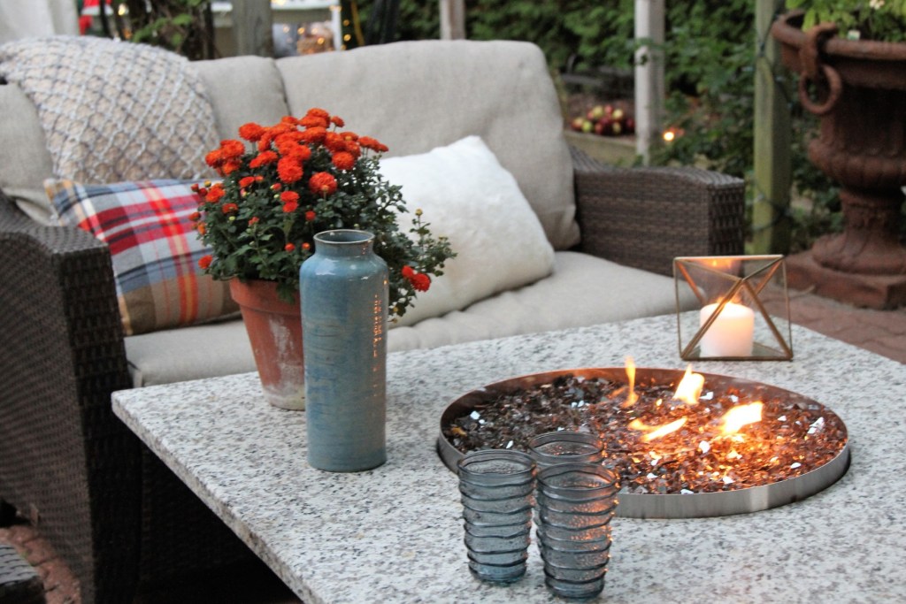
Accent with red…
Once you’ve established your primary color, find a couple of complementary accent colors to make sure your space isn’t too monochromatic. If featuring red as a central color is too striking for your design sensibilities, consider using this bold hue as an accent to create an area that’s bright, inviting, and exciting. These red and white indoor/outdoor throw pillows from Amazon are the perfect touch for your neutral or dark-colored patio furniture. To stay cool all through the hot summer days, check out this red solar umbrella with attached LED lights to illuminate your summer nights. If you’ve decided on a brighter central color, like electric blue, opt for a muted shade of red and pair it with neutral blacks and greys like those in this outdoor patio rug from Pottery Barn.
…or blue
While red is a bold, youthful addition, blues are a little more relaxing, making a space that’s reminiscent of crashing waves and sunny skies. You can certainly incorporate bright blues into the pillows and rugs, but consider adding them in more unexpected places, like the lighting, floral arrangements, and table mats. We love these boho lantern lights from Pottery Barn which play with shadows to make geometric shapes on the walls and floors.
Bring in the patterns
The minimalist style may work for some, but if that’s not your speed, design a patio that explodes with patterns, textures, and colors. Don’t be shy about mixing patterns, either. The key is to choose patterns of different sizes, so pair small, skinny stripes with a large floral print and vice versa. Keep in mind, however, that if you’re experimenting with different patterns, stick to a simpler color scheme so the deck doesn’t appear too busy. Don’t forget to mix up the texture too, so add softer touches to the cushions and throw blankets, but opt for rattan or canvas for a few pillows, side tables, and baskets.
Regardless of the size of your deck, the expansiveness of the great outdoors will always make this space feel larger than it is. Take advantage of all this space and have a lot of fun with your design, mixing and matching colors, patterns, and textures to create a more intriguing space. While it’s easy for indoor rooms to feel overcrowded when there are multiple design elements, there’s much more room for experimentation in these outdoor spaces, so let your creativity run wild!