Slate blue colors are wonderful hues to add to your palette when you’re looking to invite more peace and serenity to your space. This faded, cool color focuses on the simplicity of a soft blue-grey tone, perfect for uplifting and neutralizing any room. Unfortunately, the challenge with using this color is that it can sometimes leave your color palette feeling dull and boring due to the washed-out and faded undertones. If you adore this gentle and calming shade and want to add it to your space in a way that works, we have a few tips to help you achieve a lovely aesthetic.
We’ve gathered five spectacular ways to add a slate blue color to your home to create a relaxing and vibrant space.
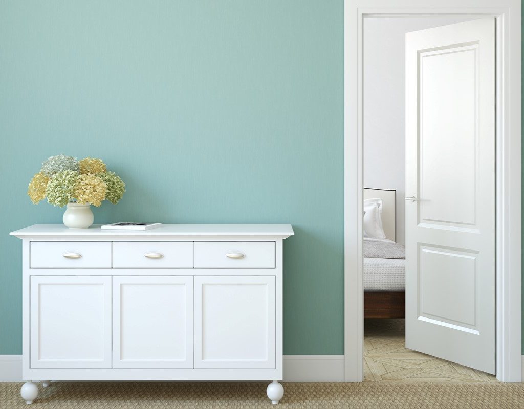
What is slate blue?
Slate blue is a color combination between light gray and a muted blue or periwinkle tone. This shade is often washed out and leans toward the cooler end of the color spectrum. Gentle and serene, this blue shade offers a sense of tranquility to the home. However, depending on the tone of slate blue you choose for your space, it can sometimes be a bit moody.
The trouble with slate blue isn’t just that it can appear washed out, cold, or dull. Too much slate blue in your room can cause the entire design to feel flat and distant. So, it’s important to understand exactly how to implement this shade into your space to take advantage of its calming ability without weighing down your overall design.
What colors go best with slate blue?
The best way to use a slate blue color in your home is to pair it with complementary colors that bring out its natural vibrance and rich blue undertones.
Muted green
Green is one of the best colors to pair with slate blue. Muted green can look lovely when paired with slate blue. Muted green adds a hint of natural beauty without drowning out the understated blue. These two subtle colors create a soft and gentle appeal, best suited for entryways, children’s rooms, or home offices where a light, airy, and soft atmosphere is preferred.
Evergreen
Alternatively, a rich evergreen can be the perfect palette pairing for slate blue. Since slate blue is a cool tone with a muted essence, it can be beneficial to incorporate more vibrant and exciting colors into the palette. This color combination would best be used in dining rooms or living rooms where a healthy sense of balance and warmth is needed.
Pale blue
Of course, slate blue is a wonderful hue to add to a blue-based color palette. Pale blues like baby blue, sky blue, and periwinkle can be great pairings for slate blue, as they highlight the blue undertones within the color. We recommend using slate blue as a wall color and adding lighter blue details to furniture and decor to best use this combination.
Navy blue
Navy and rich royal blues can also be paired with a slate blue color. However, this combination can come off as abrasive and moody, so it’s best used in places like bathrooms or bedrooms where a darker and more luxe ambiance is necessary.
Canyon shades
When it comes to curating the perfect design, you can’t go wrong with incorporating neutrals. Neutral colors are a wonderful addition to a palette featuring slate blue because they invite more warmth to a cold and sometimes distant color. Canyon shades and rich reddish browns work best with this tone by spicing up the color palette and creating a more luxe feel. This combination is best suited for dining rooms where a richly colored wood table could stand out against a slate blue backdrop.
Washed-out gray
Alternatively, washed-out gray and soft cream shades can also pair beautifully with slate blue. However, it’s best to avoid super washed-out tones and stark whites when working with slate blue so you can prevent your design from falling flat.
Dark brown tones
Pair slate blue with gorgeous brown tones like chocolate brown, mahogany, walnut, coffee, and sienna. These deep brown colors can be expressed through furniture like a dining table, a leather sofa, an accent chair, a fine china cabinet, or a lush rug. Wood paneling can also be a great choice when incorporating brown and slate blue into a palette.
Beige and tan
Alternatively, keep things light and airy with soft tans, beige, sand tones, or cream. This aesthetic does well with white and washed-out blues for a soothing, coastal aesthetic. You might also consider pairing beige and slate blue in a bathroom for a seaside feel.
Where can you incorporate slate blue into your home?
If you’re looking for additional inspiration for where you can incorporate slate blue into your home, look no further. Below are some of our favorite ways to use this color!
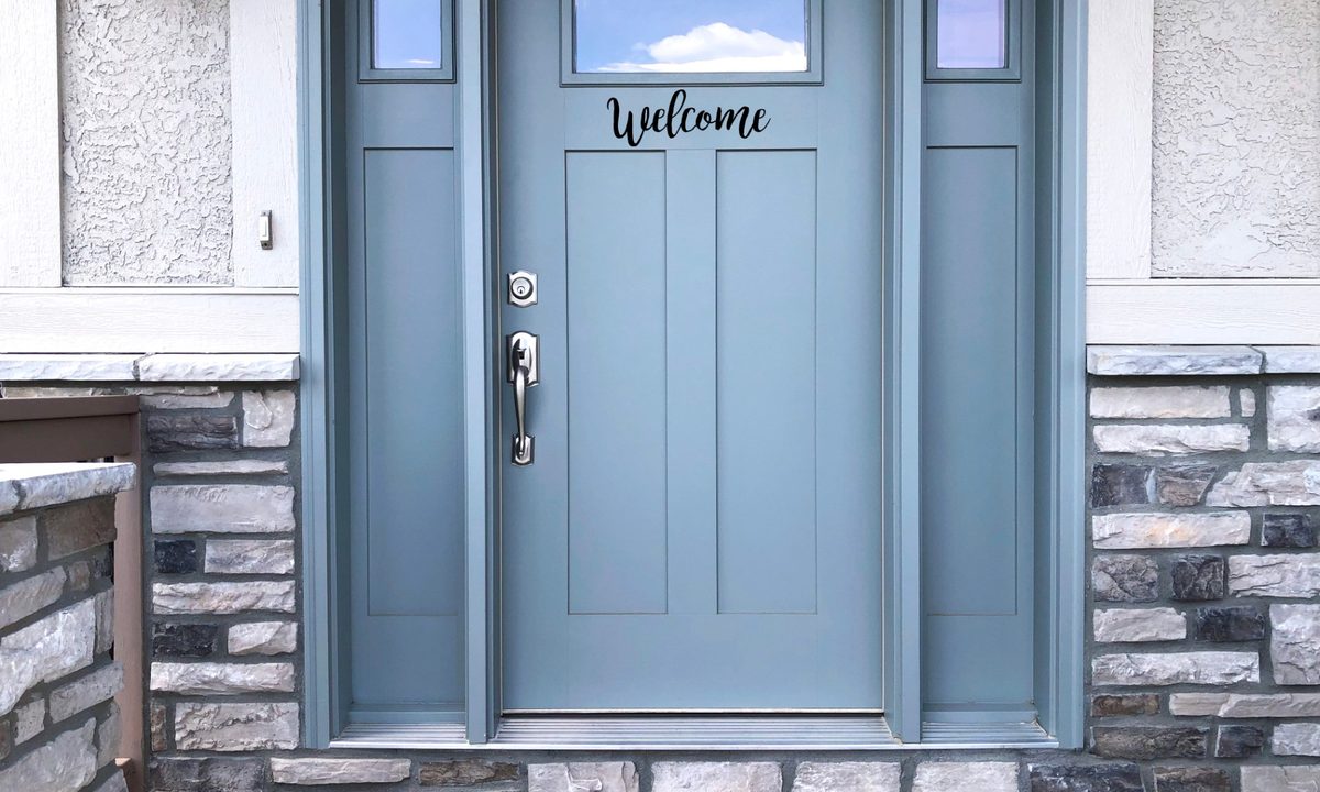
1. Paint your front door
The front door is one of the first locations visitors see when they arrive at your home. And while it’s completely acceptable to leave your front door a simple neutral, adding a pop of color can invite personality to your entrance. Try painting your front door in a soothing slate blue tone for a welcoming touch. Slate blue is a subtle shade, perfect for homeowners looking to experiment with color without going too bold.
2. Use the color on a kitchen backsplash
Slate blue can be a wonderful addition to your kitchen backsplash. As a calming shade, it works wonders in spaces that see a lot of action. With only a hint of blue, it doesn’t detract from the space or call too much attention to itself, making it a fantastic shade for your kitchen.
3. Try it in the bedroom
As we’ve mentioned above, slate blue is a calming and tranquil color that excels at creating a relaxing environment. Because of this, slate blue can be an excellent addition to a bedroom or nursery color palette. Since the color also can lean toward a rich, dark, and luxe aesthetic, you can opt for pairing it with rich browns, deep blacks, or other velvety shades that create a vibrant and cozy atmosphere.
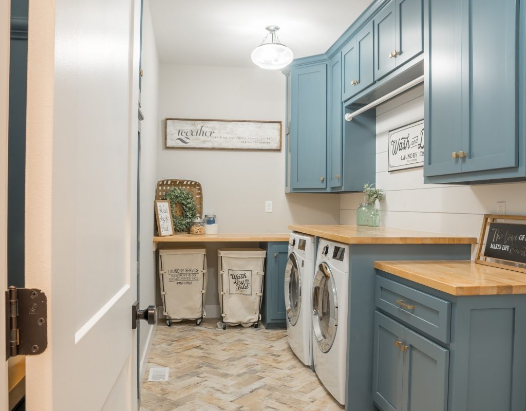
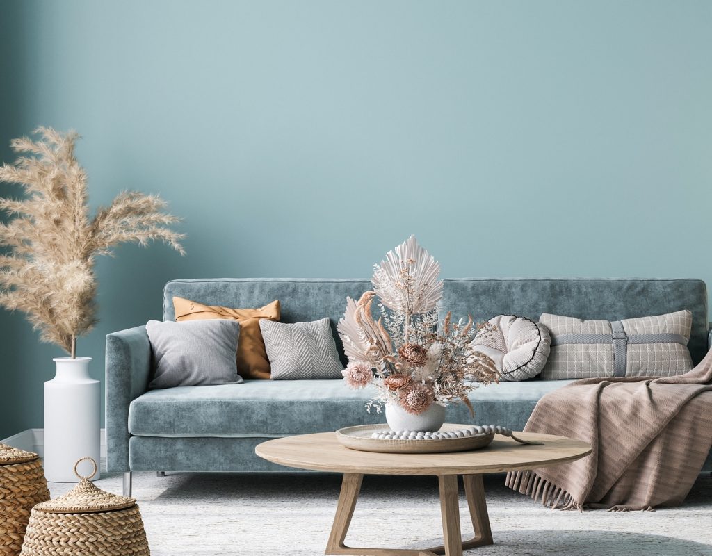
4. Opt for slate blue furniture
Slate blue furniture, like a statement armchair, elegant sofa, or even bedsheets, can create a perfect eye-catching centerpiece for your space. When opting for slate blue furniture, it’s best to use pieces in rooms that require cool hues to tone down the brashness of a space, meaning slate blue furniture might look best in rooms with a lot of red, rich browns, or other vibrant colors.
5. Transform your bathroom
Painting your bathroom slate blue is a design choice that can transform the space into a tranquil oasis. This deep, serene hue evokes a sense of calm and sophistication, making your bathroom a relaxing retreat. Slate blue pairs beautifully with white fixtures, creating a crisp contrast and a timeless aesthetic.
Moreover, many blue bathroom styles have been shown to increase home value. Blue is associated with tranquility and cleanliness, making it a popular choice among homebuyers. It adds a touch of luxury and modernity, enhancing the overall appeal of your property. Whether you’re looking to enjoy your bathroom personally or boost your home’s resale value, a slate blue color scheme can be a smart and stylish investment in your home’s interior design.
When decorating your home with slate blue, balance is key. It’s essential to use this cool tone in tandem with warmer and richer hues that can offer a sense of warmth and vibrance. When using this shade, try adding it to spaces that need more tranquility, like a bathroom, bedroom, or entryway. With a bit of forethought, you can create a relaxing space that fits your needs.