Painting the walls inside your home is a great way to freshen up your interior decor without committing to a remodeling project. But choosing the correct paint colors is a big decision — one that you’re going to have to live with for a while. The mere fact that there are so many hues to choose from can be overwhelming. Before you head to the hardware store to get paint and supplies, take some time to consider the process you’re about to undertake. If you rush into a decision, you may make one of the most common mistakes people make when picking paint colors for your home.
Before you begin a home painting project, it’s essential to take the time to consider several factors. It’s important to take a step back and gather inspiration. Whether you flip through a few magazines or browse a few websites, gather ideas and images that inspire you. Think about what kind of vibe you want in each room you’re painting and choose colors that evoke those feelings. Review your choices over the next few days or weeks to ensure that what you liked yesterday you still want a few days later. Once you’ve considered the above, don’t make the mistakes below, and you’ll be well on your way to choosing paint colors that you’ll love for years to come.

Not considering the big picture
When choosing paint colors for multiple rooms, especially rooms that you can see from one another, people often select hues that don’t really go together. This becomes a more apparent problem when painting a home with an open floor plan. You may think that painting two rooms in drastically different colors will create separation, but in fact, it ends up looking like you didn’t plan. This lack of cohesion will give off an amateur vibe, especially if the colors you choose don’t pair on the color wheel.
Matching furnishings to the wall color
Painting your walls first and then adding furnishing and decor that coordinate with that color never turns out how you picture it. Instead, start with the items in the room, like the rugs or couch, and choose a paint color that works with them. The last thing you want is walls that clash with your sofa or other decor. Your paint color choice will be most successful if you choose different colors and shades of the same color and test to see whether they complement the various items in the room.
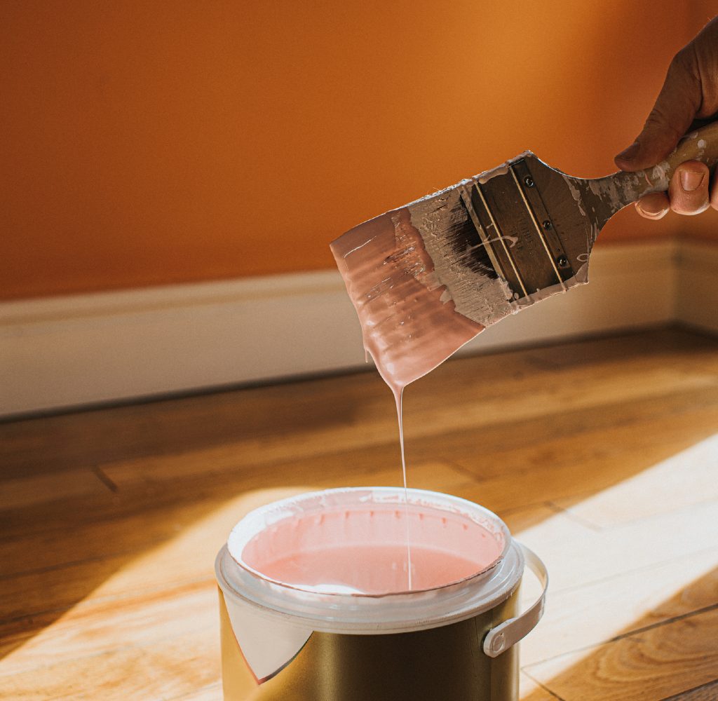
Not comparing shades
Don’t forget to look at other shades of the same tone once you find a color (or colors) that you like. Just because you want a specific value of one tone on the swatch or in the store doesn’t mean you’re going to like it at home. Things like lighting and your existing decor play a huge role in the result of a paint project, so it’s important not to pigeonhole yourself into one specific shade solely because you like it. Tones in the same family will likely give you the same vibe and may just match better inside your home. Be sure to try at least five to seven different shades on the same tone.
Forgetting about lighting
Falling in love with a color in a bright hardware store is deceiving. Once you get the color home and see it in the light that it will exist in, the color can appear totally different. Also, one shade can look just as you’d imagined it would in direct sunlight but look different at night when lit by a lamp. Before going all-in and painting the whole room, paint a test area and live with it for a while so you can see if you like the color at all times of the day. If you don’t want to paint your walls a bunch of different test colors, paint a few poster boards and move them around the room in different lighting and throughout the day to get a feel for how the shade looks at all times.
Forgetting about white
Often, homeowners forget about white paint when they consider new paint colors because they think it is limiting. But white isn’t just pure white and off-white anymore, and there are plenty of subtle shades of white that incorporate hints of green, blue, lavender, and gray. White shades can make a room appear larger than it is and brighten up a space that doesn’t have great lighting, so you should not forget about whites. Don’t forget to heavily consider lighting when choosing white hues, as the light in the room will play on white paint more than other shades.
Choosing paint colors that you’re going to have to live with for years to come is a big decision. Tiny paint swatches don’t give you the big picture view that you need to make such a big commitment, nor do they consider things like lighting, existing decor, or the colors of other rooms in your home. So before you take the plunge on that paint color you fell in love with online, consider the items above so you don’t make the dumb mistakes most people make when picking out paint colors.