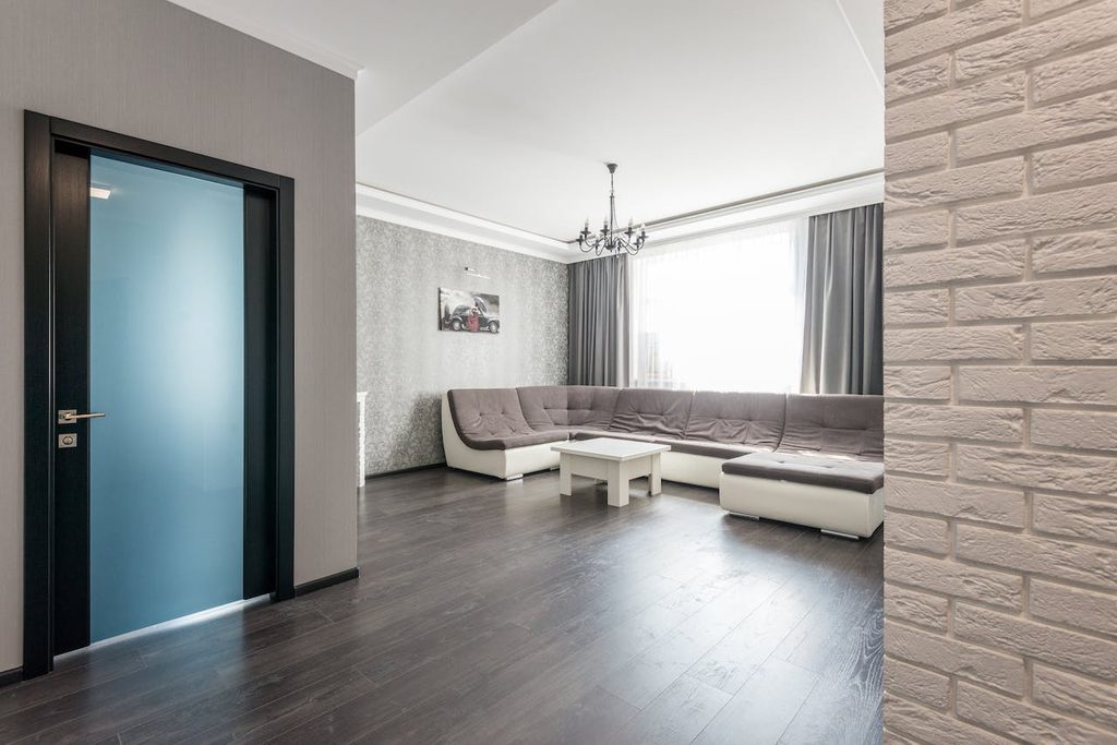
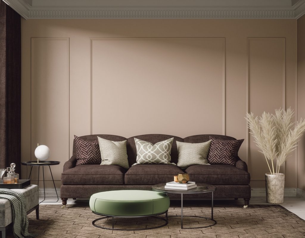
In the realm of interior design, finding the perfect neutral hue can transform a space from ordinary to extraordinary. Greige, a sophisticated blend of gray and beige, has emerged as a timeless favorite for its ability to effortlessly complement a variety of styles and aesthetics.
Whether used as a wall color, trim accent, or foundation for decor, greige offers a subtle yet elegant backdrop that enhances any room. If you’re searching for the best greige paint colors, we’ve got you covered! Keep reading to find out why it’s a great color, how best to use it, and some of our favorite greige paints.
Why greige is a great color for your home
Greige is an ultra-popular paint color for interior walls for several reasons. First, because it’s neutral, greige-colored paint will go well with almost any other color in your home. Greige goes with both warm tones of brown and lighter colors like gray and white.
Second, greige is unique enough to make a statement but not bold enough to overwhelm the room. Greige also works well in most rooms. From kitchen cabinets to offices, bedrooms, and basements, you can’t go wrong with greige when it comes to wall color.
In fact, greige is so popular there is even a shade called Perfect Greige, which is two shades darker than Popular Gray and one shade darker than Versatile Gray on paint swatches. Most paint manufacturers have a color they refer to as Perfect Greige, and though they may vary slightly, all are relatively similar.
Sherwin-Williams Anew Gray SW 7030
This greige paint from Sherwin-Williams is excellent for kitchens with marble countertops and darker paint on kitchen cabinets or wood floors. Since this greige color combination is more beige than gray, it pairs well with darker colors but remains cool enough to go with stone. Anew Gray will also work in bathrooms, bedrooms, and basements.
Behr Silver Drop 790C-2
Silver Drop from Behr is one of our favorite greige colors for family rooms because it isn’t too dark and gives a welcoming vibe. The color is subtle and neutral but still warm and versatile. Silver Drop will pair well with light rose colors, off-whites that trend toward yellow, and shades of green, making it great for a bedroom or office, too.
Magnolia Yarn
Magnolia Yarn from Chip and Joanna Gaines’ company is a go-to version of greige that is neutral yet crisp and bright. The color is inviting because it is gray, but the touch of beige keeps it from feeling drab or cold. This color will pair with natural rustic decor accents like distressed wood or exposed ceiling beams, making it great for living rooms or bedrooms.
The Spruce Best Home Sandbar SPR-04
This paint color from The Spruce Best Home is just on the edge of taupe but still makes it into the greige category. With an almost light-orange undertone, the shade is calming and goes well with warm accents and tones since it will pull other colors out nicely. Consider Sandbar for a warm den, cozy basement living area, or even a bedroom.
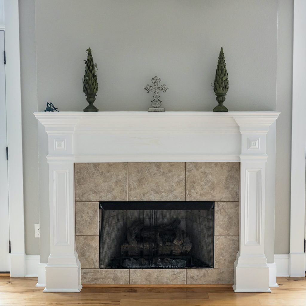
Which accent colors go with greige?
Accent colors that complement greige span a spectrum of possibilities:
- Warm hues like soft blush, muted coral, or rich terracotta add a subtle contrast, infusing warmth and depth into the neutral backdrop.
- For a cooler aesthetic, consider accents in shades of dusty blue, sage green, or slate gray, which harmonize beautifully with greige while imparting a serene ambiance.
- If you want a bolder color approach, jewel tones such as emerald green, sapphire blue, or amethyst purple inject drama and sophistication, creating striking focal points against the understated elegance of greige walls or furnishings.
Ultimately, the key lies in balancing tones to achieve a cohesive and inviting interior design scheme.
If you’ve been thinking of painting the inside of your home and need a neutral shade that isn’t cold or boring, greige may be the way to go. Greige is very popular, but there are so many different shades of greige that you don’t have to worry about it being predictable. You can choose greige paint that trends more toward beige or select a color that is heavier on the gray. Either way, you should be able to find a color that either complements your existing decor or acts as the building block for a whole new look.