How can your dining room table look put-together when it’s not ready for a meal? Start thinking about this well-used surface in your home as a design opportunity in itself. It is time to say goodbye to the tired floral arrangements of the past and get creative by bringing in a fresh, updated centerpiece.
As one of the largest tabletop surfaces in your home, it offers the perfect place to create a mood and add drama. Even better— keep things interesting by continually switching out centerpieces throughout the year to give your space a whole new life. Below, we take you through the essential steps to take your dining room decor from stale to sensational.
Keep it clear
Since the dining room table is such a big surface, it tends to be a magnet for clutter. The first step is to clean up the table to give yourself a blank palette to work with. Once your new centerpiece is in place and looking good, chances are you will want to keep it that way. When time is invested, and the result elevates the aesthetic, you will be less likely to use the table as a catchall.
What is your style?
There is no right answer here. Each home has its own style, and you should select the one that works for you. Rustic, modern, boho, or traditional, this is your chance to make your mark. Once you have determined that, you will want to find elements that match it. Let’s take a look at our tips below.
Think about scale
One of the most common mistakes people make when decorating is not getting the scale right. Since a dining room table is such a large surface, this is especially true. If you decide on one single item, make sure it is large enough to match the table. The same holds true for grouping similar items—each one may be a smaller scale but make sure when they are placed together, they have a strong visual impact. This is not the time to save a few dollars by selecting slightly smaller or fewer pieces. In the long run, it is worth the investment because the result will be much more effective.
Work in odd numbers
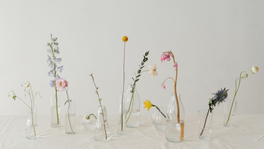
When decorating, groupings of varying heights work well together. Two candles placed on either side of a vase of flowers is standard. For a fresher and more current look, display objects such as candles or botanicals in odd-numbered groupings. Instead of one large vase, a series of smaller ones with just a few stems in each can be more visually stimulating. Greenery in attractive planters add interest and bring the outdoors in. Choose plants that reinforce your look, such as succulents for a modern or boho vibe or ferns or ivy for a more traditional aesthetic. For the planters, vary the sizes and shapes but stick with one or two colors.
Keep the balance
One designer trick that should always be followed is to give any vignette balance. What does that mean? Think of a centerpiece as you would a seesaw—what is done on one side should be replicated on the other. Imagine how strange it would look to have a floral arrangement with a candle to the left but not the right. If using multiple candles of varying heights, for example, don’t put all the taller ones on one side and the shorter on the other. Make sure they are mixed so that no single candle stands out.
Let there be light
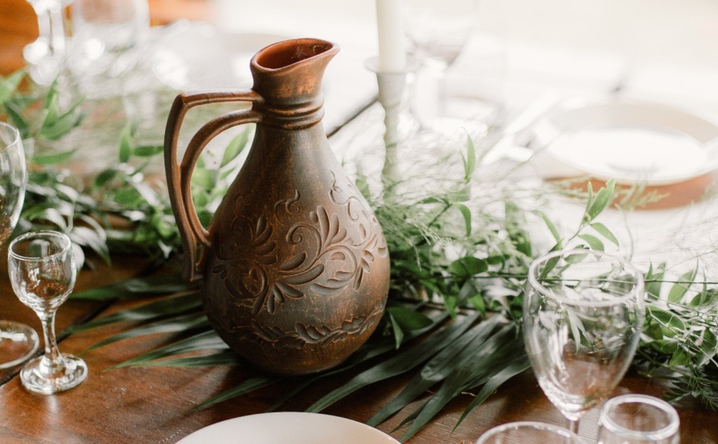
Speaking of candles, nothing adds more warmth than candlelight. Not only do the candles themselves bring serenity and calmness to any environment, but their holders are also another way to add style to the design. Think of all the possibilities and what will work best with your look—glass urns, rustic pottery, metal, or even turned wood.
Keep it corralled
In practical terms, what often stops people from having a large arrangement on their dining room table is that the table actually needs to be used for eating. That is what it is for, after all. One of the best solutions to have both an aesthetically pleasing centerpiece and use the table functionally is to place your centerpiece on a tray. This way, it can be on the table when it is not in use and easily removed when it needs to be.
Whatever centerpiece you decide on, always remember that it is a chance to showcase your style and bring a fresh look into the space without having to redo the whole room.


