Each year, well-renowned companies in the paint industry select a color of the year to highlight current trends around the world, looking at fashion, design, and pop culture trends to curate a color that highlights the times. In 2021, bright colors and soothing earthy tones were abundant as designers sought to create a refuge while working and quarantining at home.
Now, as we shift into a post-pandemic climate in 2022, trends are showcasing the new appreciation for nature and earthly connectivity that many of us are striving for.
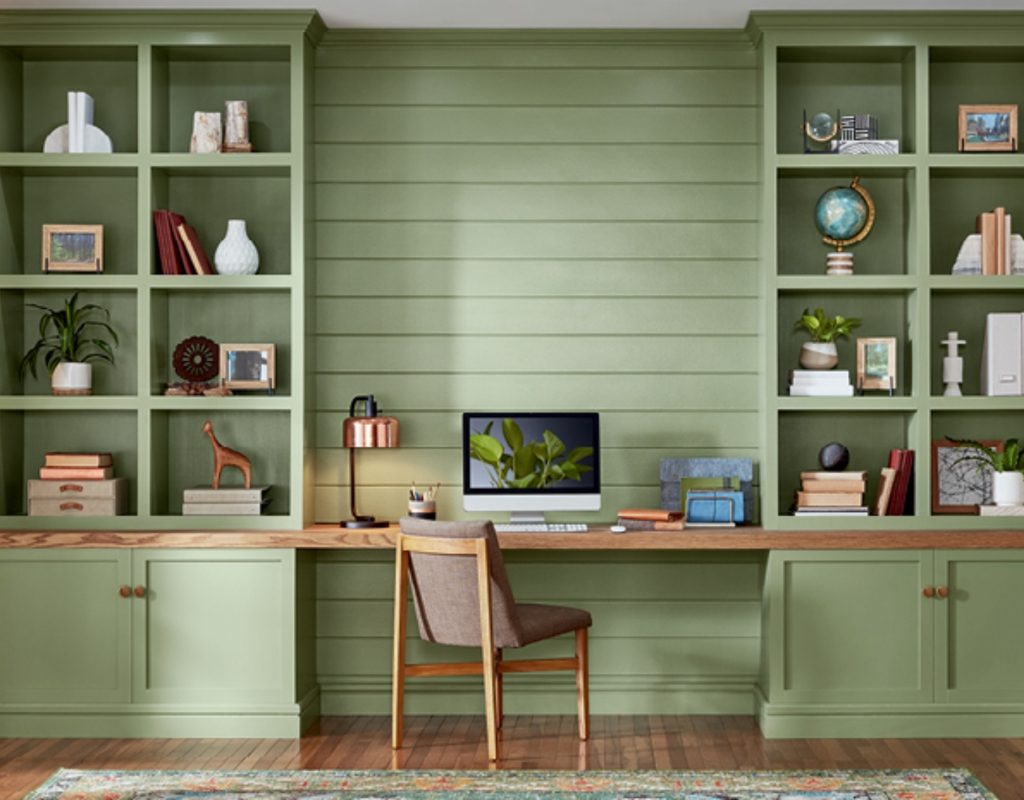
Subtle greens take center stage
A subtle green can represent life and the natural world and generate a feeling of serenity and peace. That being said, it’s no surprise that many of the leading design companies have chosen these hues as their top choices for 2022.
Evergreen Fog by Sherwin-Williams
Evergreen Fog is a subtle greenish-gray shade that invites a sense of comfort and luxury to a space. Since the green is a subtle undertone, this shade is a great way to add a hint of color to living rooms, entryways, and kitchens for a natural, calming look. Paired with brass furnishings, leather, and neutral fabrics, this color can elevate your space to create a sophisticated and modern appeal.
Blanched Thyme by Valspar
As a more vibrant green, Blanched Thyme reminds us of the luscious and vibrant outdoors. This pale shade is perfect for high-energy spaces like kitchens, offices, or activity rooms. The color is rich and bright, pairing stunningly with natural woods, copper fixtures, and other grounding materials. This color reminds us of rolling hills and aromatic herbs, making it a wonderful way to generate a more biophilic design.
Guacamole by Glidden
Named after the rich color of avocado, Guacamole by Glidden is an exciting and vibrant color, perfect for accent walls. We recommend using this hue in bathrooms, kids’ rooms, and entryways to create a stunning retreat. Thanks to its vibrancy, this color is best paired with light neutrals like beige and cream to keep the energy level high. Using natural elements like plants, woods, woven baskets, and leather can also elevate the ambiance of the room.
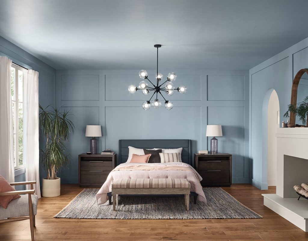
Washed-out blues add a new sense of calm
While green will take center stage during 2022, washed-out blues are favorites of many leading paint companies.
Aleutian by HGTV and Sherwin-Williams
Aleutian blue is a washed-out blue that’s reminiscent of the look of well-loved, well-worn faded blue jeans. HGTV Home and Sherwin-Williams’ rich, grey-tinted color also includes a hint of warm undertones to keep a room from feeling too chilled. This color effortlessly enhances the environment of private spaces like bedrooms and bathrooms, pairing well with off-whites, natural woods, and woven textures.
Breezeway by Behr
As a light blue-green, Breezeway by Behr is reminiscent of sea glass by the shore. This light, airy color can brighten a living space and introduce a subtle hint of color that isn’t too overwhelming. This cool tone works wonders when contrasted against dark woods, and looks especially vibrant against whites, greys, and pale beiges for a seaside palette.
Valspar introduced hints of color for 2022
Valspar went above and beyond for 2022, introducing twelve stunning shades as their top picks of the year. We mentioned Blanched Thyme above, but we recommend checking out some of their more vibrant selections as well.
Sunset Curtains
While neutrals and natural colors took the lead in 2021 and 2022, Valspar doesn’t want you to neglect the use of fun colors in your home. Sunset Curtains is a pastel, peachy pink color that exudes youth and relaxation. Warm undertones make this color feel gentle and assuring, making it a fantastic choice for kids’ rooms or living spaces. Pair Sunset Curtains with copper details and soft whites for a luxurious look.
Delighted Moon
Delighted Moon will adorn your walls with a pale yellow that showcases a hint of brown undertones, reigning in its radiance just enough to make the color feel earthy, rich, and quiet. This can be a wonderful color for nurseries or spaces where you want to invite more light and happiness into your space.
Subtle Peach
Subtle Peach was made for modern homes. Just as its namesake would have you believe, Subtle Peach is a natural pink-brown color that is subdued, gentle, and beautiful. The slight pink tint gives this shade an air of warmth that looks stunning in bathrooms, bedrooms, and living spaces. Valspar encourages homeowners to pair this shade with “greige” woods and furnishings that highlight the color’s warmth and radiance.
With a focus on lively greens and calming blues, the forecast for interior design in 2022 is a breath of freshness. While neutrals and soft hints of color are still on the radar, we can expect homeowners and designers alike to experiment with a more nature-inspired design within their spaces, adding soft, muted pinks, blues, and greens. As you remodel for the new year, try them out for yourself, especially if you’re looking to bring more vitality and serenity to your life.