One of the easiest ways to create an entirely new look is by adding a fresh coat of paint. Since living rooms are often one of the first spaces guests see, updating the color can have a huge impact on a home. The right one can completely reinvigorate a room, transforming it into a place not only you but your guests will want to spend time in.
Wall color is one of the biggest commitments when it comes to designing a space. It serves as the backdrop for the rest of the elements. Getting it right is no easy task, and with so many choices, narrowing down just the right one can be downright exhausting. And let’s face it, if you are going to put in the work, you want it to get the best results. Here, we break down the keys to finding the right shade.
Things to consider
The first thing to remember is no one color is right for everyone. While there are timeless living room paint colors, you don’t have to apply them to your own place; this is your space, so it should reflect your personal style. You probably already have elements in place that will guide you. Is your home formal or casual? Rustic or elegant? What colors do you gravitate toward? Do you prefer soft neutrals or rich jewel tones? These are all questions you should ask yourself before popping open a can of paint. Every shade will give a space visual impact, so think of your room like a painting — what do you want it to say?
Another factor to consider is what you want to achieve with the color. Are you looking to open up the space or create a warm, cozy oasis? Are you open to trying new and unique wall color combinations? Certain shades and color families can help you achieve different things. Consider what you have in place to begin with and if the color will work with it. If updating fabrics and accessories isn’t in the budget, there are still ways for paint to breathe new life into what is already in place.
Bright and light
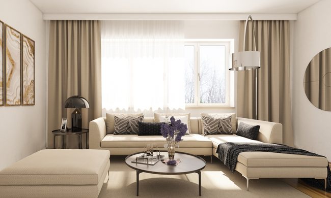
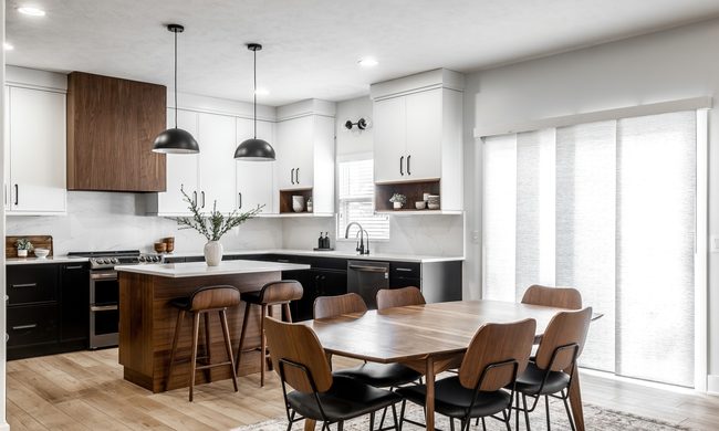
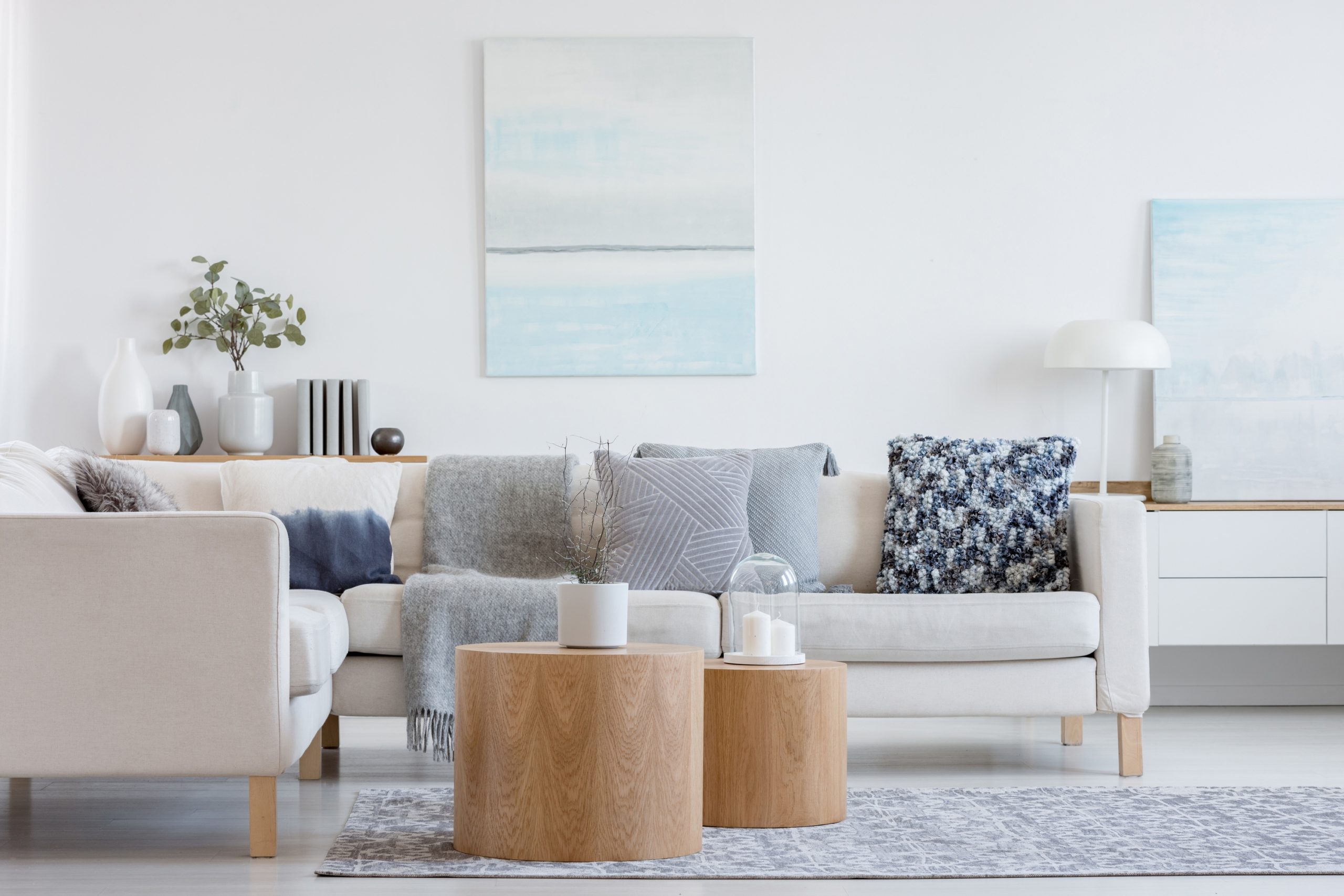
Whites, creams, and soft pastels have a magical way of bestowing a fresh, open feel to a room. Not only do they make it feel larger, but they also provide a great neutral backdrop for other components. Instead of absorbing light like dark colors, these shades will reflect it creating an airier feel. White particularly works when juxtaposed with vibrant artwork because it doesn’t compete and allows for the piece to shine. It also offers the perfect neutral backdrop to organic, rustic elements. When it comes to choosing a white, it can be trickier than it seems. Two of the best options are Cloud Nine by Benjamin Moore and Pure White by Sherman Williams.
Spicy warmth
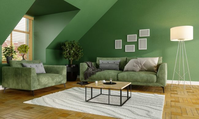
A cozy fire, plush throw blankets, and seating that begs for settling in with a glass of merlot. Think saffron, woodsy green, burnt red, and rusty orange. These shades allow you to create a space that oozes comfort. Earthy and warm, they invite guests to snuggle in and stay awhile. Pair them with rustic wood tones, colorful funky patterns on rugs and pillows, and soft lighting, and you have a space that begs for relaxation. Try Behr’s Hot and Spicy, Sherman Williams’ Overjoy, Benjamin Moore’s Forest Green, or Behr’s Ground Nutmeg.
Entertaining vibrance
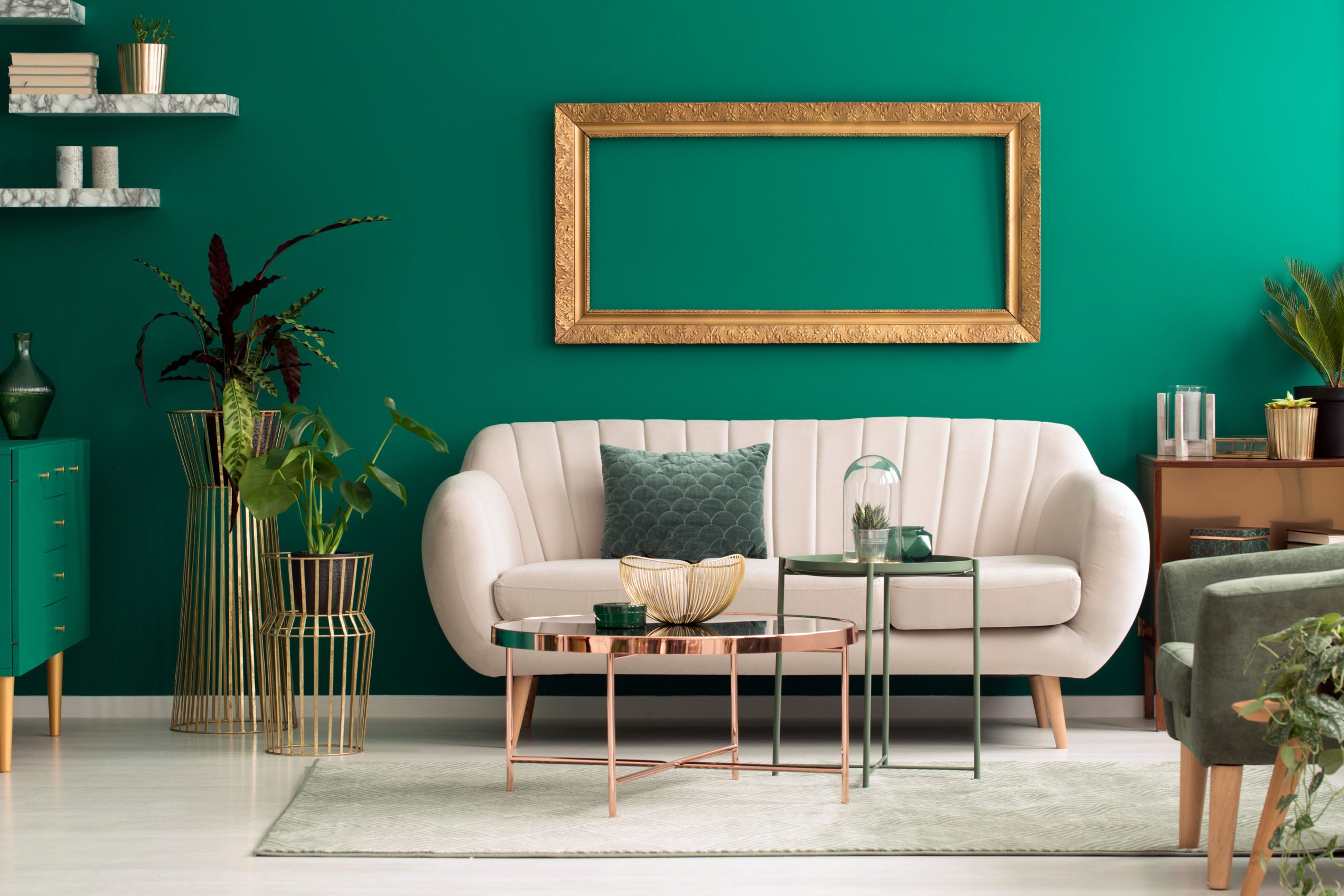
Rich, vibrant hues have a way of infusing a space with energy. They call for conversation, cocktail parties, and lively conversation. Another bonus: These deep shades are powerhouses at making contrasting trim and design features pop. Which one is for you? It should come as no surprise that a popular choice is a bold red hue. Benjamin Moore’s Heritage Red instantly packs a punch and imparts a festive vibe into any room. Looking for something a little different? Intense emerald greens like Benjamin Moore’s Emerald Isle are making their way into more interiors. They pair well with wood tones and bring a freshness into the design. Strong and classic, a deep blue shade like Benjamin Moore’s Blue Nova or New York State of Mind never goes out of style and works well with any look.
Before you paint
No matter what color you choose, it is always a good idea to take home some samples and paint a small portion of the wall. Colors can change depending on your room’s lighting and the amount of natural light. To get the best coverage, make sure the walls are smooth and any imperfections like nail holes are filled and sanded. If you are drastically changing the color, start with a primer. This may seem like an annoying extra step, but in the end, primer is cheaper, and by using one, you will need fewer coats of paint to cover the walls. For more, check out our tips on sanding, priming, and other prepping methods.

