Feeling blue from your blue-hued room? Then it’s probably time to mix it up a bit with some new shades that will go great with your exact shade of blue, whether that’s through contrast or similarity.
Having a blue room doesn’t mean you’re sad, but it can get a little depressing staring at the same bland color every day. Blue rooms are good for calm, peace, and tranquility, but it’s good to lighten up your blue room with some different colors. If you’re searching for ideas on how to make your blue room pop, we’ve found the most dazzling complementary shades for you to try.
Pink
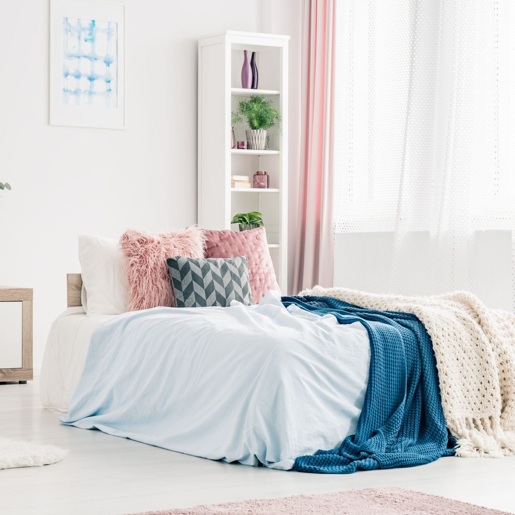
Pinks always look rockin’ with blue, but you have to get the shades just right so that both colors can shine and don’t make each other look muddled or garish. If you’re working with dark shades like royal, denim, or midnight blue, mauve pink is the trendy choice for you. This light, dusty color complements darker blues in a fun yet subtle way. You can get wall art, pillows, or lampshades to introduce the hue to the room.
Burnt orange
There’s a reason why so many sports teams’ colors are blue and orange—they’re actual complementary colors. We suggest a burnt orange to complement your medium-to-light blues. First off, burnt orange is very in style right now. Second, it will add an unexpected accent to the room in a way that’s new and refreshing. Try it out with burnt orange curtains, throw rugs, or even a painted accent wall.
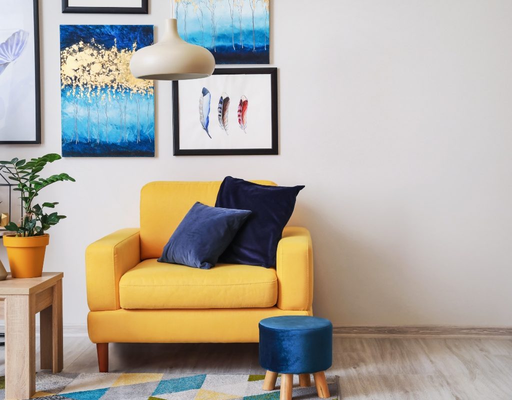
Bright yellow
If you’re really looking for an exciting pop in your blue room, go with a bright yellow. It cannot be overstated how well yellow pairs with blue. This is especially true if you have a dark or medium shade of blue; yellow swoops in to elevate that blue color with a bit of contrast. Our suggestion: be bold with your bright yellow additions. Get a statement piece, such as a funky yellow lighting fixture, a large piece of wall art that prominently features yellow, or a yellow couch or chair.
Fuchsia
This purple-y shade of pink is perfect to pair with lighter blues. It’s equally as bold as yellow and will add some spunk to your space. Think sheer or beaded fuchsia curtains, a fuchsia throw rug, or fuchsia-framed mirrors or wall art. Plus, a fun do-it-yourself project would be to use stencils to paint a fuchsia design on your light blue walls.
Seafoam green
Another color that’s trending right now and that will complement your lighter-toned baby blues is seafoam green. If you’re decorating a baby’s nursery or simply don’t want anything too flashy in your blue room, then seafoam green is the way to go. This light, cutesy color keeps the tranquil, Zen vibes alive while also adding a bit of variety. Try adding seafoam green containers, handles and knobs, throw rugs, and even furniture to your blue room. While pairing it with light blue is recommended, a brighter shade of seafoam green can work well with darker blues too.
Maroon
Here’s another color to pair with medium-to-light blue shades. If you’re going for a sophisticated and possibly romantic style in your room, maroon is your best bet. Some maroon accents can include throw blankets, pillows, valance curtains or other window treatments, or furniture, such as a coat rack or side table.
Tan/beige/brown (think neutrals!)
Earth tones always look nice with blues. You will want to properly contrast your earth tone to correctly match the shade of blue in your room. Tans can go with medium blues, light beiges with dark blue, and dark browns with light blue. Got it? This is an easy one because you can always find furniture in this color, or you can paint your existing furniture in one of these colors. You may also want to choose two, such as a brown and a beige, and get a multi-tone effect going in the room. This can be done with curtains, lampshades, wall art, and other kinds of home decor. We even suggest playing around with gold hues to match this style.
Having a blue room doesn’t mean you have to feel blue. In fact, introducing an additional color will keep you feeling balanced—the blue will keep you calm and grounded, while an additional color can bring more thrill and pleasure.
When decorating your blue room with an additional color, don’t forget to consider the shade of blue, and also consider using one of our awesome suggested colors to complement your blues. Whether you choose a bold and bright color or a more subtle shade, the room will feel less static and more free-flowing when it breaks away from its blue-only phase.