 No matter how large or small your house is, it (and you) can benefit from a cohesive color scheme. There are ways to develop a palette that gives you room for creativity but will still make your home look like it flows together.
With open floor plans becoming more prevalent, it is important to pay attention to where colors flow.
What the pros are seeing now
According to Suzi Dailey, a luxury realtor with Realty ONE Group International, interior colors are still trending towards neutrals.
“In terms of interiors, I see a design shift leaning heavily towards soft contemporary right now. For a period of time, there was a lag, and some wealthy buyers still preferred a formal look. But now, people really want a clean look,” she said.
 So how do you achieve that?
 So how do you achieve that?
First, decide what your color personality is. What’s your favorite color? If you don’t know, look in your closet—when you are buying clothes, what color do you buy the most? There you go, that’s your favorite.
Now, if that turns out to be a saturated purple, you’ve just picked one of those accent colors you will be using judiciously about the house. If it’s beige, we’ve got a winner. As Dailey points out, white is still the predominant pick as a base color. So, pick a white. Some have blue undertones, and some have red undertones. Red undertones are warm; blue undertones are cool.
Next, pick five more colors
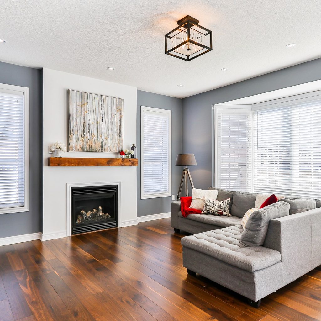
One color will be for the hallways, from the foyer to the upstairs, inside the closets, and in any other common spaces. Think about sightlines. You may not think a wall is a common area, but if you sit in a room and see a hallway wall or the wall above the stairs, that counts as a common area. Your base color will be for the walls, ceiling, and trim. Your carpets, drapes, and window coverings will complement that base color, so keep that in mind.
There are a couple of ways to work with color. You can get a good, old-fashioned color wheel with complementary colors marked to help you figure out what to use. If you are trying to decide if a certain hue of color is going to work, go darker or lighter than your neutral. A straightforward way to do that is to go to a paint store or the paint area of a big box store and pick one color—there will be darker and lighter gradients of that color either on the wall where you picked the original color or on a color strip at the store. You can also ask for lighter and darker color mixes if you can’t find just the right shade you want.
If a certain store doesn’t have the exact shade of color you want, go to another store. You will be looking at those colors for a while; get the ones that are the exact color you are thinking about. Some paint stores can also computer match colors from objects. If you have a sweater that is the exact shade of gray you want in the laundry room, find out which store will do a computer match.
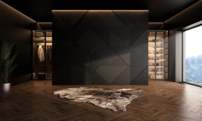
Accent colors
 Accent colors
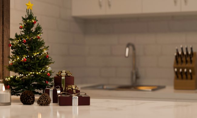
Accent colors can be on accent walls. But use restraint: An accent wall in every room is no longer an accent, it’s a pattern, and it’s not a surprise. Try out peel-and-stick wallpaper using accent colors that match your neutrals, or maybe you want to try them to test some complementary colors.
Throw pillows, throws, and painted furniture can all be in your accent colors. Any one of those items can be changed out, and it will refresh your color scheme without having to paint a bunch of walls. Try to include something with your accent color in most of your rooms to maintain a cohesive color palette.
Settling on a color palette shouldn’t be something you do in a day. Get big samples of the colors you are thinking about and look at what they look like when it’s sunny, first thing in the morning, and at dusk. According to Dailey, as long as you focus on letting light and bright colors into your space, you can’t go wrong.
“I would say that [homeowners should] focus on an open floor plan, lighter wall colors, clean whites for furniture [and space that’s] not cluttered,” Dailey said. “Obviously white and variations of white have been very popular, but even other lighter colors too, especially now that we’re seeing accent colors pop up here and there.”