Paint is a crucial element in your home’s interior design, setting the mood of the entire room. From classic paint colors to trendy hues, there’s a lot to consider when picking the perfect one for your space. While traditional paint colors never seem to go out of style, trendier spaces need constant remodeling to not look dated.
If you’re looking for paint colors that will outlast the ever-changing fashions, choosing classic colors is essential. Before you break ground remodeling your space, check out these classic hues that will stand the test of time.
Stay with neutral shades and low sheens
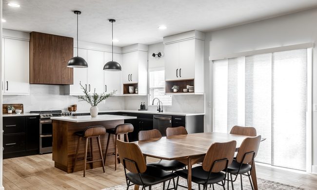
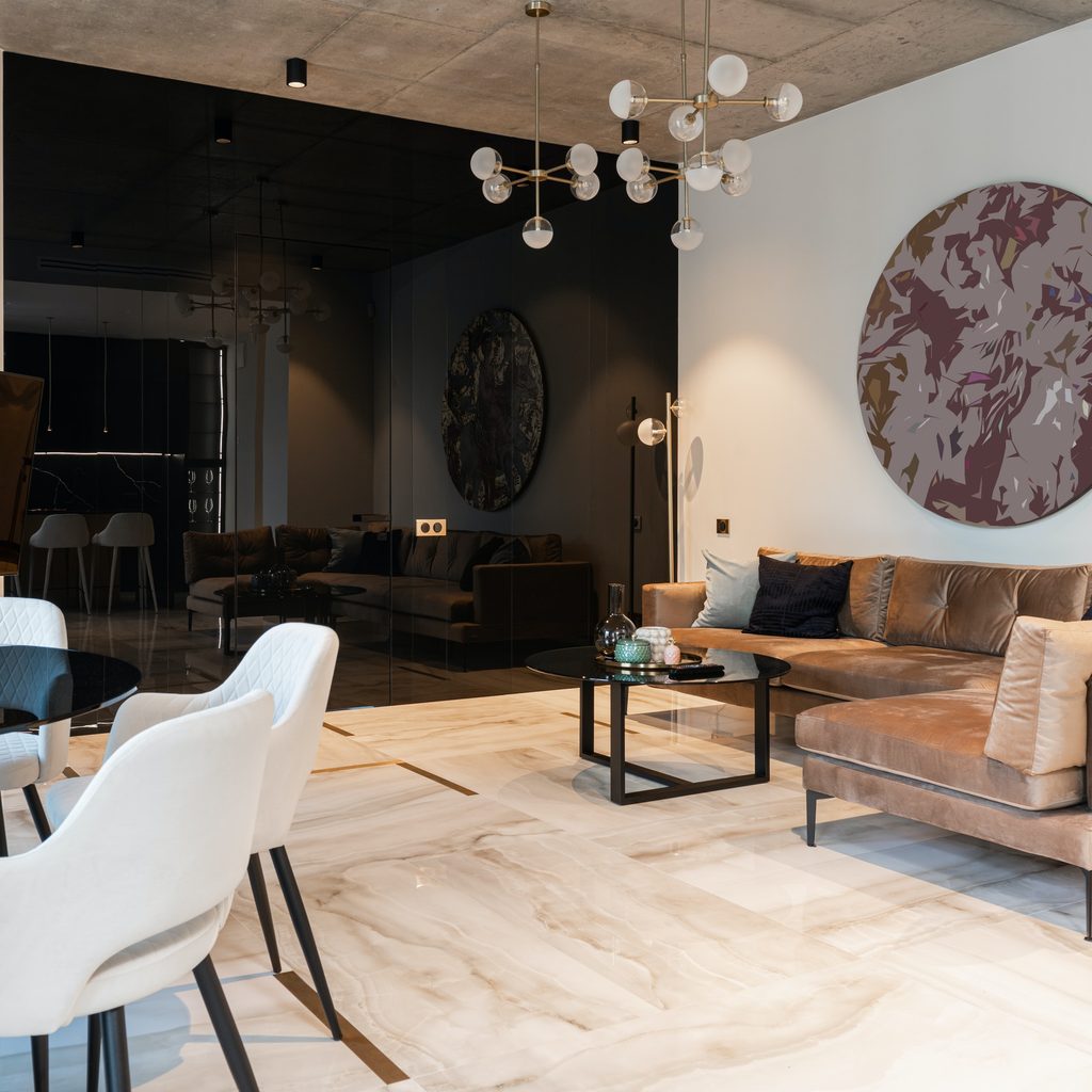
Neutral colors are the foundation in most peoples’ homes, as they won’t clash with the changing decor. Neutral, classic shades are more than just beige and white, though. This collection of colors can also include navy blues, deep reds, greys, and even emerald greens. With all these options, it can be difficult to know where to start.
Eugene Colberg, an expert on architecture and interior design from Colberg Architecture, shared, “When we recently repainted our home, we started by selecting a neutral base color which was not to be white. We wanted all of the crispness of white without its sterile starkness.” According to Colberg, a warm grey, like Benjamin Moore, OC27: Balboa Mist, can brighten up a room all while adding a soft, warm tone that bright whites can’t quite provide. He continues, “this is a great color which can look white if not next to a white but can make the white trim and ceilings of your home pop, defining your space in a subtle way.”
Next, it’s best to choose accent colors that pair well with the neutral grey on the walls. Colberg shares, “we complemented that selection with white trim, Iron Mountain on a number of walls, and Blue Hydrangea.”
In terms of brand, he recommends sticking with Benjamin Moore. “They have a great reputation as a manufacturer, great color palettes, good choices for sheen, and their products are widely available,” he said. His favorite Benjamin Moore shades include:
Blue or green undertones:
Deep, statement-making hues:
Dark and moody:
Bold accent colors:
- Caliente for the hall or entry foyer
- Blue Hydrangea across the ceiling in a child’s room, giving them blue sky all day long
- Happily Ever After for the eat-in kitchen or sunroom
Consider the mood you want to create in your home
Classic neutrals, like brown, taupe, beige, and grey, have been popular for centuries because they work with any style or color scheme, and can complement your decor regardless of material.
Brown, for instance, works well with aesthetics that include a lot of natural materials like the classic country style or bohemian chic. Taupe adds a romantic softness to powder rooms or other small, intimate spaces. Beige is a classic neutral that can reflect light in dimmer spaces like hallways and rooms with few windows. Last, grey has a cooler tone than beige making it a favorite of styles with an industrial or contemporary flair.
As previously mentioned, don’t be afraid to add more color with deep blues, greens, and reds, whether you paint the whole room with these hues or just stick to one accent wall.
Stick with one or two colors, and not more than three
As a general rule, it’s best to use no more than three main colors in the room. Adding more can cause a room to look too busy, especially once you add in decor, and it also increases the risk that the colors will clash. Accent colors in the pillows, wall art, rugs, and the like are welcome as long as they complement the dominating tones in the room.
Avoid bright colors
Remember that the name of the game here is choosing colors that are classic and not trendy. If you want to create a fun, contemporary theme, feel free to bring in bright reds, electric blues, and sunny yellows. However, if you’re looking for a style that will stand the test of time, keep it simple and neutral.
Have fun painting your interiors
Choosing suitable paint colors for your home can be a daunting task. There are so many options to choose from, and it seems like every other day, there’s a new trend on social media. For those with a love of decor and the motivation to remodel every so often, try them out! For others, who are looking for classic, crowd-pleasing styles, keep it classic with neutral shades in low sheens.
Keep in mind that the colors you paint your walls set the tone of the space, so take some time to consider the purpose of the room before picking out those new color swatches. At the end of the day, if you decide the hue doesn’t quite do the room justice, you can always paint over it again!